01
Always be Curious
Curious people make great marketers. We're all about the 'what ifs' in marketing. We encourage you to channel your inner curiosity, experiment freely and hone your game.
spin
brand guidelines
Welcome to the Spin brand guidelines and graphic standards. Here you will find everything you need to successfully maintain the Spin brand system and avoid visual and tonal inconsistencies across brand communications.
Spin's approved brand system describes the correct design practices necessary for preserving the integrity of the brand, so careful attention must be paid to the rules outlined in this document.
Certain aspects of the brand system are straightforward, others may initially appear vast and intimidating. But by immersing yourself in the system, keeping a critical eye, and - above all - actively seeking to improve your understanding of it, the system will soon feel like a second language.
Section 1 - Spin Social
Section 2 - Spin Performance
Section 3 - Assets
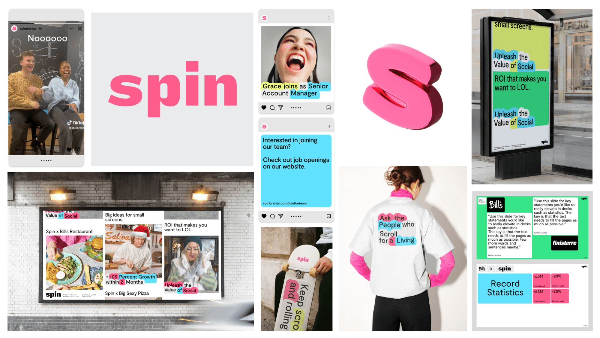
We’re a team of social natives you can trust to unleash your brand on social.
We believe that social media has a gravitational pull on culture. Whether we like it or not, social media is no longer the backdrop of behaviour; it’s the stage. Shaping and influencing how we, as humans, interact. We believe that building a great audience on social is the best way of future-proofing your business. We believe that a social-first approach is the only way to create content and connections that matter.
Brand Purpose
The reason you exist beyond making money. The northstar to guide all you do.

Unleashing limitless potential
Brand Values
The core principles, beliefs and standards that our company embodies and represents in our day to day life. They help guide our company culture.
01
Curious people make great marketers. We're all about the 'what ifs' in marketing. We encourage you to channel your inner curiosity, experiment freely and hone your game.
02
Social moves fast and it's our job to move even faster. Manage your day, manage your mind and manage our approach to ensure we're on our toes, always ready to pounce.
03
Social can at times be a sea of copycats and lazy thinking. We encourage you to push your creative boundaries; be it for content or problem-solving. Magic things happen when you think bigger.
04
We only get one chance to do what we do - so make it count. Make your time at Spin count, make that client campaign count, make that creative piece count. Show them what you can do. Show them what social can do.
05
We expect excellence in all aspects of our business. We should expect it of ourselves and in each-other. We are not afraid to strive for excellence and work, collectively, to improve - even if that means having direct communication. Mediocrity cannot spread.
Tone of voice is not just what we say, but how we say it - the type of language we use, the way we construct sentences, the rhythm and sound of our words. With a killer tone of voice we can stand out in a single sentence and stop the world in its tracks. Saying this is Spin, where power and possibility happens.
Our tone of voice is based on our three principles:
Plug In Introduction
We value social intelligence. So we need a tone that is insightful and plugged into social trends. We speak like the specialists we are. Assuring big brands that we have the knowledge and insight they need to add value to their business through social. We talk directly to their problems and marketing needs to show them that we understand. Spin is the solution. They are in safe hands.
Sounds: Informed, Direct, Self-assured
Do
Channel confidence through clear and focused copy that targets the needs of our clients.
We say
Know billboards but not digital banners?
Leave social to those who are obsessed with it.
Don’t
Sound too functional or B2B boring. A Head of Marketing is human too.
We don’t say
We achieve business performance and drive growth by leveraging social know-how, commercial acumen and creative flair.
Do
Write articles, thought pieces and posts that show insight and opinion on social trends.
We say
Our Performance Director, Robert Neander, shares insight into reaching 42.8k views with one Bill's Instagram post.
Don’t
Just tell people we're specialists. Show that we are specialists by backing up claims with examples and facts.
We don’t say
Experts on all things social, we're the number one agency for all your marcom needs.
Do
Use data, analytics and the language of business in a compelling way to engage clients.
We say
E-commerce with A-game
Increase your Google revenue by 200% at Spin.
Don’t
Try too hard. Smart sounds simple. Think Apple, Dyson and Tesla.
We don’t say
Paid, organic, influencer, creative. You name it, we got it.
Plug In copy bank
Make Magic Introduction
We pride ourselves on creative excellence. So we need to inspire through our words and make magic. In our world, anything is possible. We encourage brands to take (calculated) risks and invite our employees to be curious in everything they do. Our words are considered, crafted and exciting. Think intriguing turns of phrase, creative use of syntax and headlines that make you think again.
Sounds: Witty, Compelling, Smart
Do
Work hard to craft headlines that show clever creativity.
We say
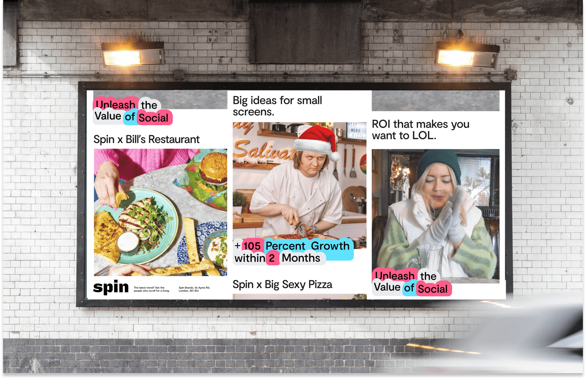
Big ideas for small screens.
Don’t
Use clichés, overly conceptual or sensationalist language. It loses real meaning and sincerity.
We don’t say
Enter Wonderland. Let us show you around.
Do
Twist popular phrases, use questions, rhyme and opposition (eg. More X. Less Y.) as a start for clever wordplay.
We say
From attention seekers to attention grabbers.
Don’t
Push it. If the line isn't working it's better to say it straight.
We don’t say
Audiences old. Audiences new. We connect with all of you.
Do
Put the most interesting point first on a (web) page.
We say
We think like clients. Not an agency. We've been in your shoes. We know both the pressures and the passion for performance marketing. Which is why we can effectively increase your ROAS.
Don’t
Just preach about the benefits of social or explain what clients already know.
We don’t say
Social is the future. Your brand needs a strong presence.
Make Magic copy bank
Play Around Introduction
We have a youthful spirit. So we need to sound fresh and fun and play around with our storytelling. Our storytelling pops with feel-good energy. We speak in human truths, give it a little self-deprecation and crack in-jokes about the industry. This puts Spin in the know and at the centre of social fun. And we make sure our humour is always the inclusive kind.
Sounds: Playful, Charismatic, Personable
Do
Write with refreshing honesty, show self-deprecation and playfully dig at the social media industry. It shows off our youthful energy and passion for all things social.
We say
If you know, you know. If not, get in touch.
There's nothing different about perfect.
Don’t
Sell the idea of perfection.
We don’t say
Be at the forefront of culture. Up your audience overnight. Spin will show you how.
Do
Add personality and humour through casual asides and wordplay, making sure everyone is in on the joke.
We say
ROI, meet LOL. At Spin, we trade in both.
Don’t
Push the personality too hard. If you're worried it might sound cringe, chances are it does.
We don’t say
Give your performance marketing a big thumbs up. Spin. Like what we do.
Do
Celebrate relatable experiences that put a knowing smile on our customers' faces.
We say
Wondering if you could do more on social? Take this as a sign.
Don’t
Be overfamiliar. Even though we work in social, we are still professionals.
We don’t say
WTF is UGC? Dw we'll make you some banging content.
Play Around copy bank
Introduction to the Spin Wordmark
This is the Core Spin Wordmark. This should be used in all instances where we need to use a logo. In order to maintain the legibility and recognisability of the mark, there are a few guidelines to follow.
The wordmark is to be used for applications where it is needed to communicate the Spin voice efficiently.
Download Wordmark 1.4 MB hover to see visual
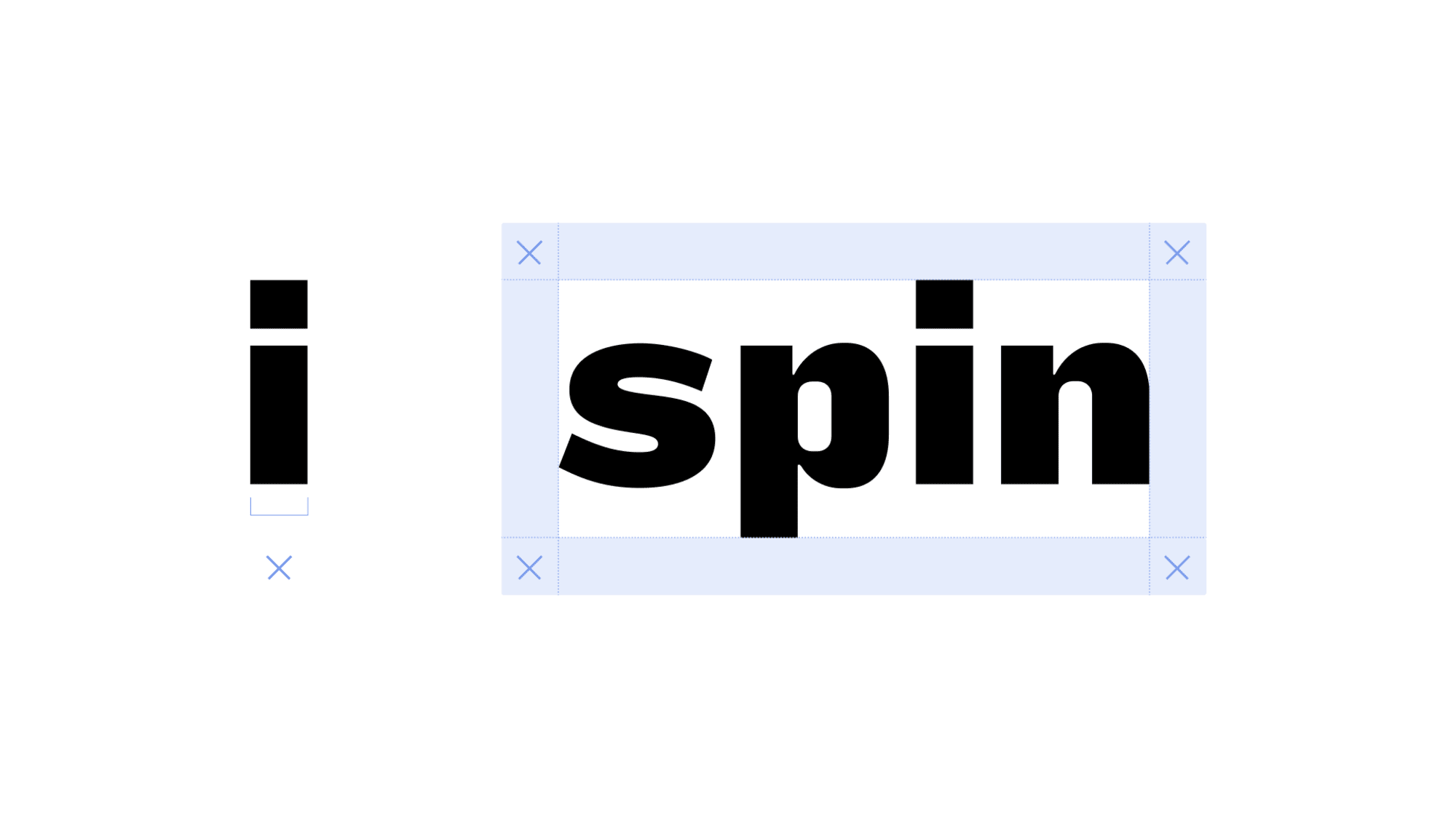
 The margin around the wordmark is derived from the width of the letter “i”.
The wordmark and subsequent typeface was designed to work great when used at a friendly display scale and at smaller subheading sizes for body copy.
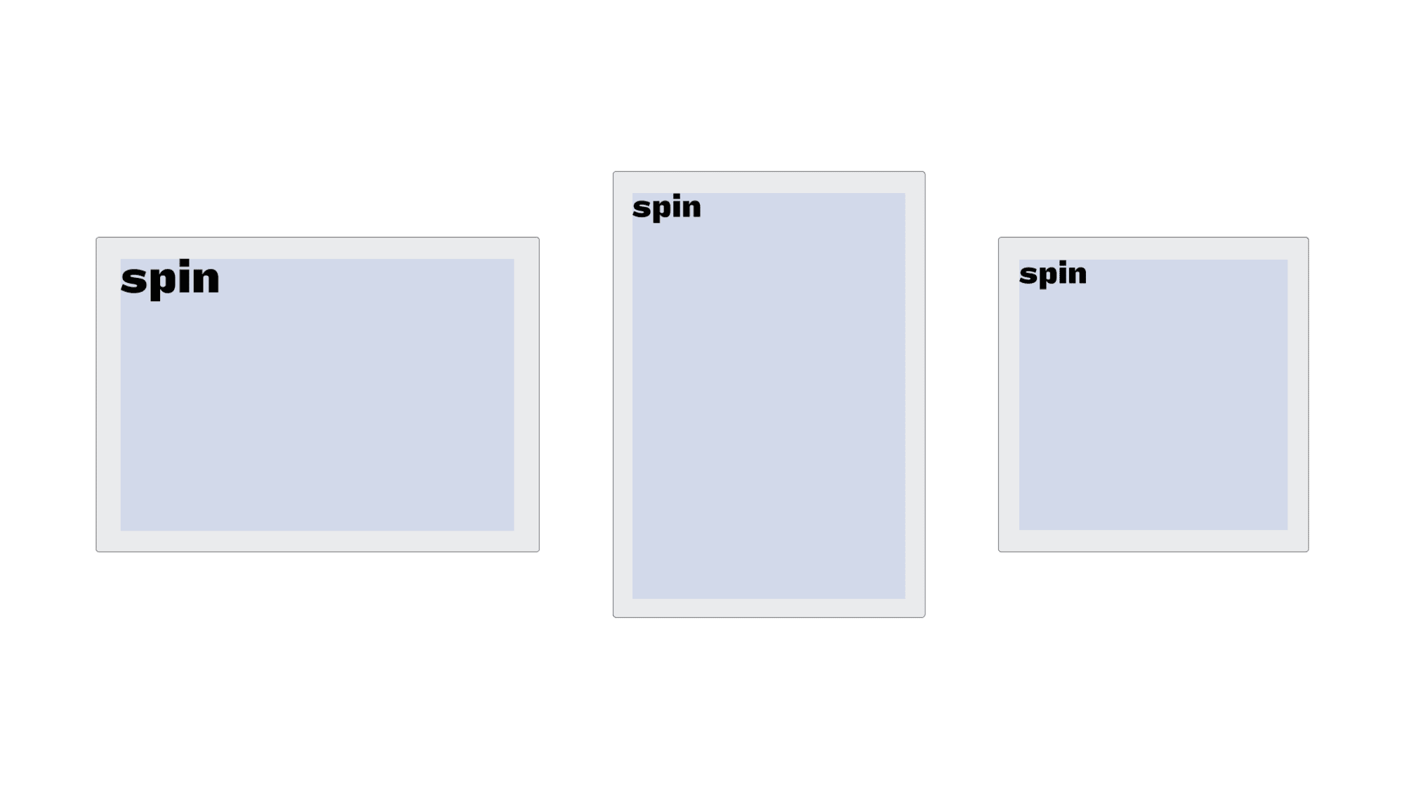
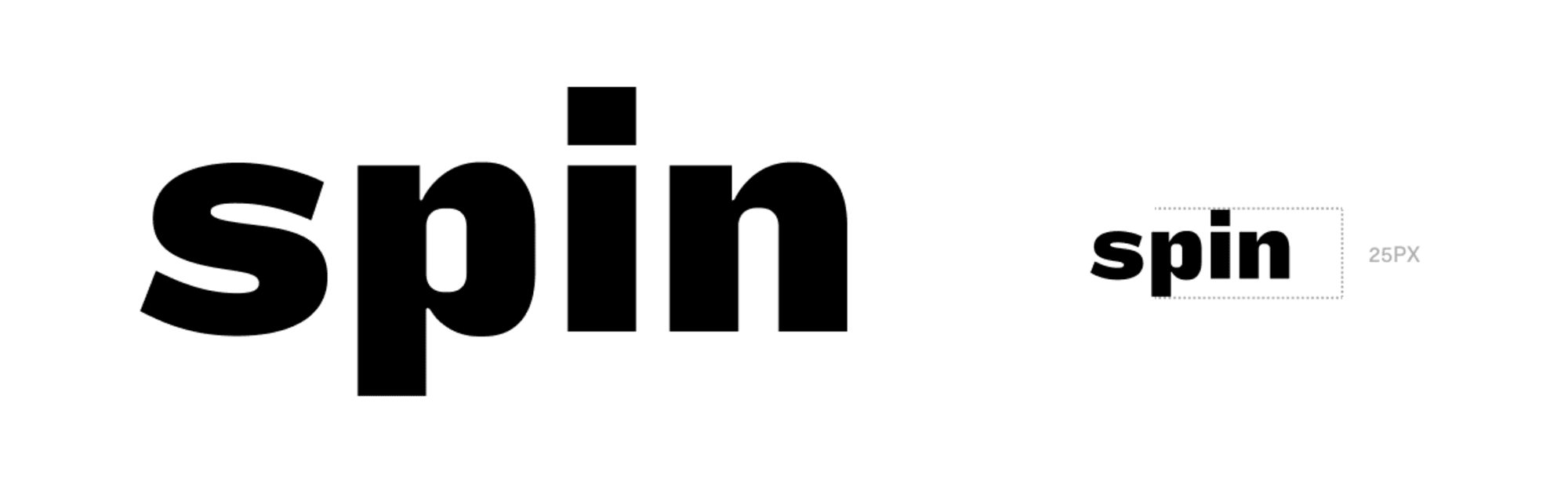
There is no limit on how big you can make the mark (as long as it fits within the grid parameters), but establishing a minimum size helps ensure that the legibility of the mark isn’t compromised.
Minimum Size - to ensure legibility and impact, the Spin Wordmark should never be reproduced smaller than 25px / 28pt tall in any communication.
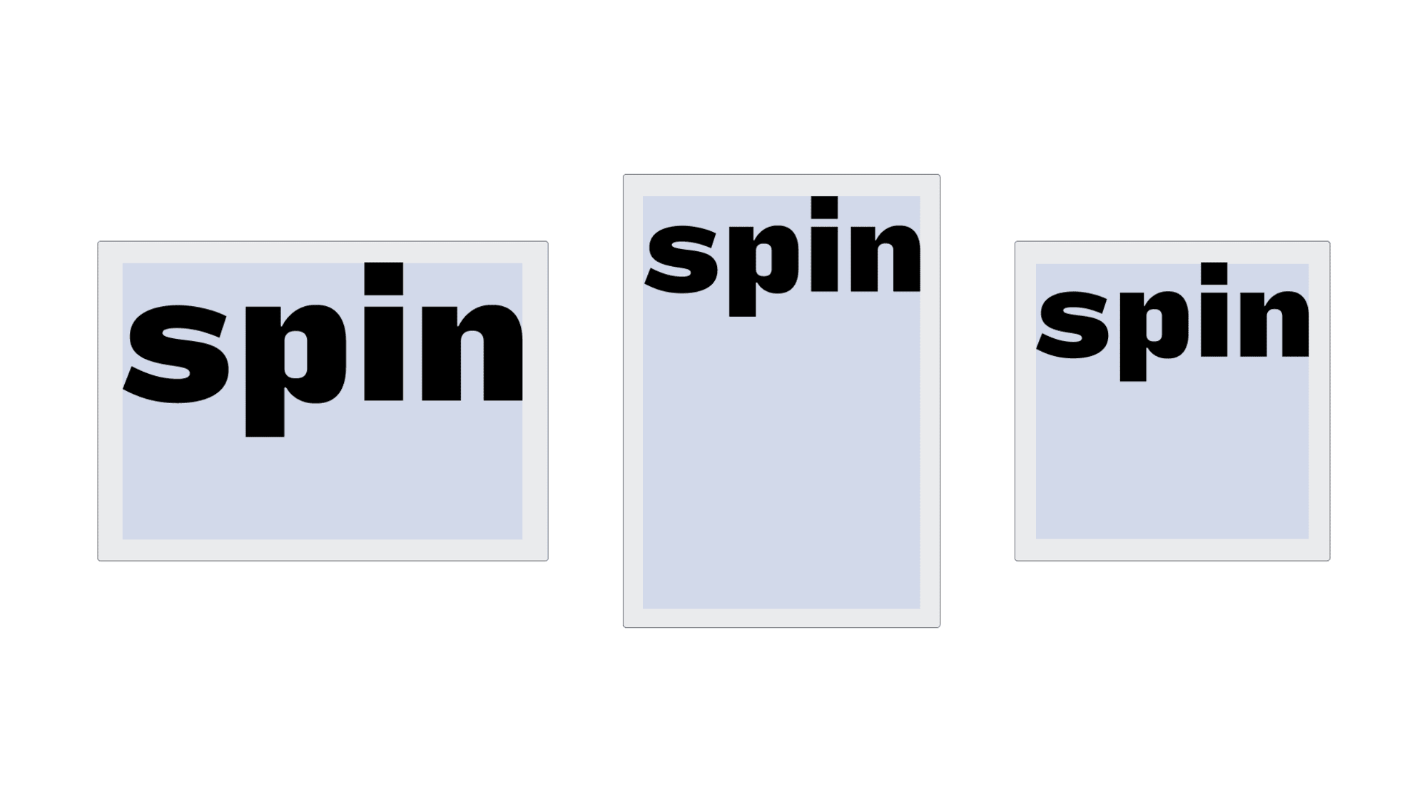
When setting the wordmark, it should always be positioned to the top of the format and expand to the width of the margins.
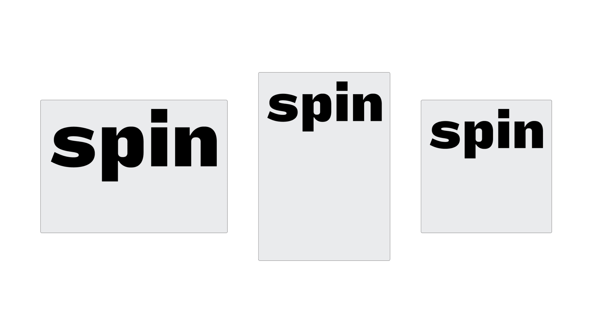 hover to see visual
 Spin can also be set at a smaller scale. This must be derived from the setting of Spin Performance.
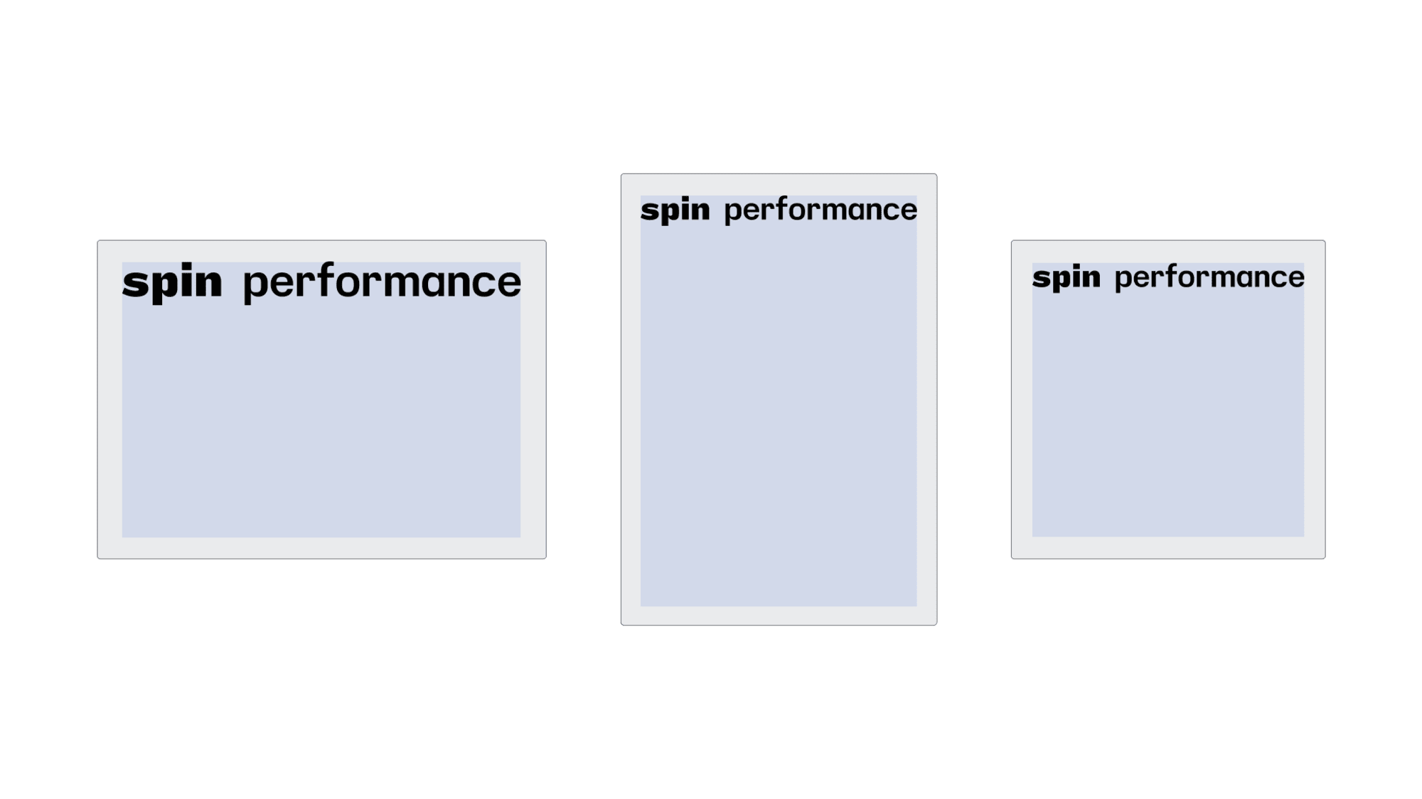 hover to see visual
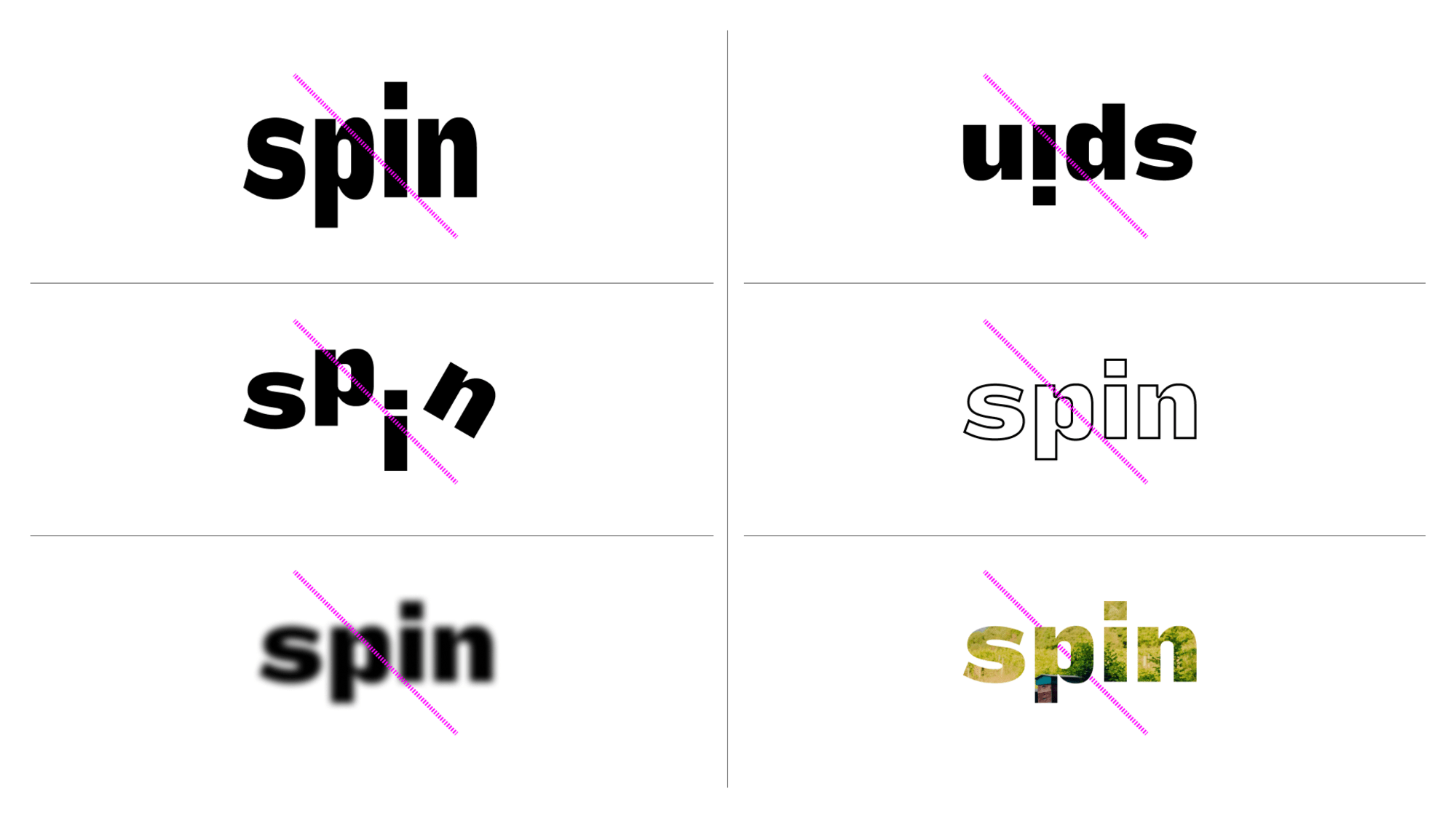
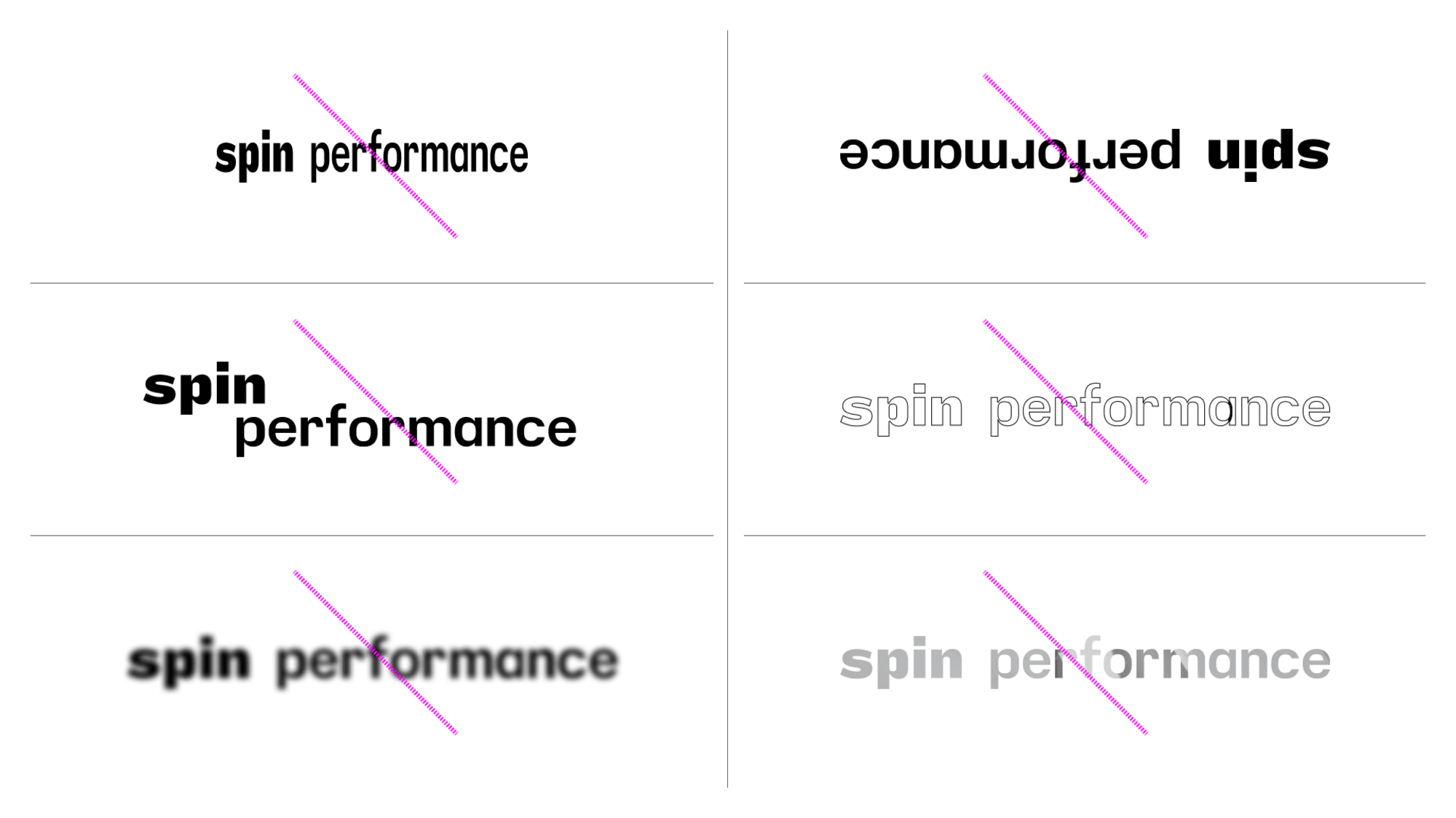
 This applies to all iterations of the mark.
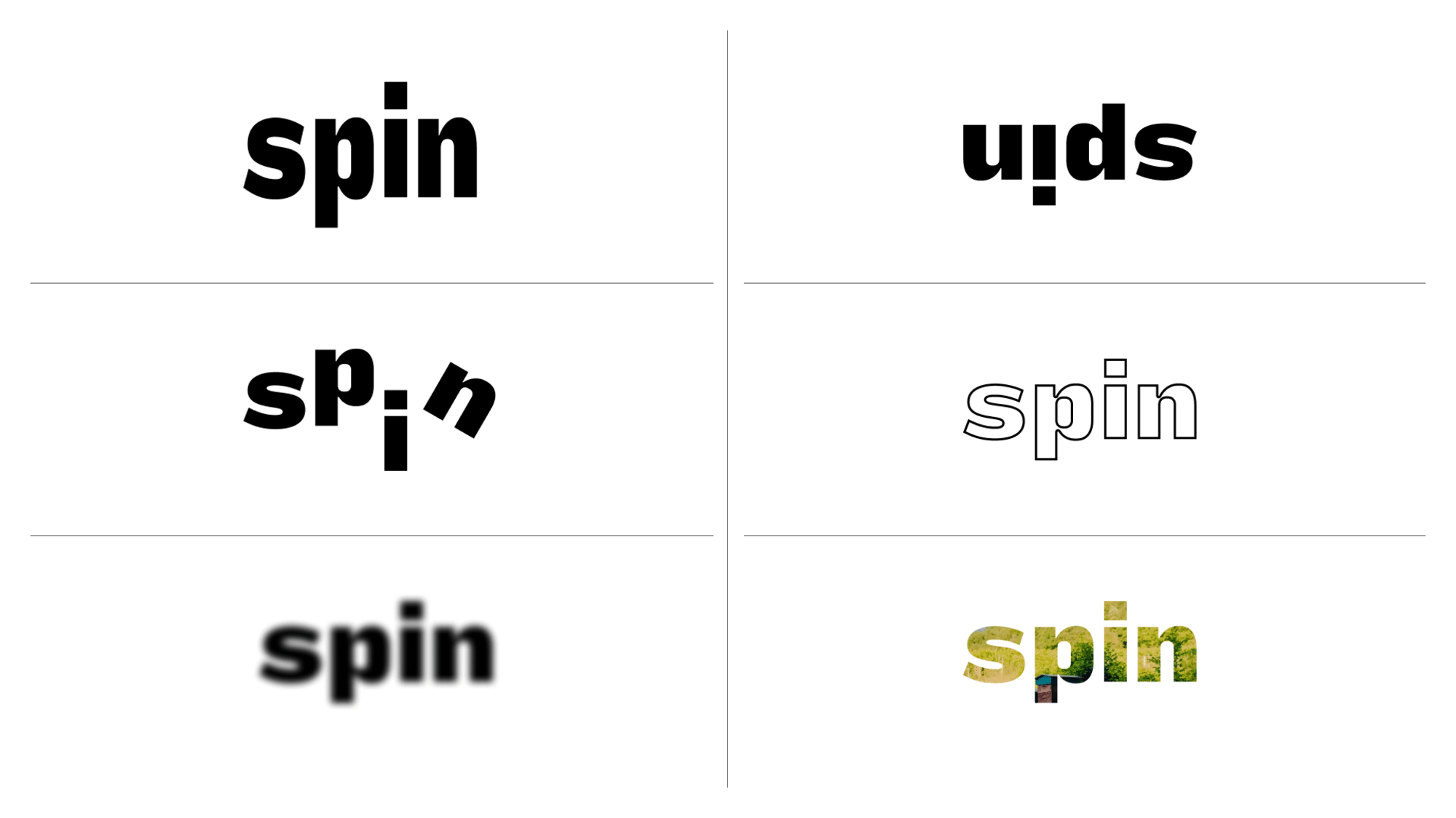 hover to see visual
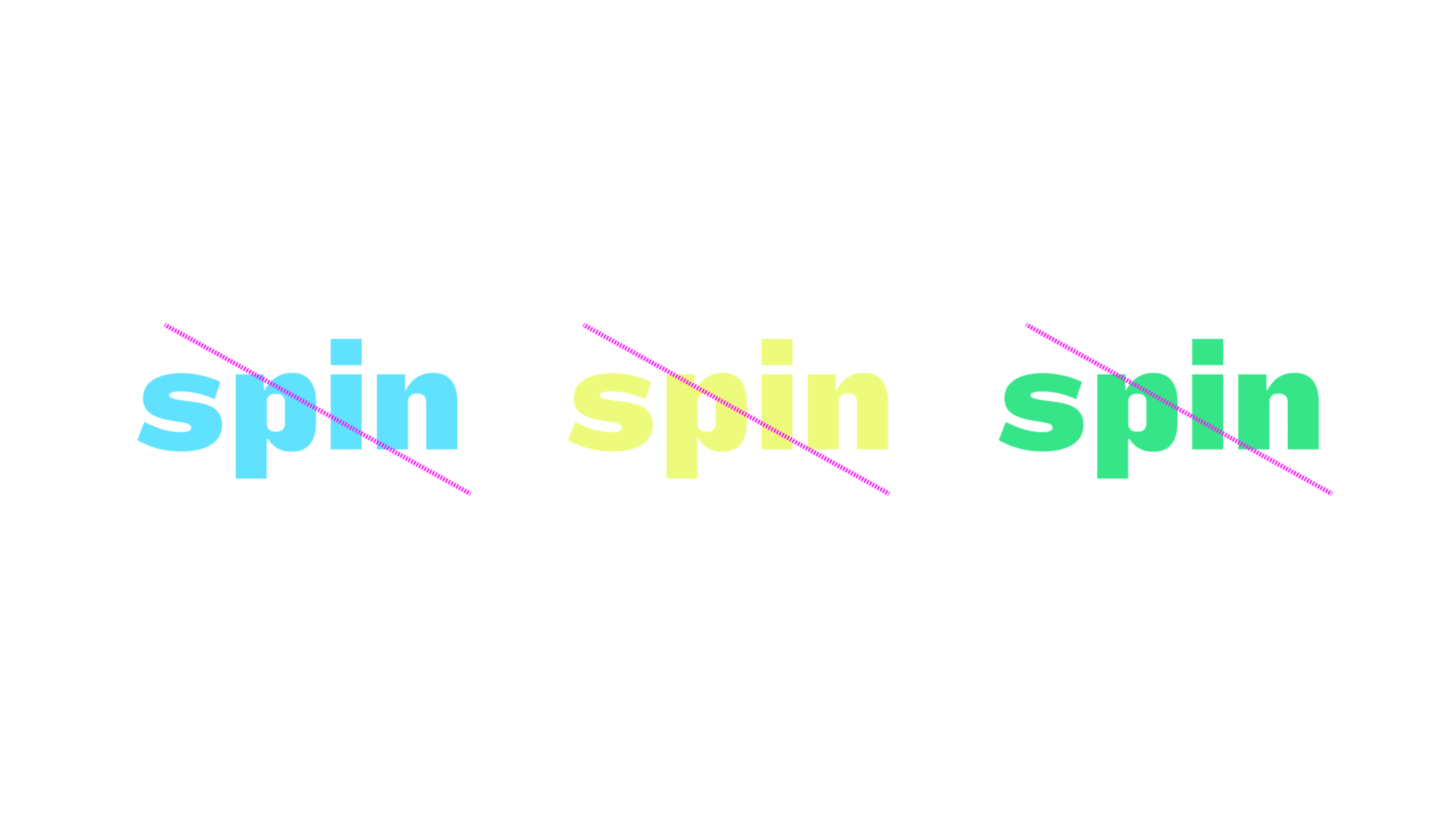
 The wordmark should only ever be used in pink, black and grey.
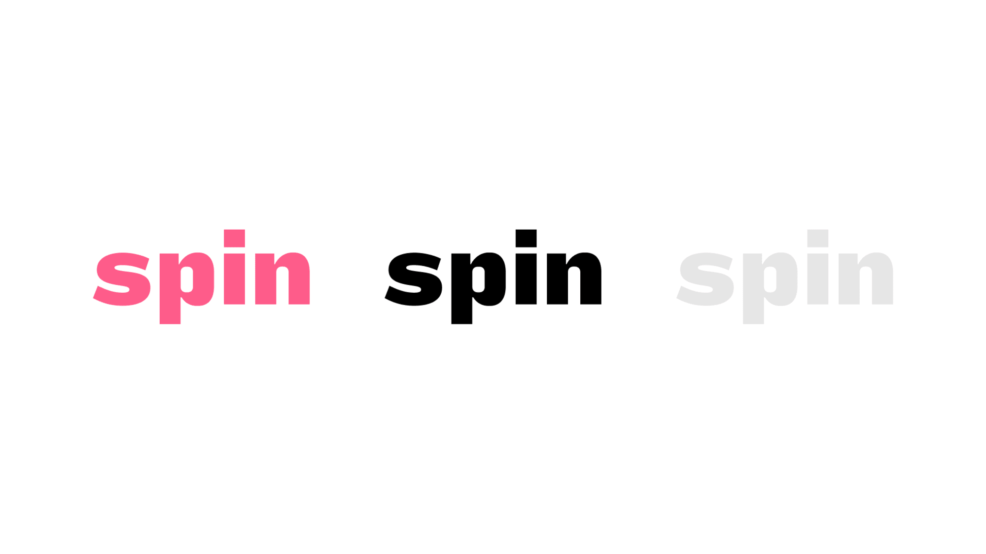 hover to see visual
 For digital applications an animated version of the wordmark is available.
Download Motion 10 MB
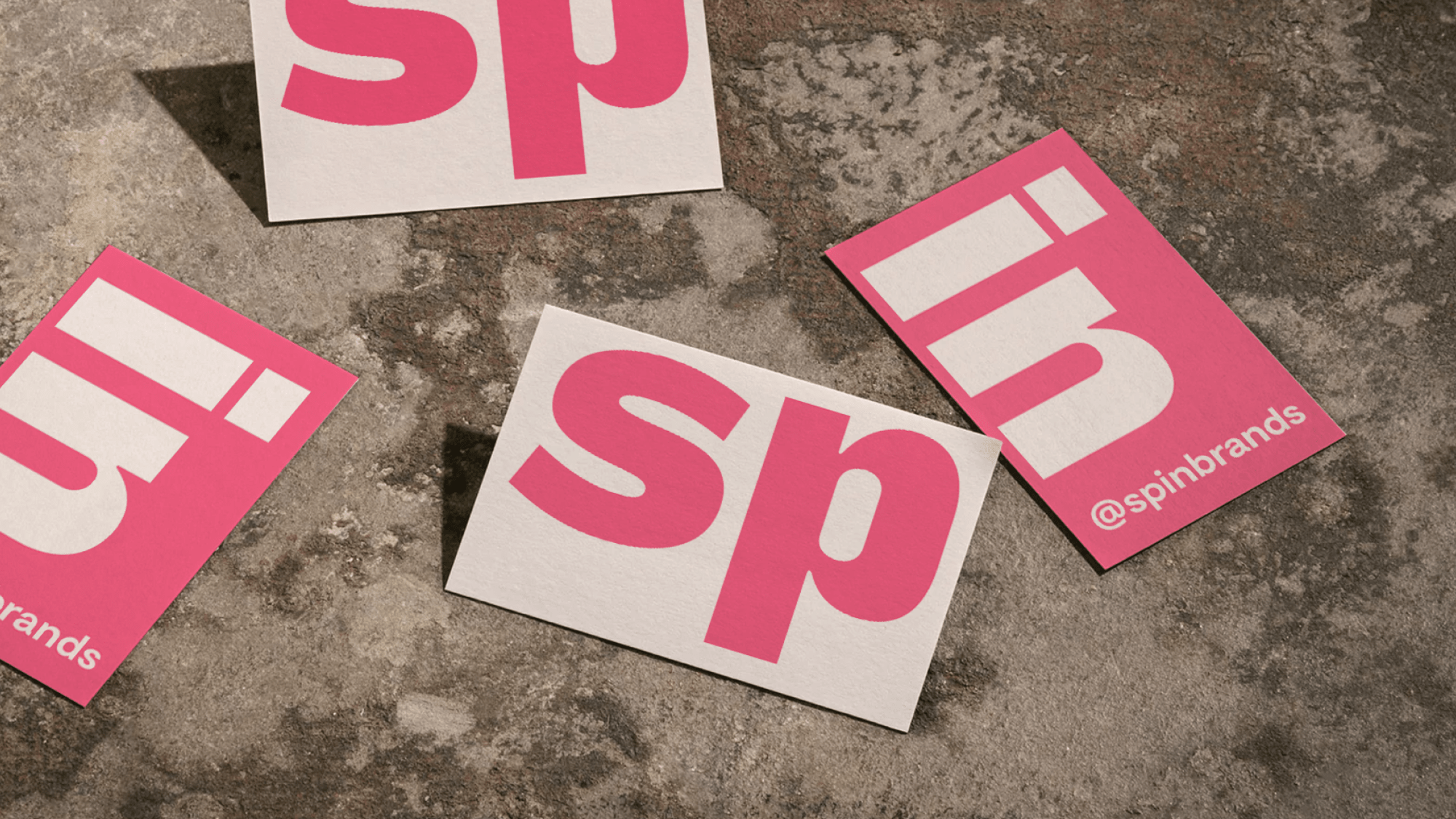
Shortened Spin Wordmark
In addition to the Core Spin Wordmark, a simplified ‘S’ has been created to use across collateral that has a minimal amount of real estate.
Download Shortened Wordmark 392 KB
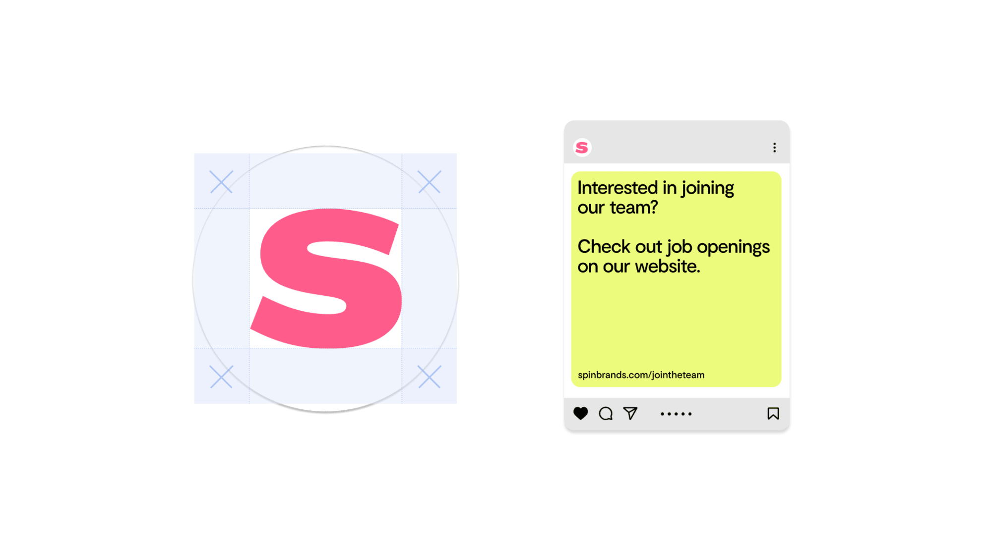
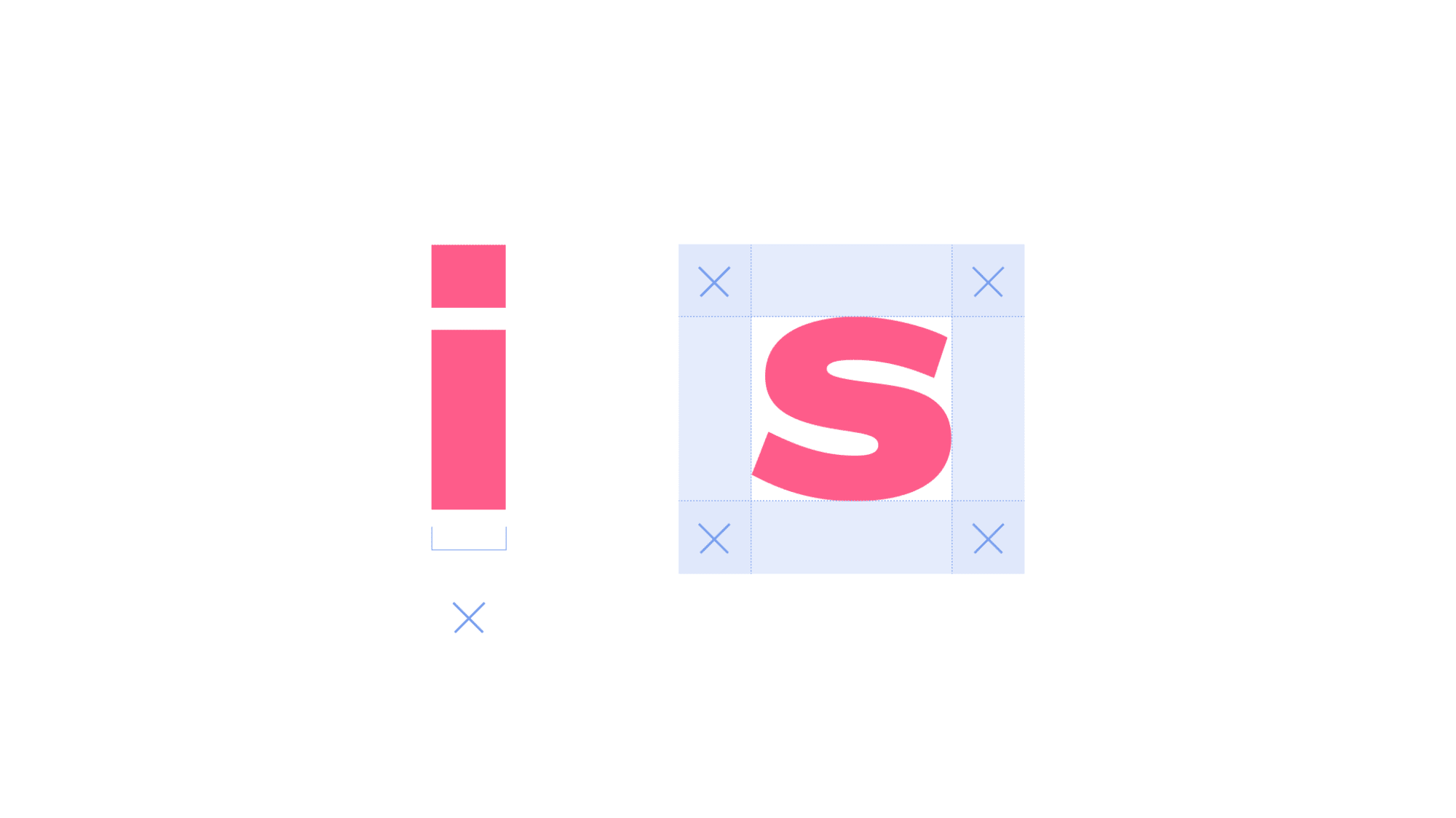
The margin around the shortened wordmark is derived from the width of the letter “i” from the extended Spin wordmark.
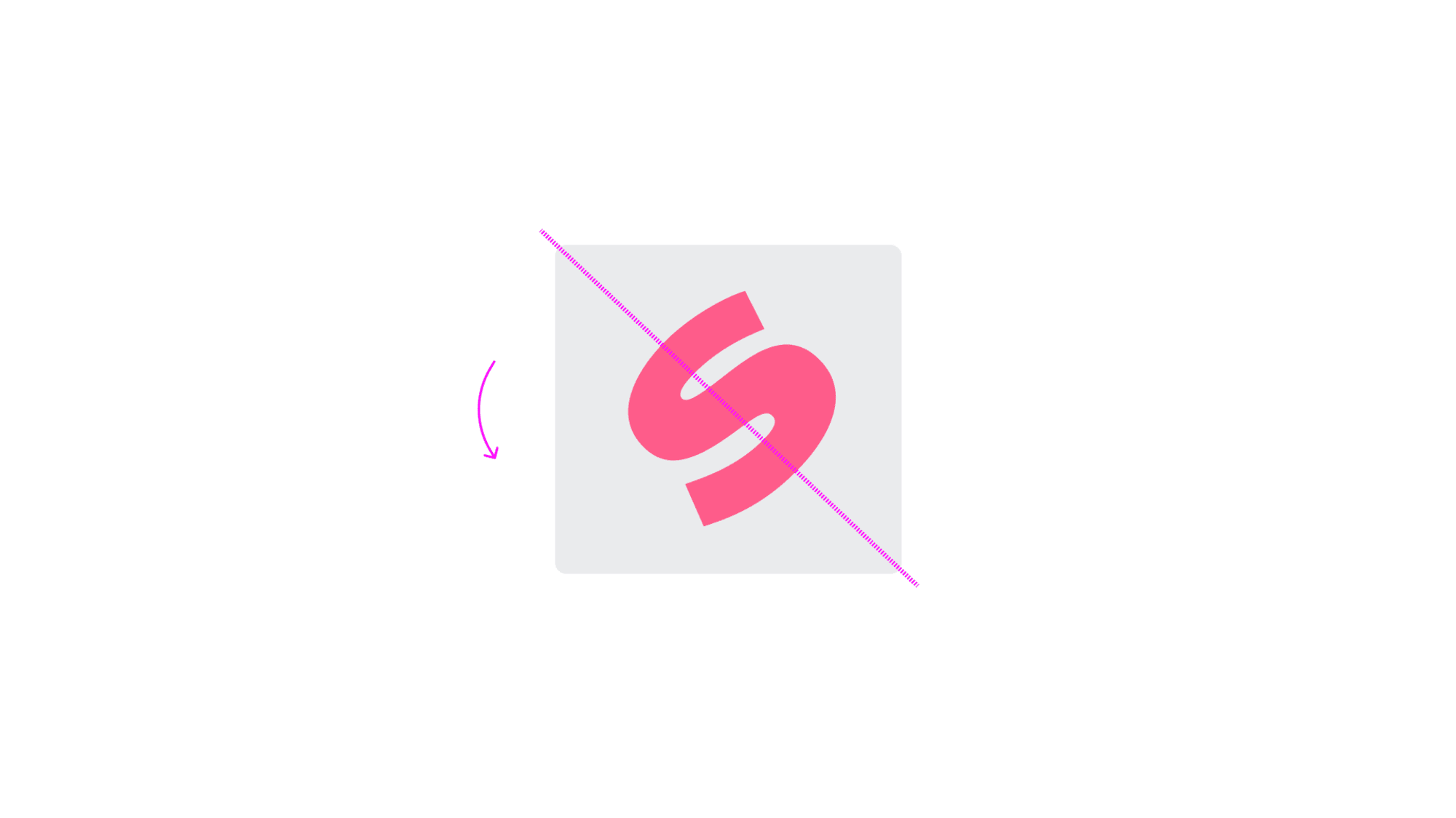
The shortened wordmark should never be rotated.
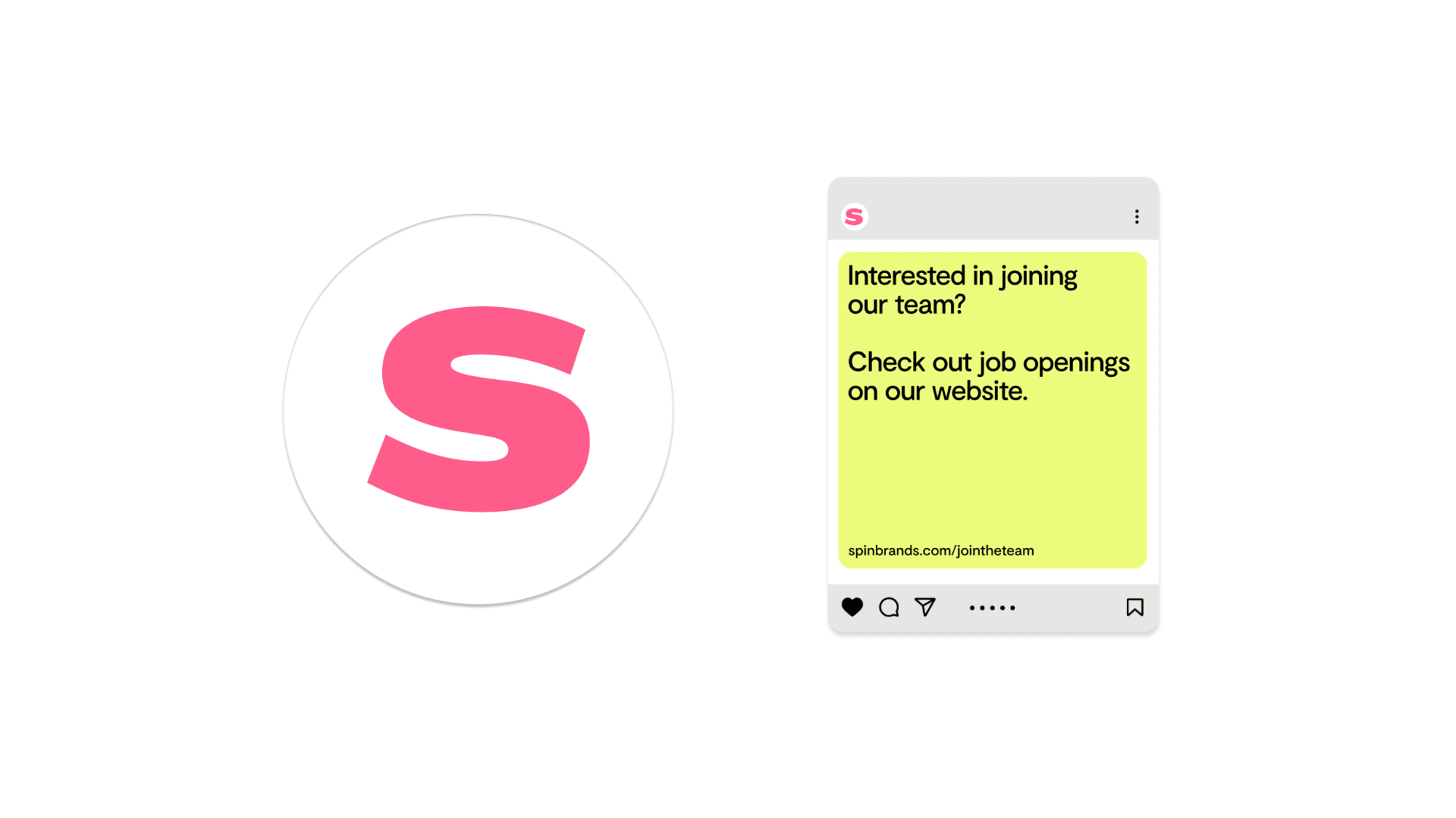
The shortened Spin wordmark should also be used for instances where there is minimal real estate. For example: social profile pictures and favicons.
Take care to maintain the guidelines for clear space and margins when using the ‘S’ logo at this scale.
 hover to see visual
Shortened S
An elevated 3D ‘S’ has been additionally created. This is to be used only in specific instances. Please see below for guidelines.
Download 3D Brand Assets 24 MB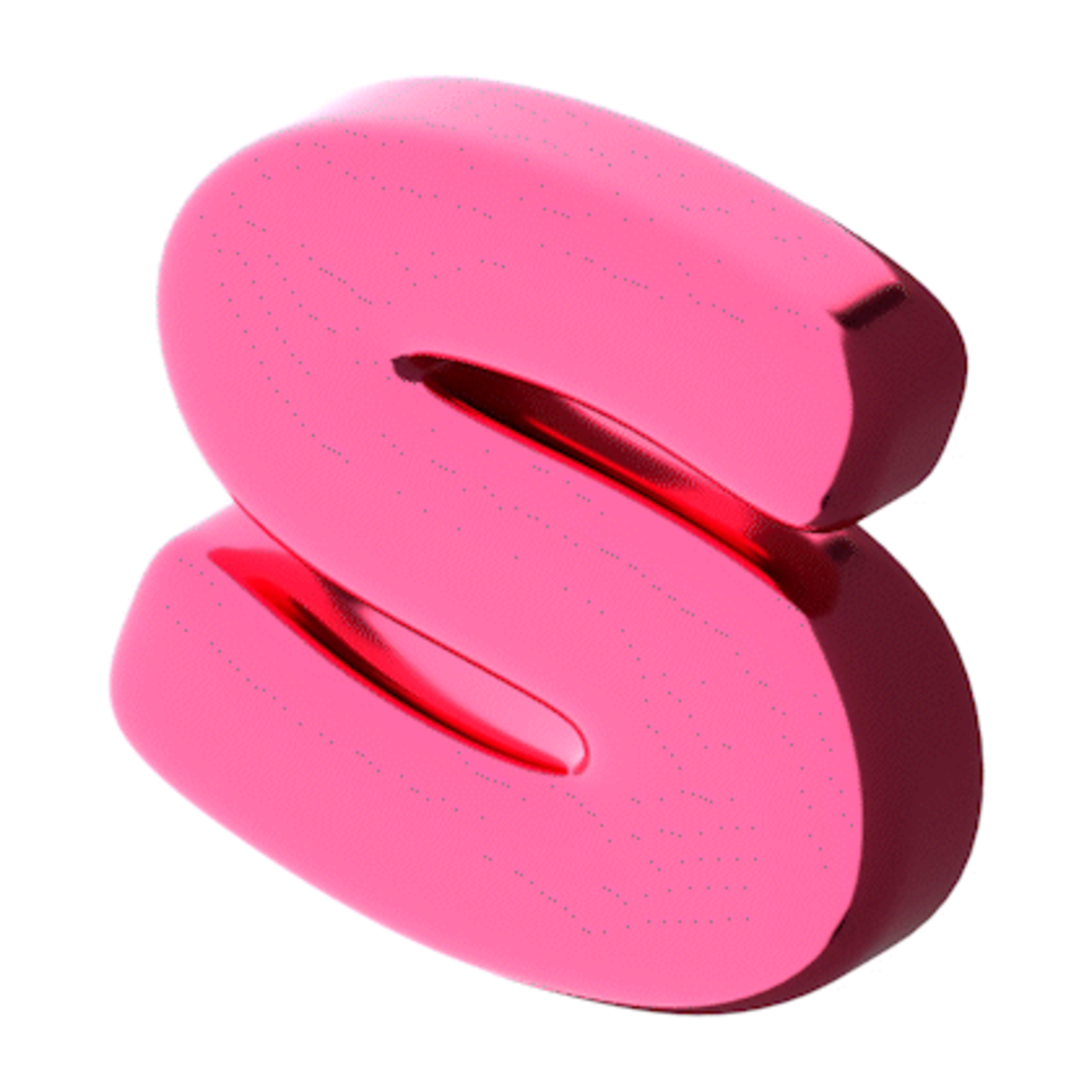
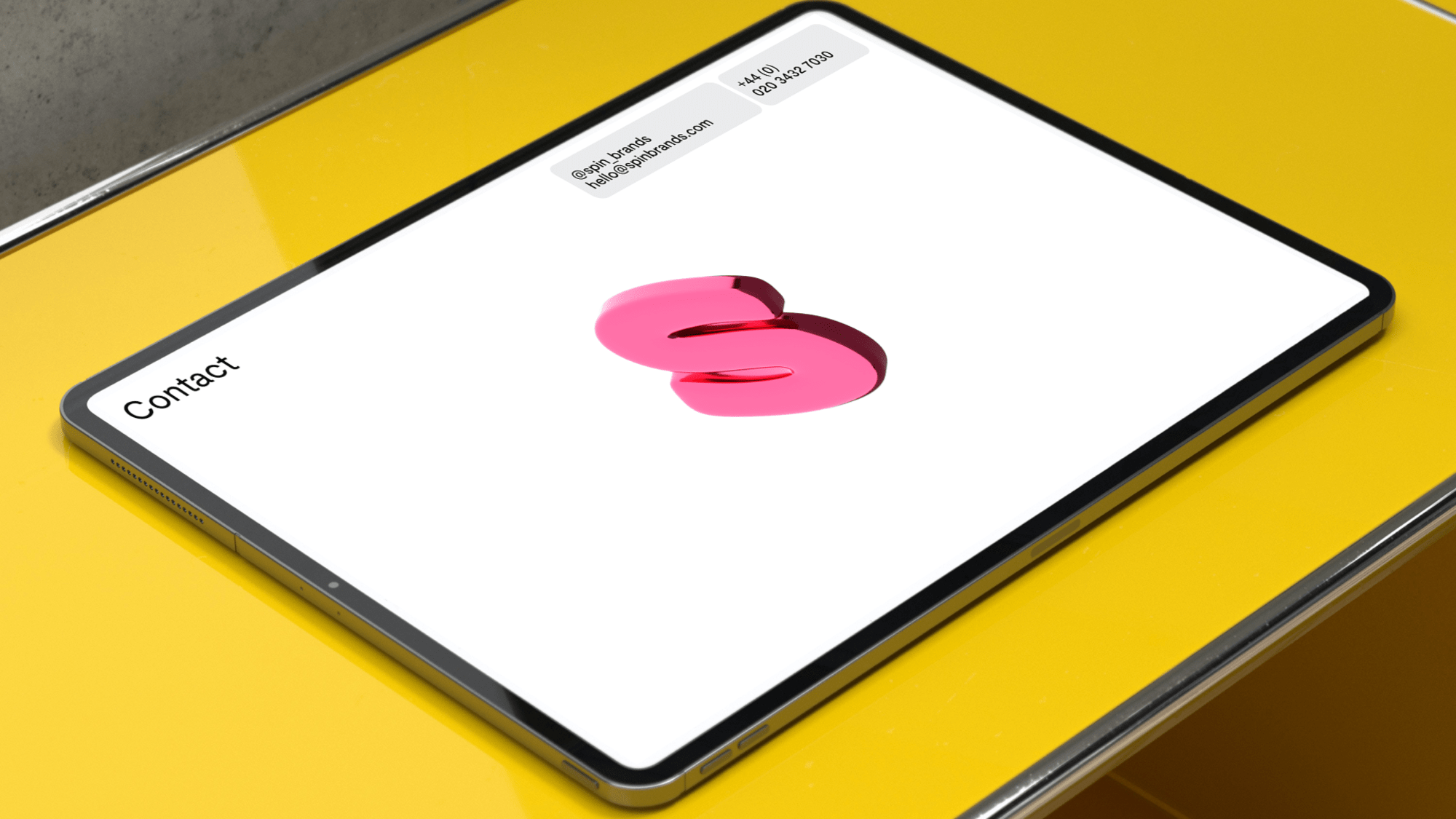
Correct Usage
The 3D element has been embedded into the pitch presentation decks on the contact pages.
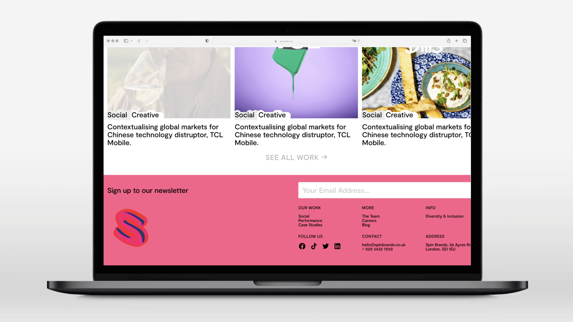
Correct Usage
The 3D element sits within the footer on the website.
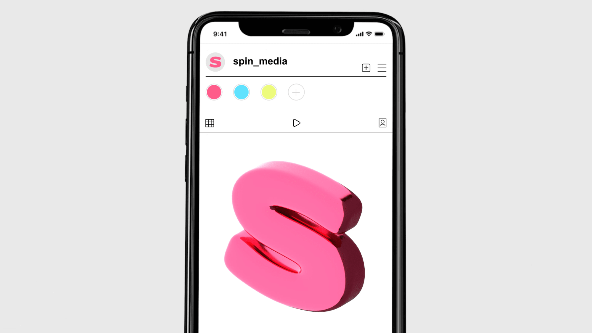
Correct Usage
The 3D element can be used as a teaser post when introducing the new brand on socials. Please refer to the do not’s below.
This applies to all iterations of the mark.
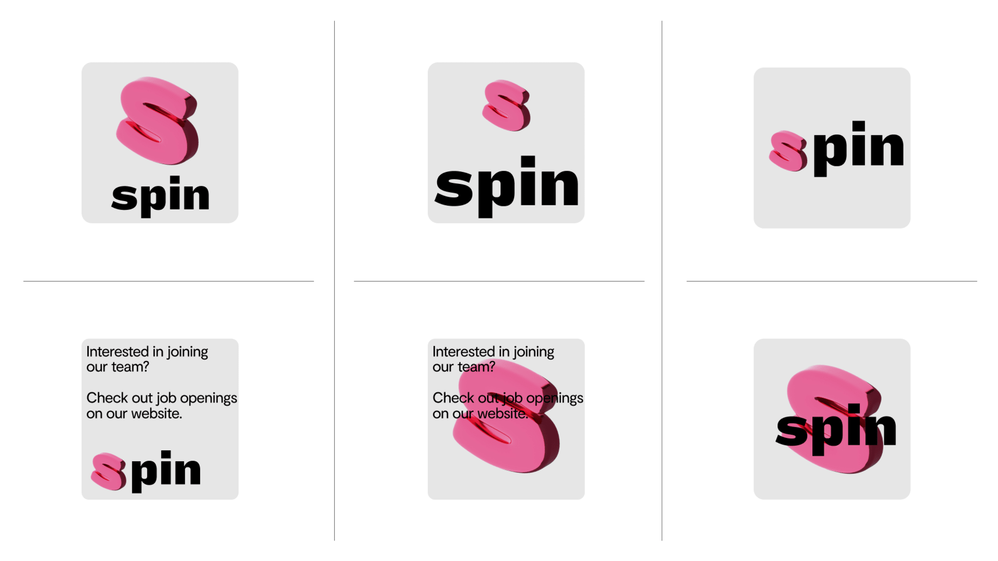 hover to see visual
 God Mode Widgets
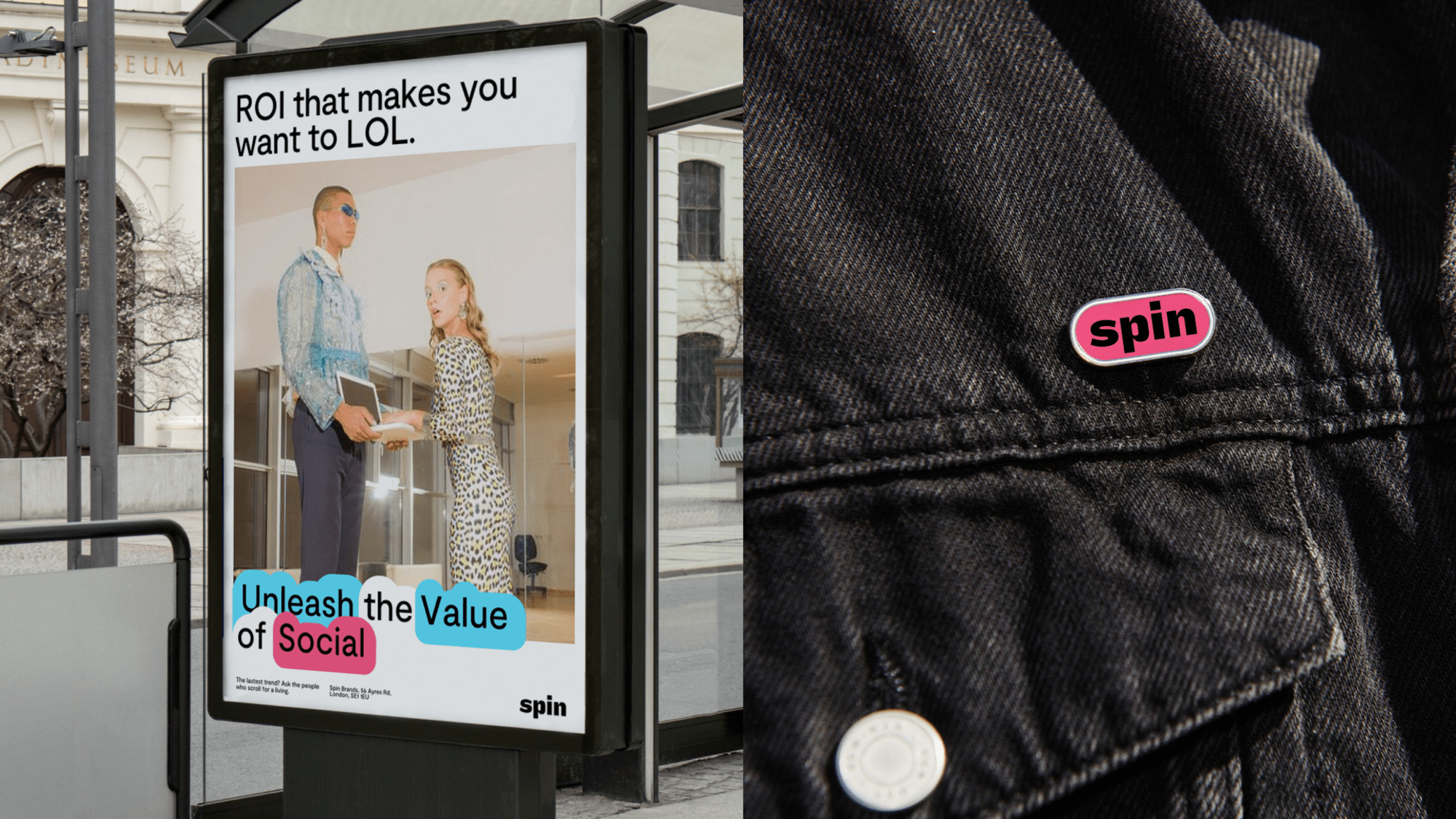
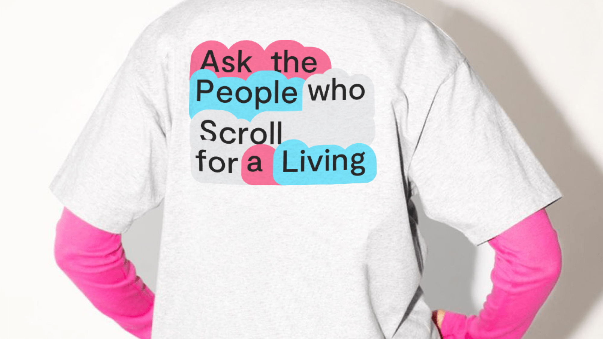
An elevated set of widgets have been created to help in launching the rebrand. These are not to be edited or manipulated.
God Mode Widgets


Introducing the Spin Colour Palette
The most recognisable Spin brand colour is a vibrant shade of pink. It should be used across all forms of communication from marketing, campaigns, and events to internal documents, press releases, and social media.
When designing for any digital application, the RGB values should be used. When designing for printed collateral, the PMS (Pantone) should be used where possible, or the CMYK values where PMS is not possible. RGB values should never be used in print environments.
Colour Palette 652 BGradient versions of the core colours are used for shapes, backgrounds and buttons. Grey plus two additional colours should always be used together - never a single colour, never more than three.
Introduction to the Brand's Typographic Voice
Spin’s brand typography uses two typefaces: Special Gothic Expanded One for headings and Inter Tight for body copy. This section guides you through the brand typography and the usage of each typeface in detail.
Special Gothic Expanded One - headings - always lower case
abcdefghijklmno
pqrstuvwxyz
ABCDEFGHIJKLMNO
PQRSTUVWXYZ
0123456789
,./?;:'"[]{}|@£$+€¢¥∞%^¶&*!-_–—\
Headings are always set in Special Gothic Expanded One, bold, and always lower case.
Inter Tight - body - Medium for copy, Bold for sub-headers
abcdefghijklmno
pqrstuvwxyz
ABCDEFGHIJKLMNO
PQRSTUVWXYZ
0123456789
,./?;:'"[]{}|@£$+€¢¥∞%^¶&*!-_–—\
Body copy is set in Inter Tight Medium and is always sentence case. Use Inter Tight Bold for sub-headers.
Roboto (Google Docs only) 88 KBRecommended Sizes for Use (Print & Digital)
To maintain hierarchy and balance in a composition, the secondary type should be no bigger than 50% of the primary type.
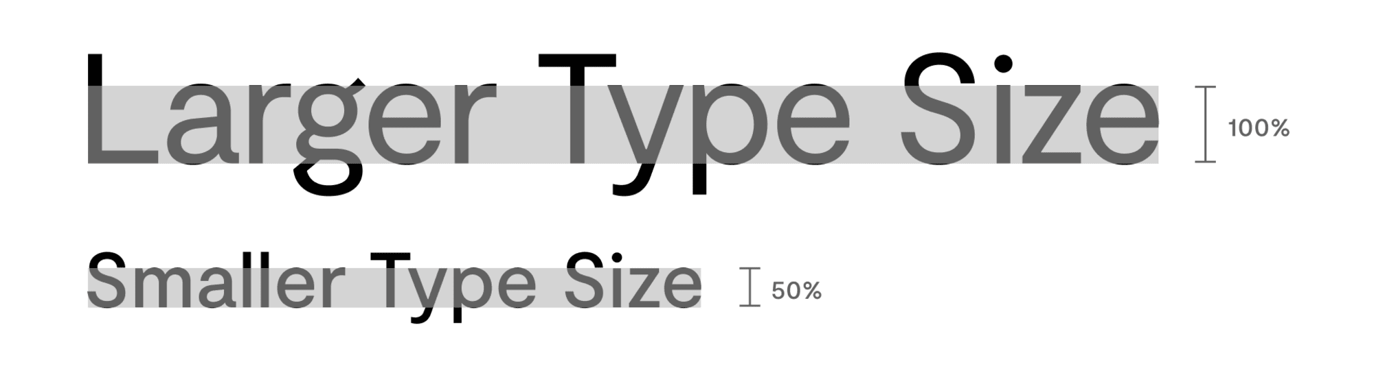
The type is always to be set left aligned.
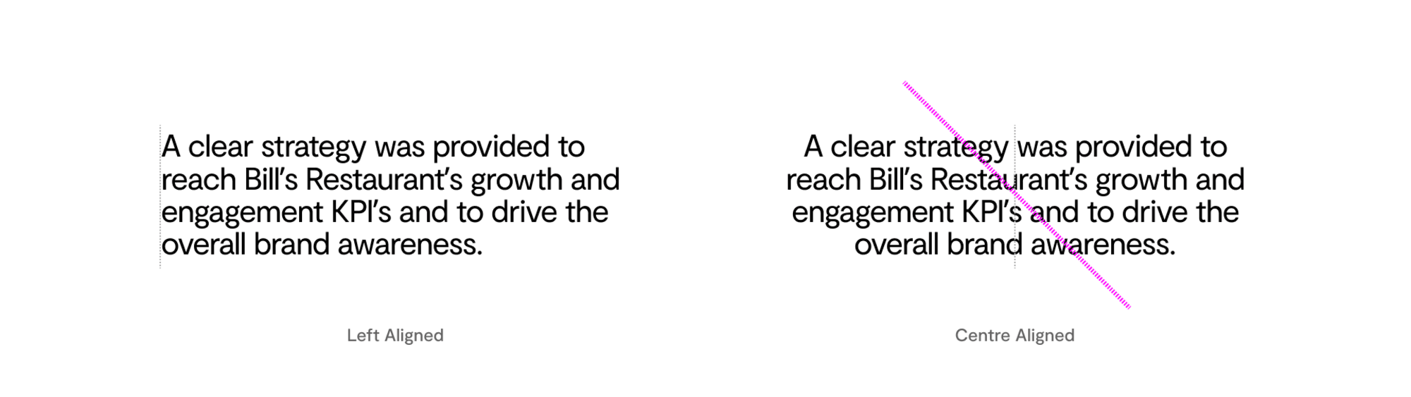
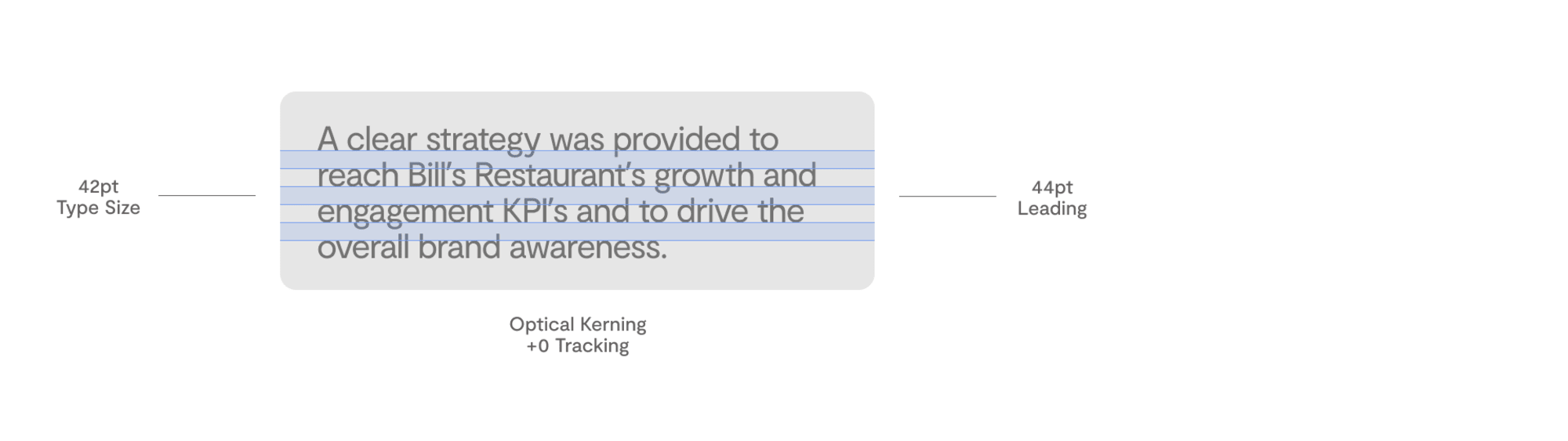
Type should be set with balanced point size and leading, and with optical kerning toggled on. No, or very little, additional tracking needs to be applied to help create a healthy line length and reading experience. Make sure the line length for your body text is between 50-60 characters per line, including spaces.
 hover to see visual
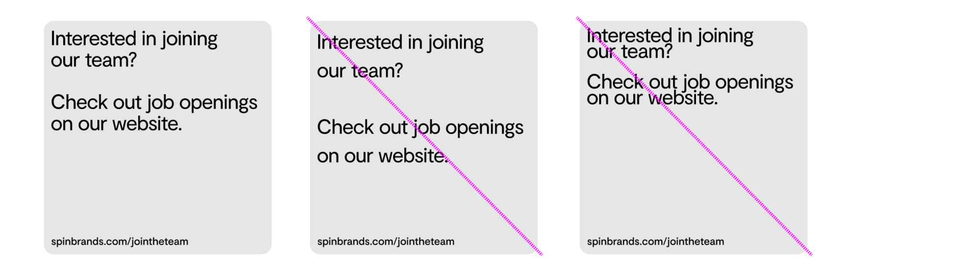
 Balanced leading should be maintained when setting the type. Examples of inappropriate leading are shown here.
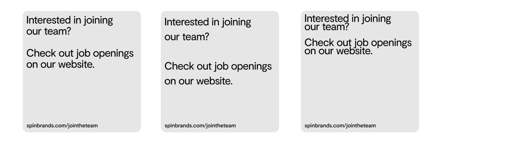 hover to see visual
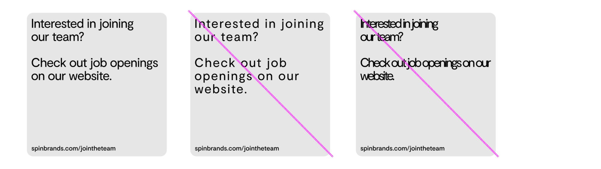
 Balanced tracking should be maintained when setting the type. Examples of inappropriate tracking are shown here.
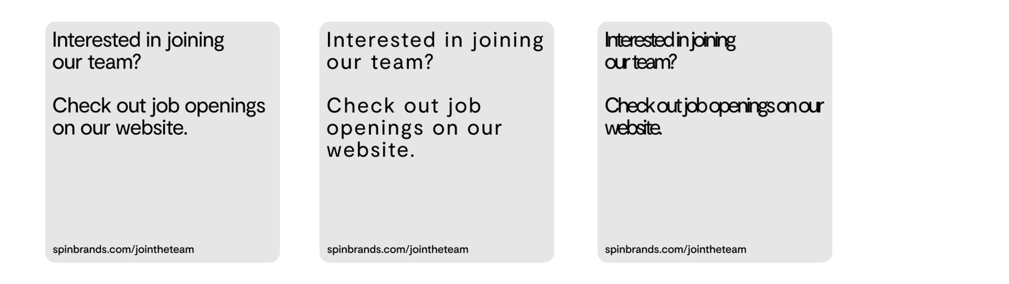 hover to see visual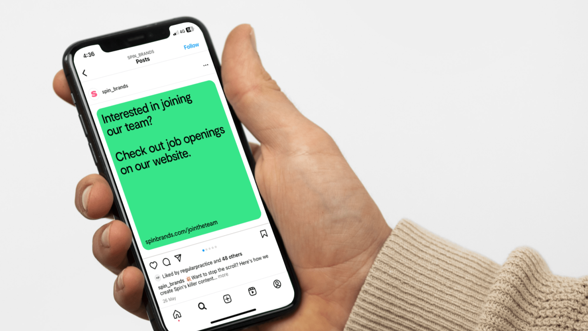
Widget Generator
Do not hand craft them.
Widget Generator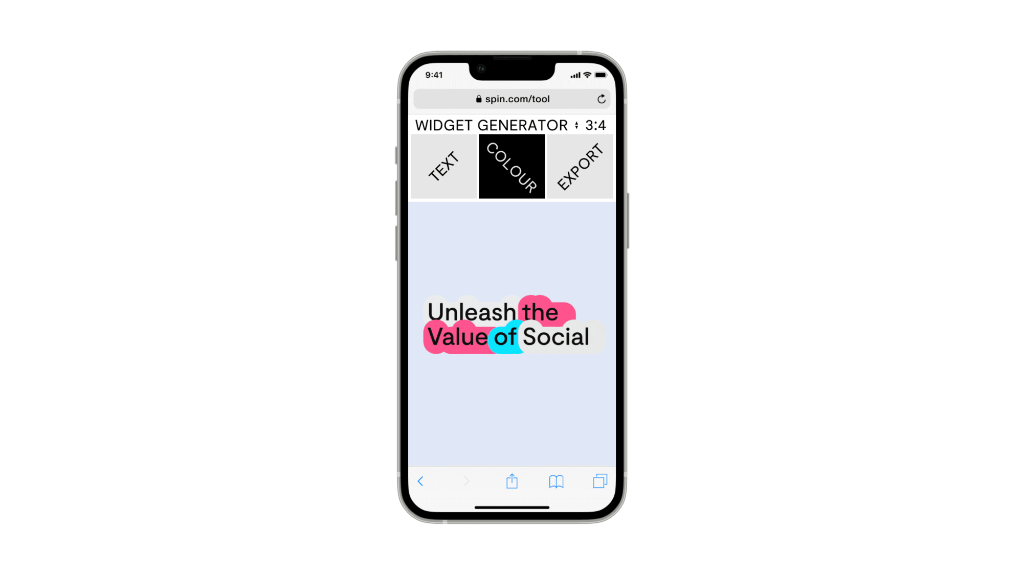
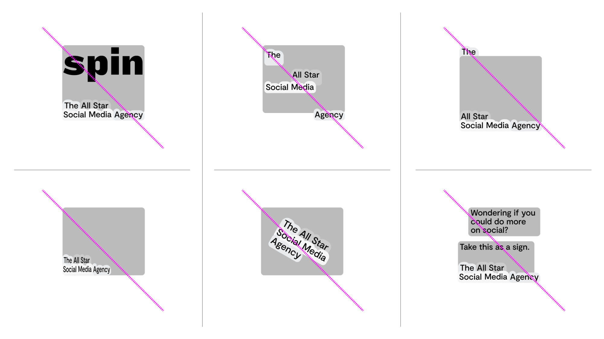
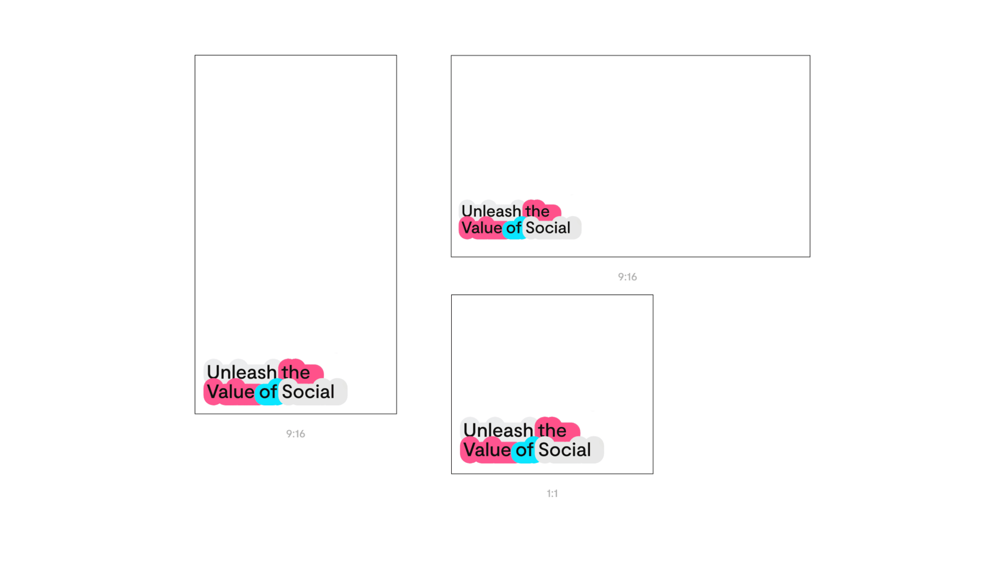
The widgets will export onto a pre-set canvas. This allows the type size to stay consistent across different formats. Do not stretch the exported widget - it must sit 1:1 to your appropriate format.
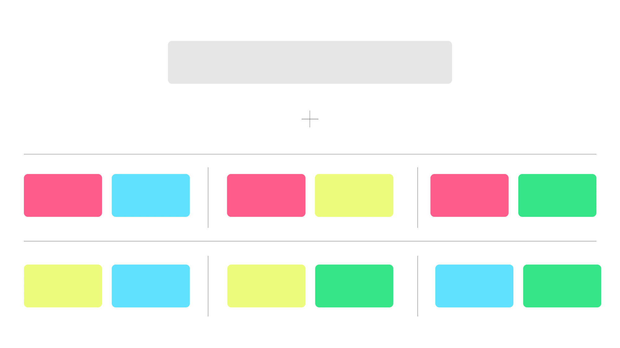
A coded system has been created when generating the widgets. Grey plus 2 additional colours are to always be used.
Correct Usage
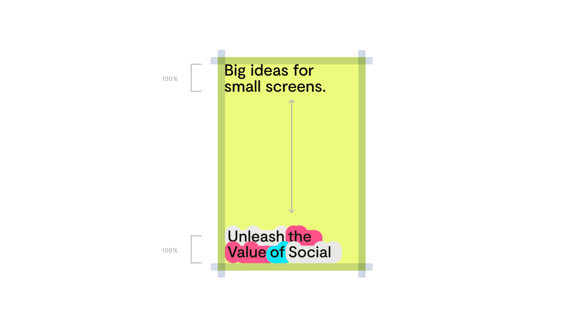
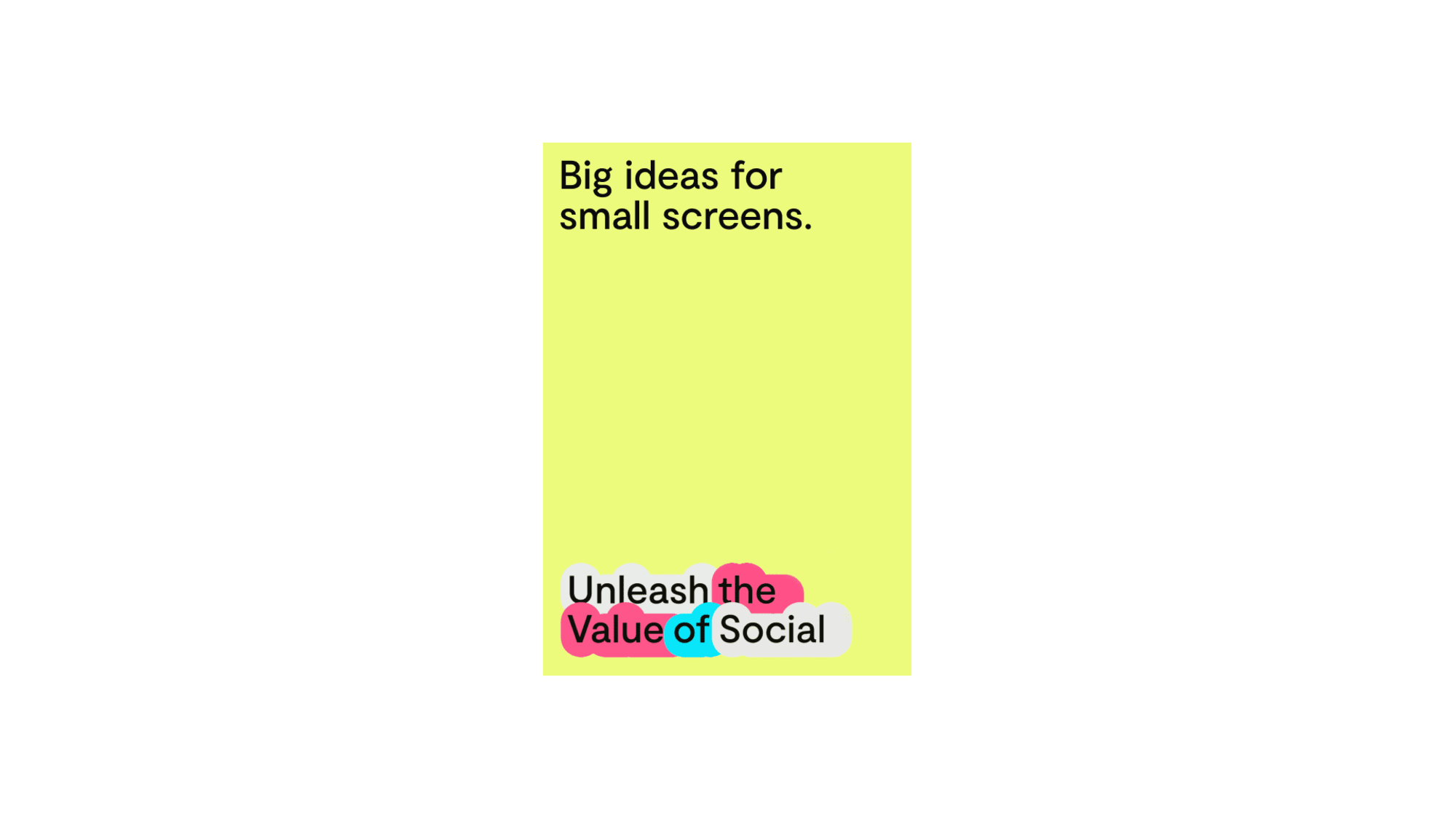
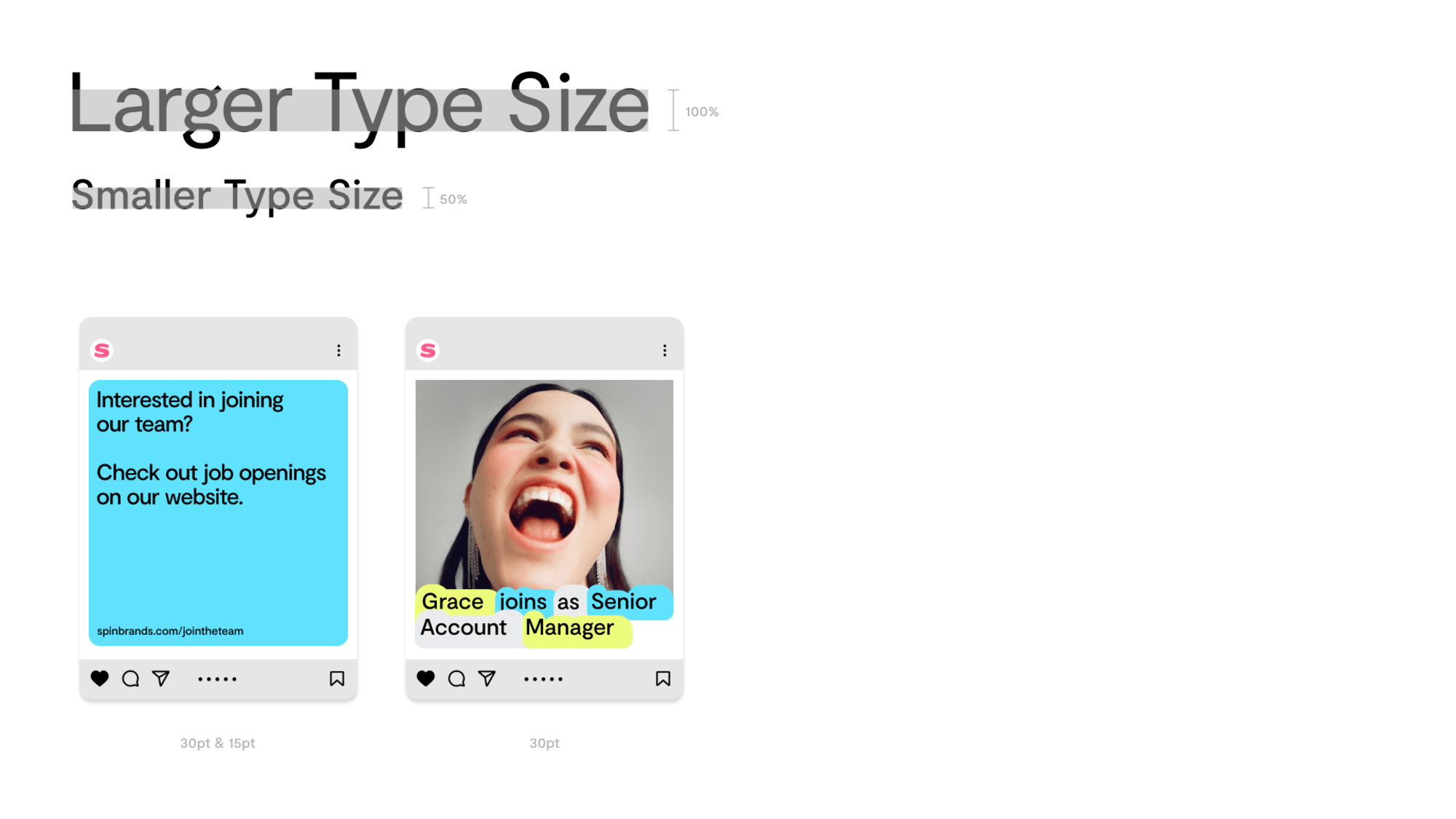
When setting 2 different levels of copy we can use positioning to create clear hierarchies. The widgets always must sit to the bottom left hand side of the format. Additional copy is to be set in the same size to the top left hand side.
 hover to see visual
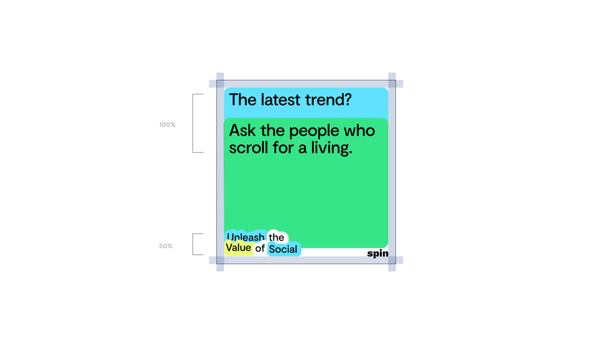
 If you are required to set multiple lines of copy, this alternative system can be implemented. Widgets are to be set to the bottom left hand side at 50% of the size of the main copy. The main copy is to be set to the top right hand side at 100%.
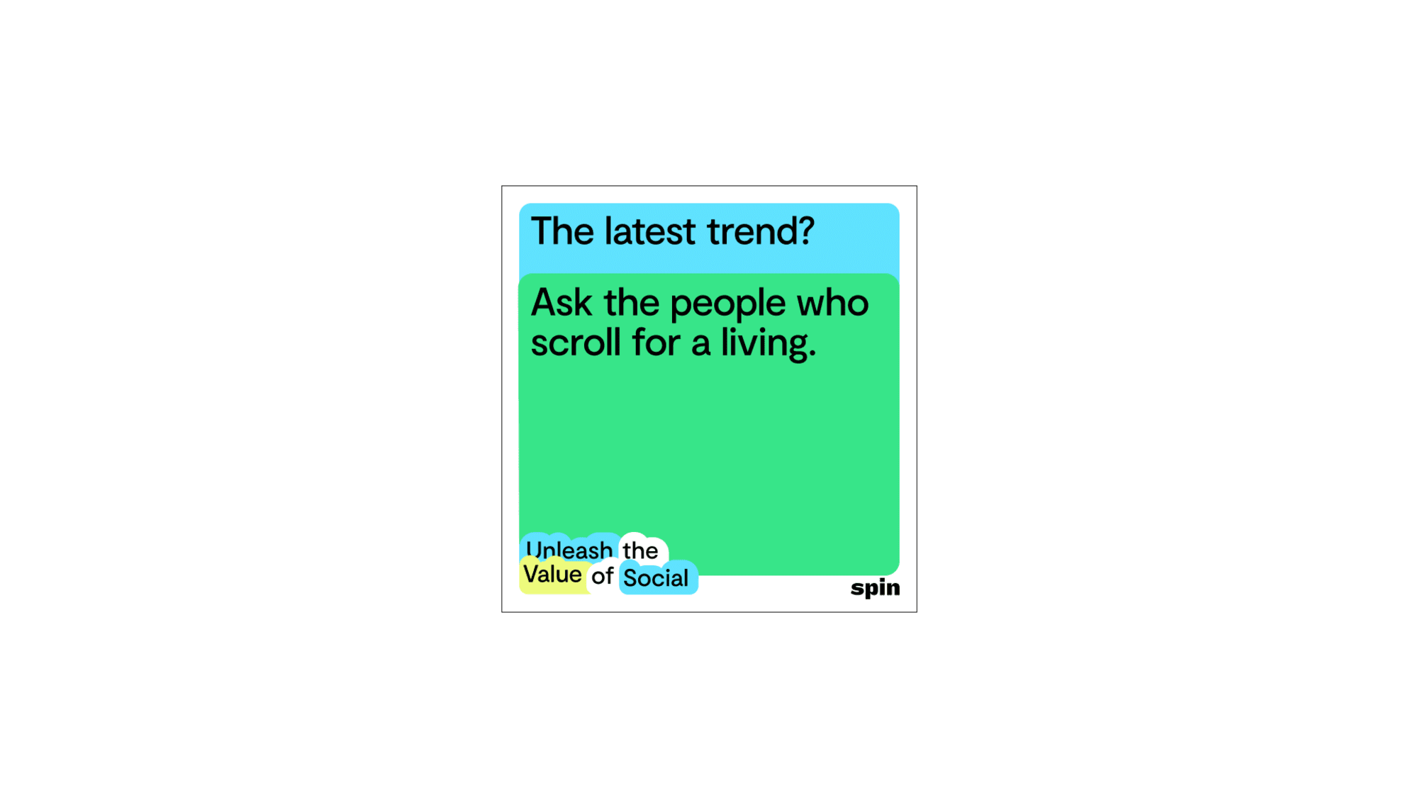 hover to see visual
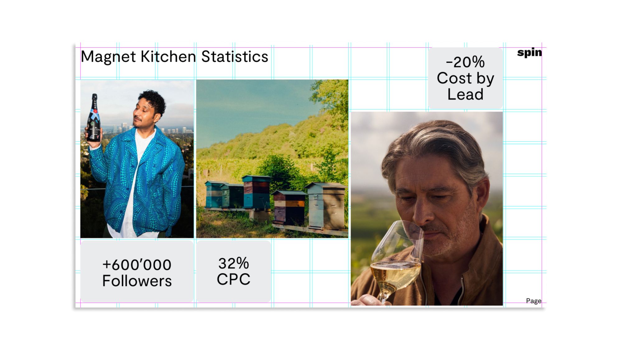
 When pairing an image and widget together both elements must sit within the margins.
 hover to see visual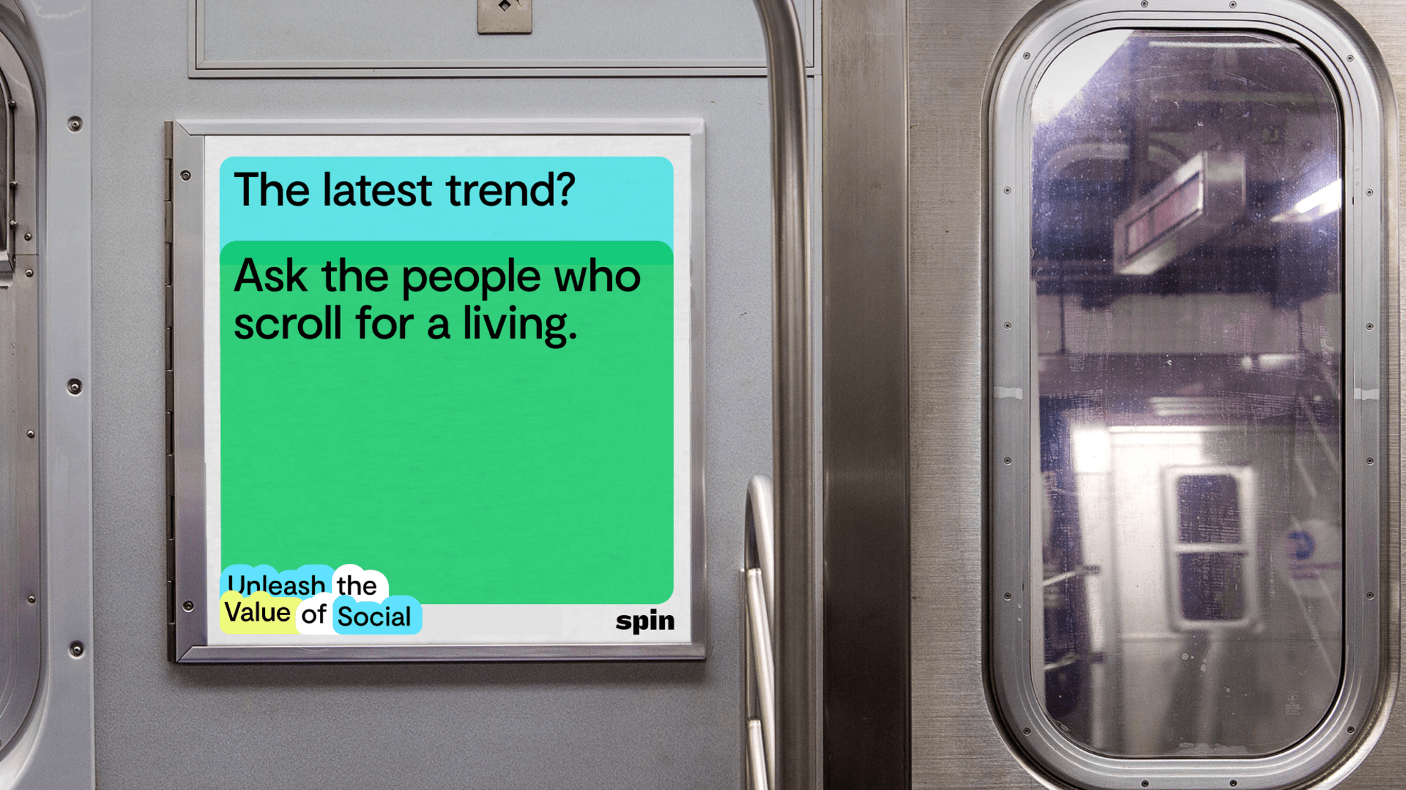
This applies to all iterations of the widgets.
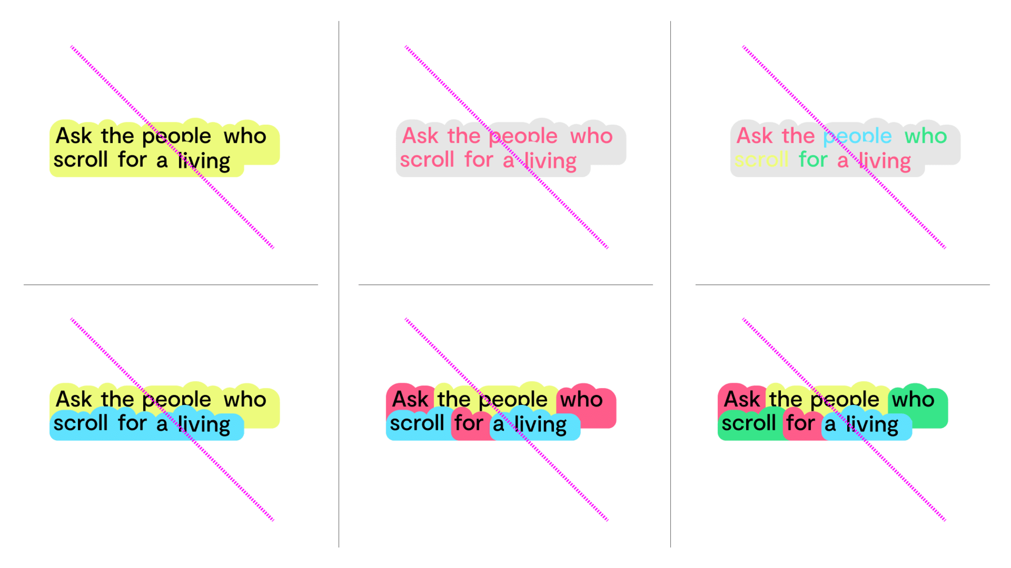 hover to see visual
 Start every deck, social post and printed piece from an approved template. The master decks and template packs are linked below and collected in full under Asset Downloads.
Spin Deck (Google Slides)A grid system has been utilised across all printed and digital collateral. Please follow the guidelines below when working in different formats.
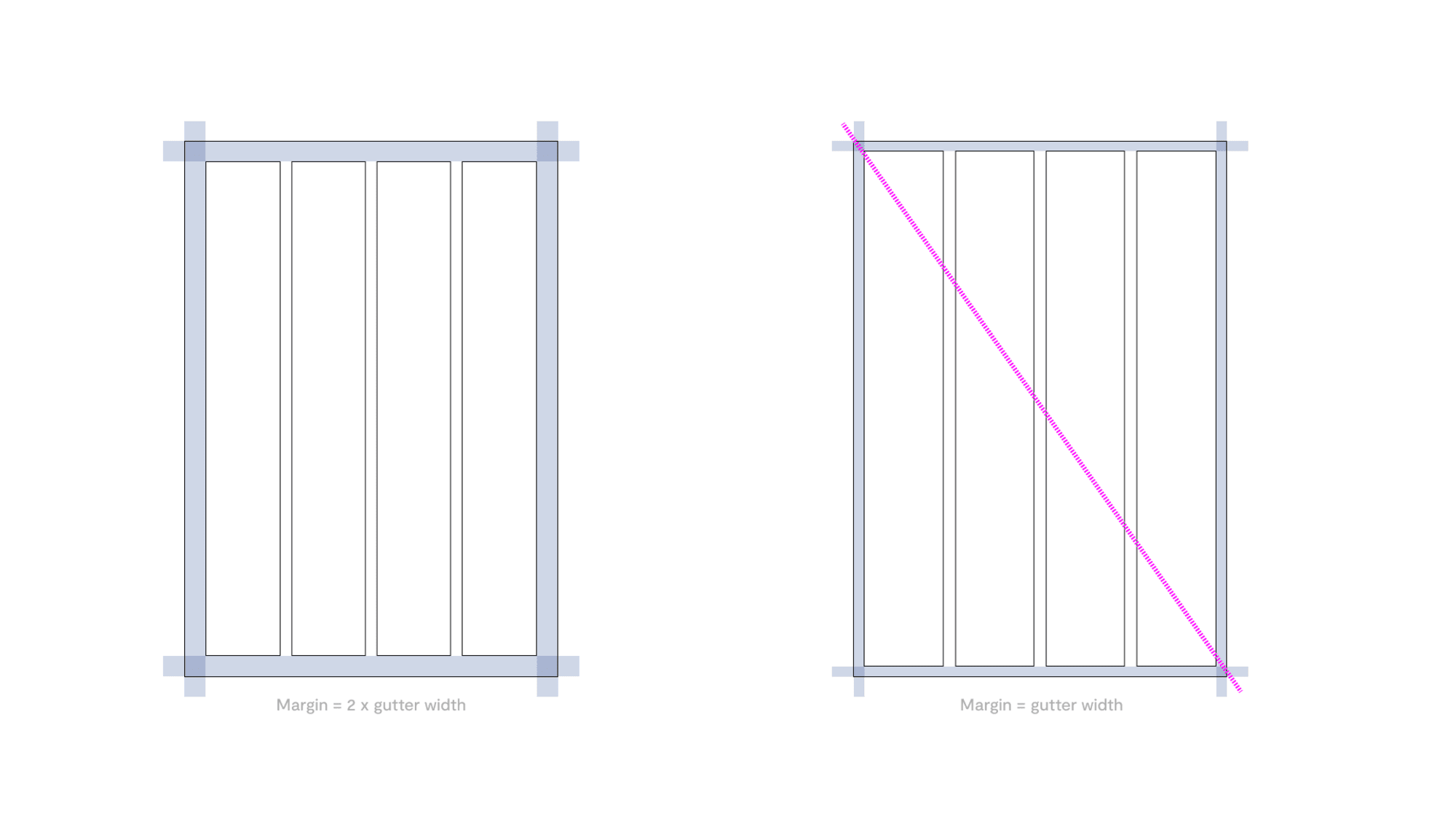
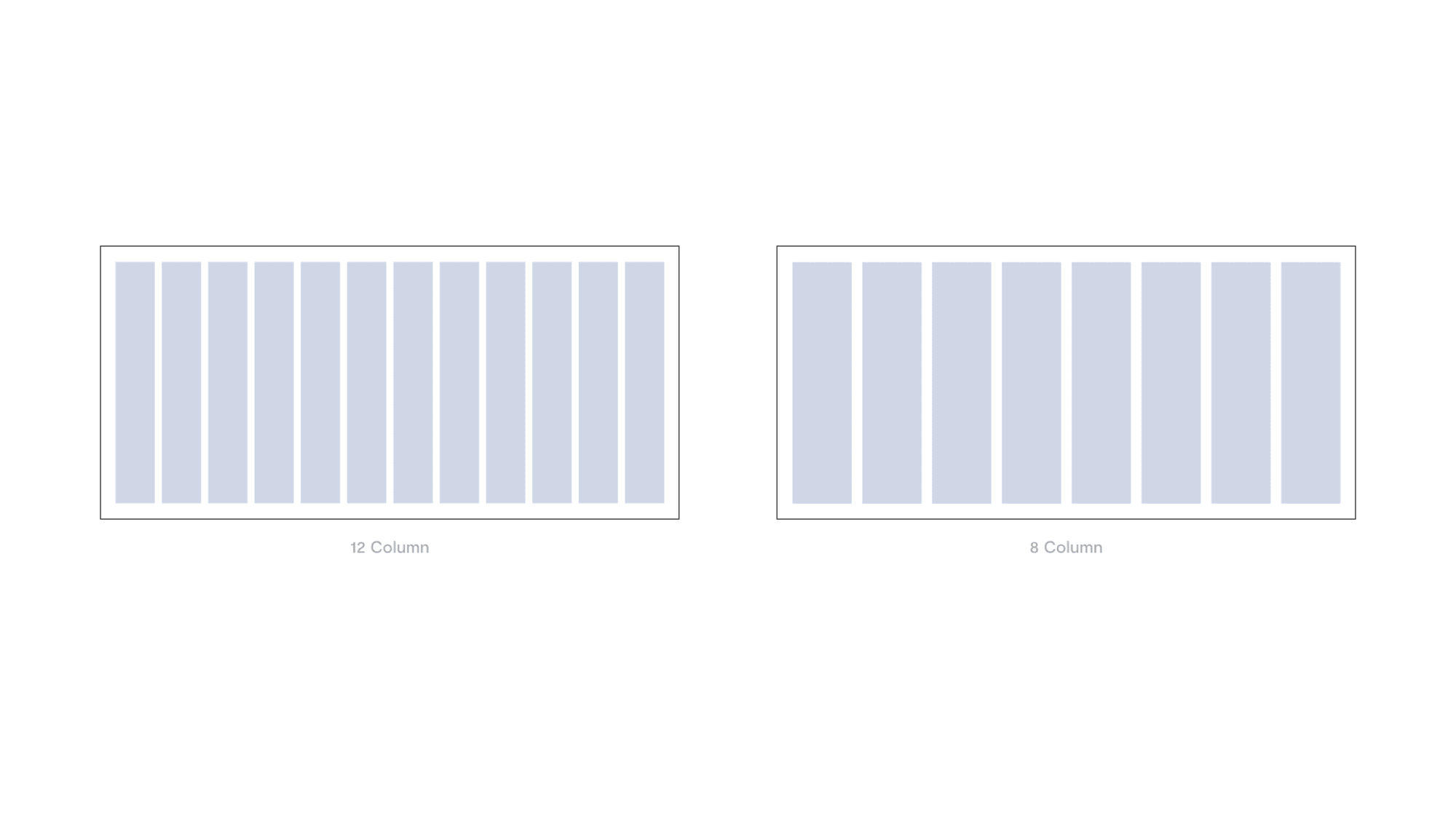
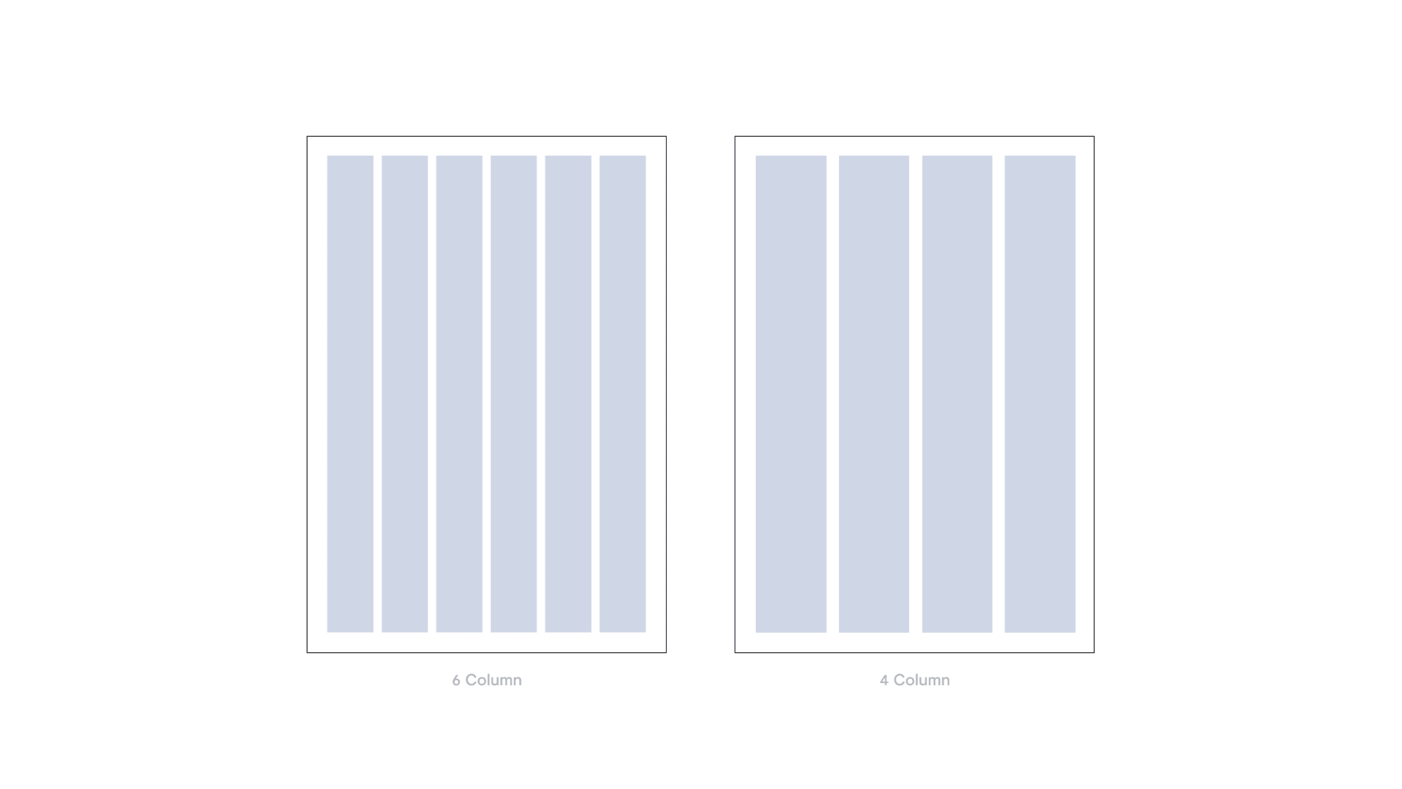
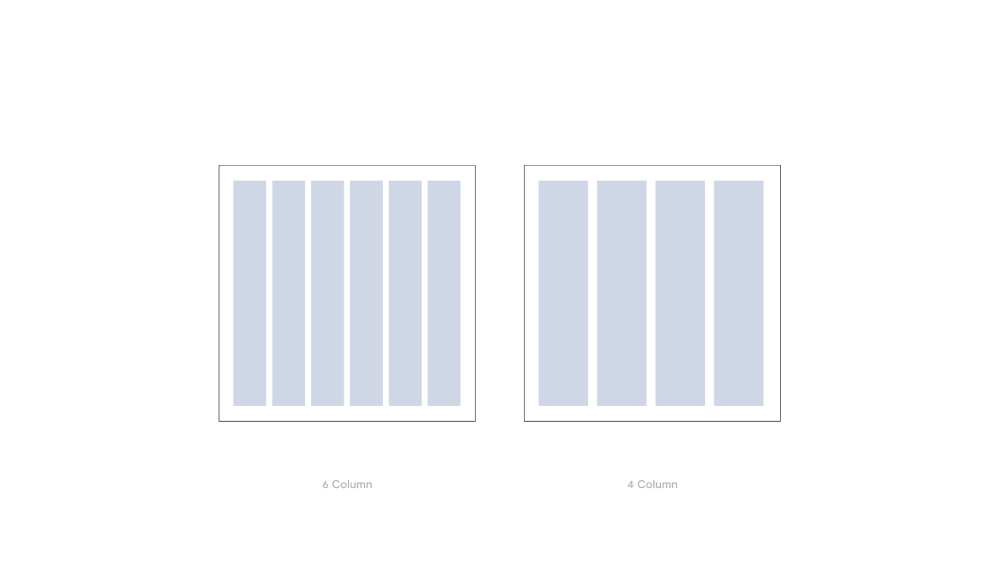
Within social media posts the two type scales can be used to create hierarchy. The larger type size within social posts should always be 80pt. The smaller size should be 40pt.
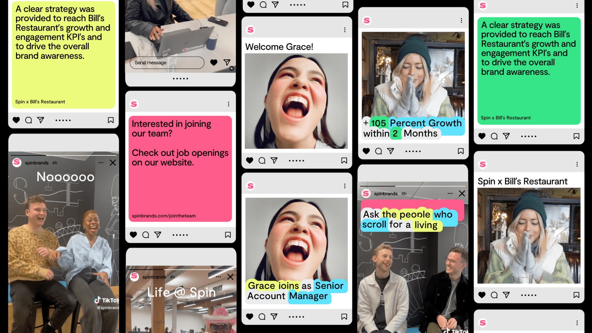
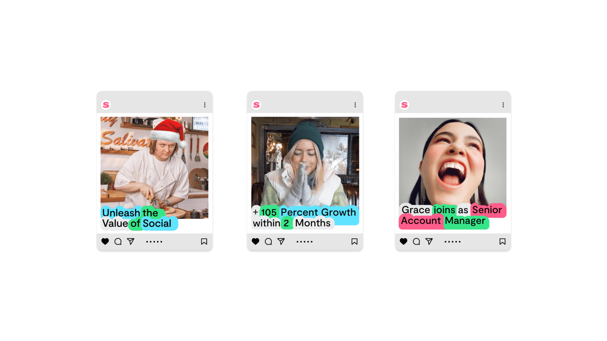
Instagram Post
This template can be used to highlight key stats, taglines and/or new job announcements.
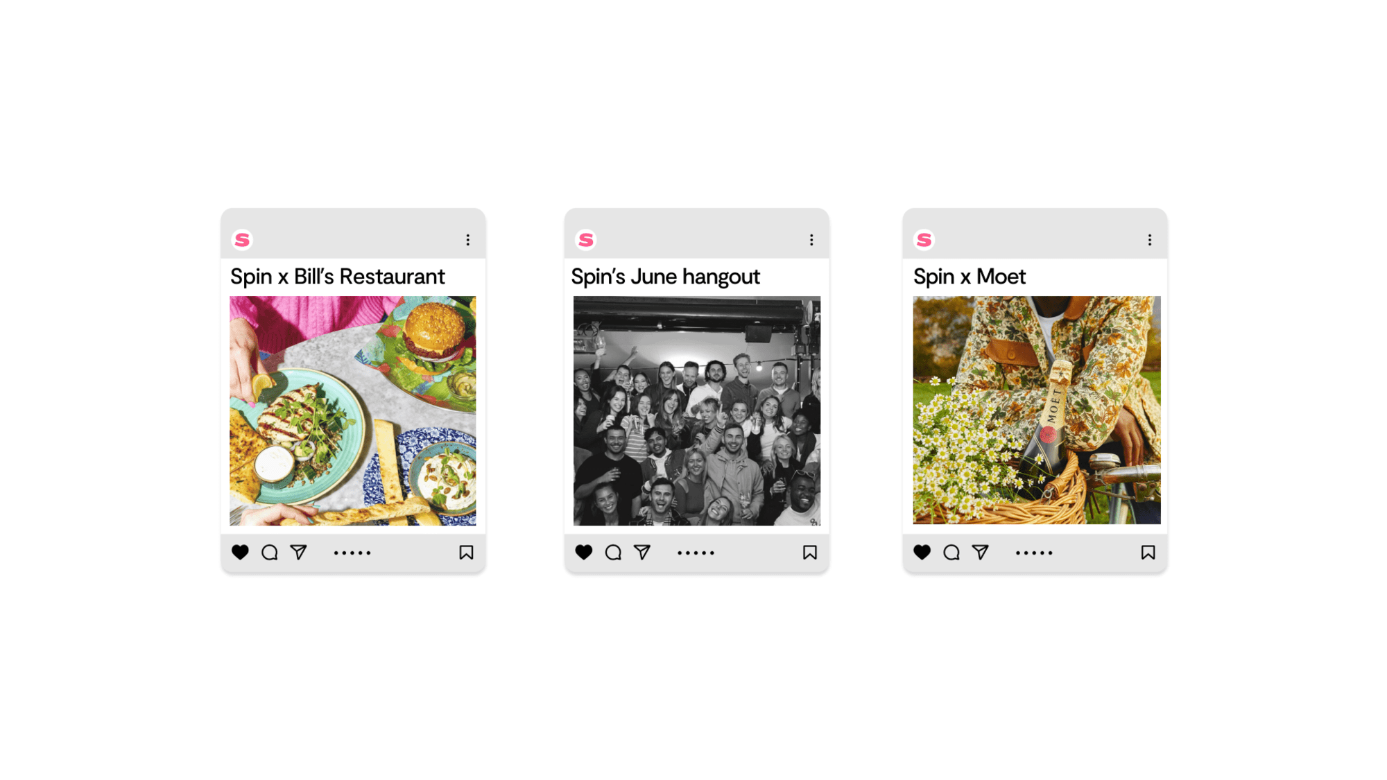
Instagram Post
This template can be used when the copy is only a few words long. We recommend only using one line of copy for this template.
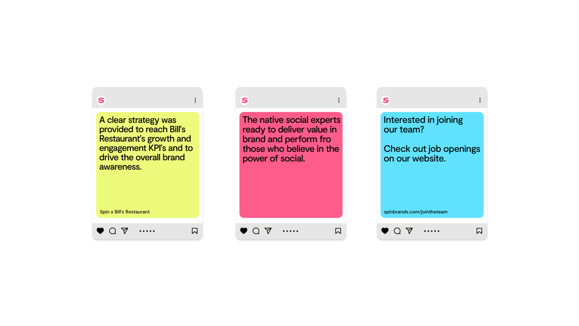
Instagram Post
This template can be used to house longer forms of copy.
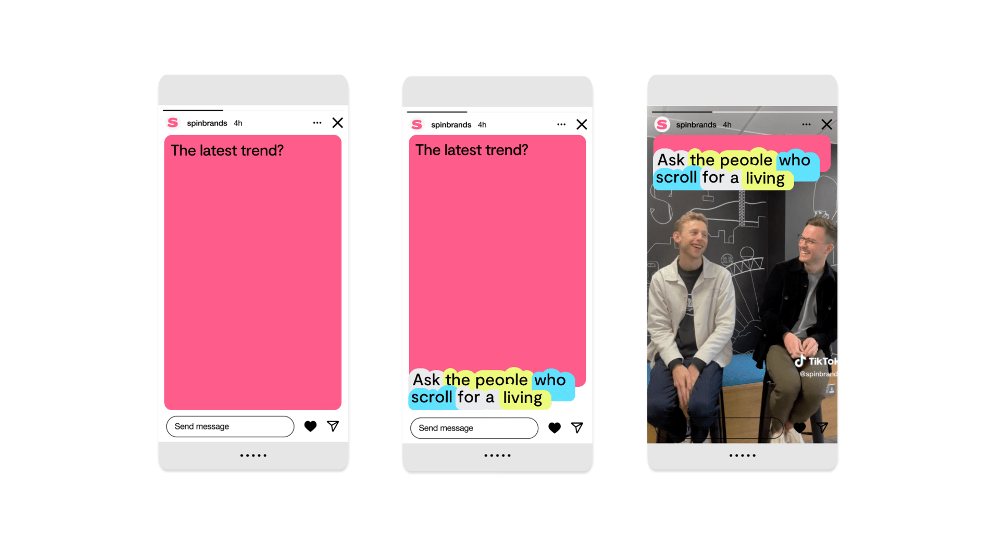
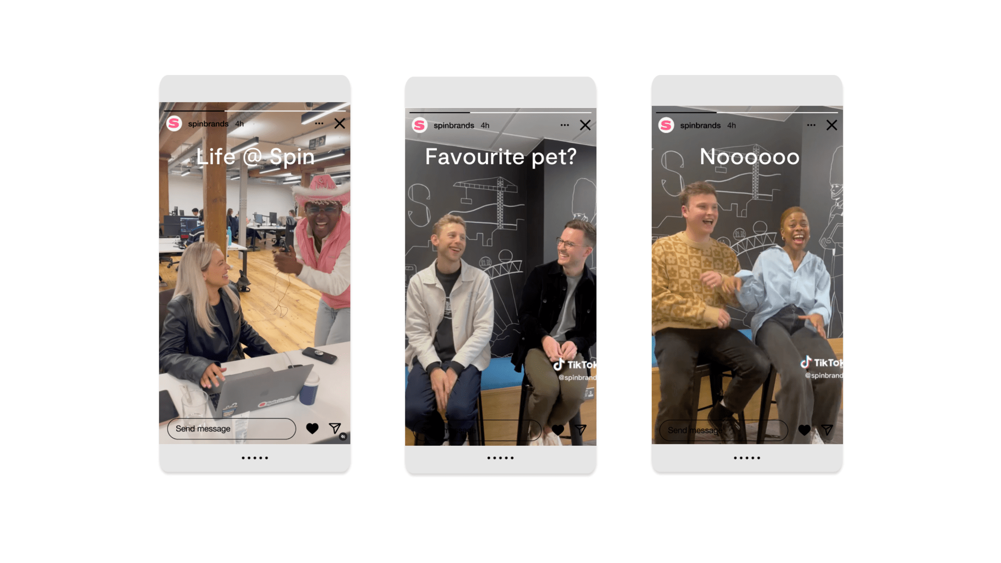
Template guide for InDesign
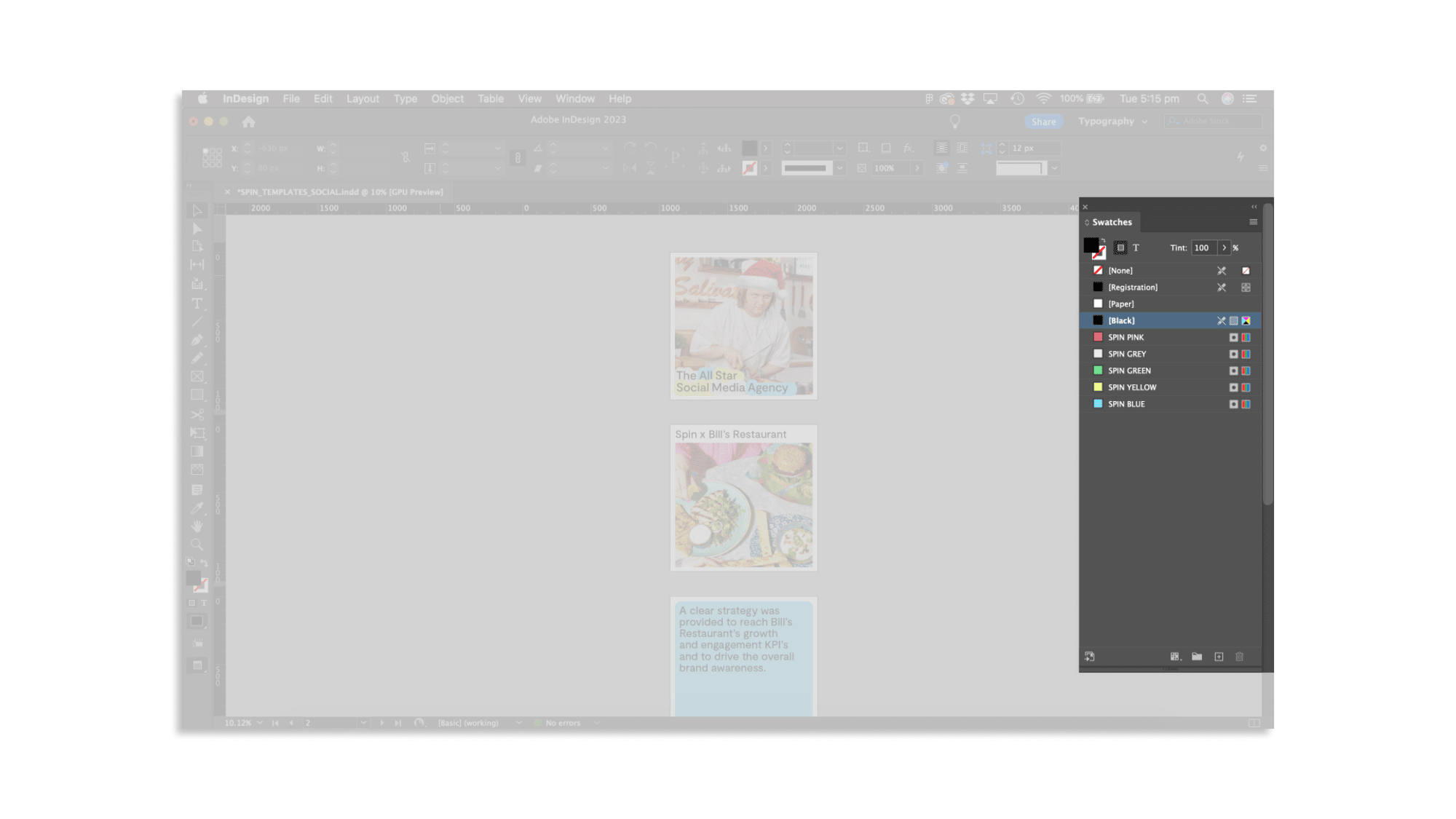
The InDesign templates provided include predefined style options for all typographic elements. It is important that the contents fit within the grid and style parameters of the template.
Spin Social Templates 10 MBYour InDesign template has the Spin colour palette loaded in the colour swatches. Picking colours from here ensures consistency of colour use throughout.
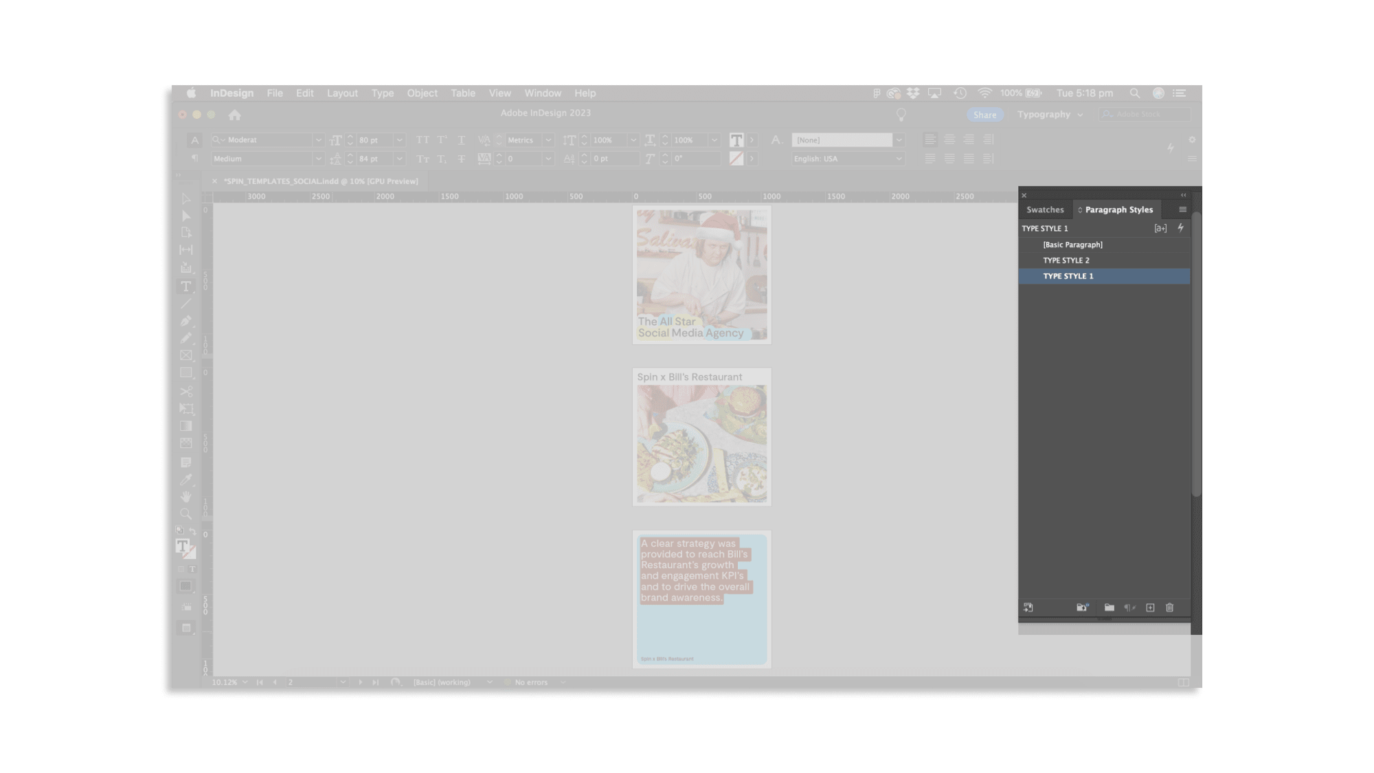
Text should always be styled using the type styles provided. There are 2 type styles to be applied where appropriate. All type should have a typestyle applied to ensure consistency and sophistication throughout the social templates.
Template guide for Pitch
The Pitch templates provided include predefined style options for all typographic elements. It is important that the contents fit within the grid and style parameters of the template.
Spin Social Pitch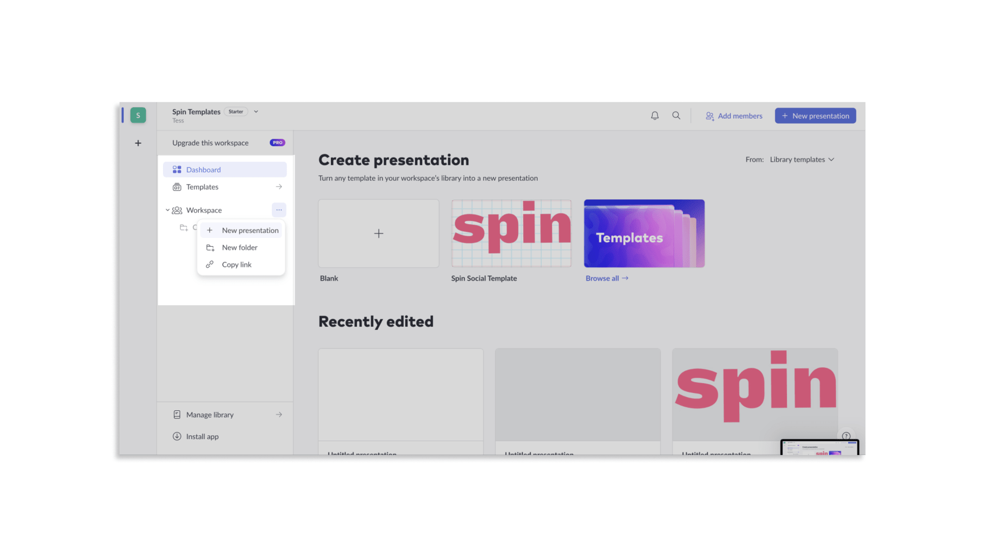
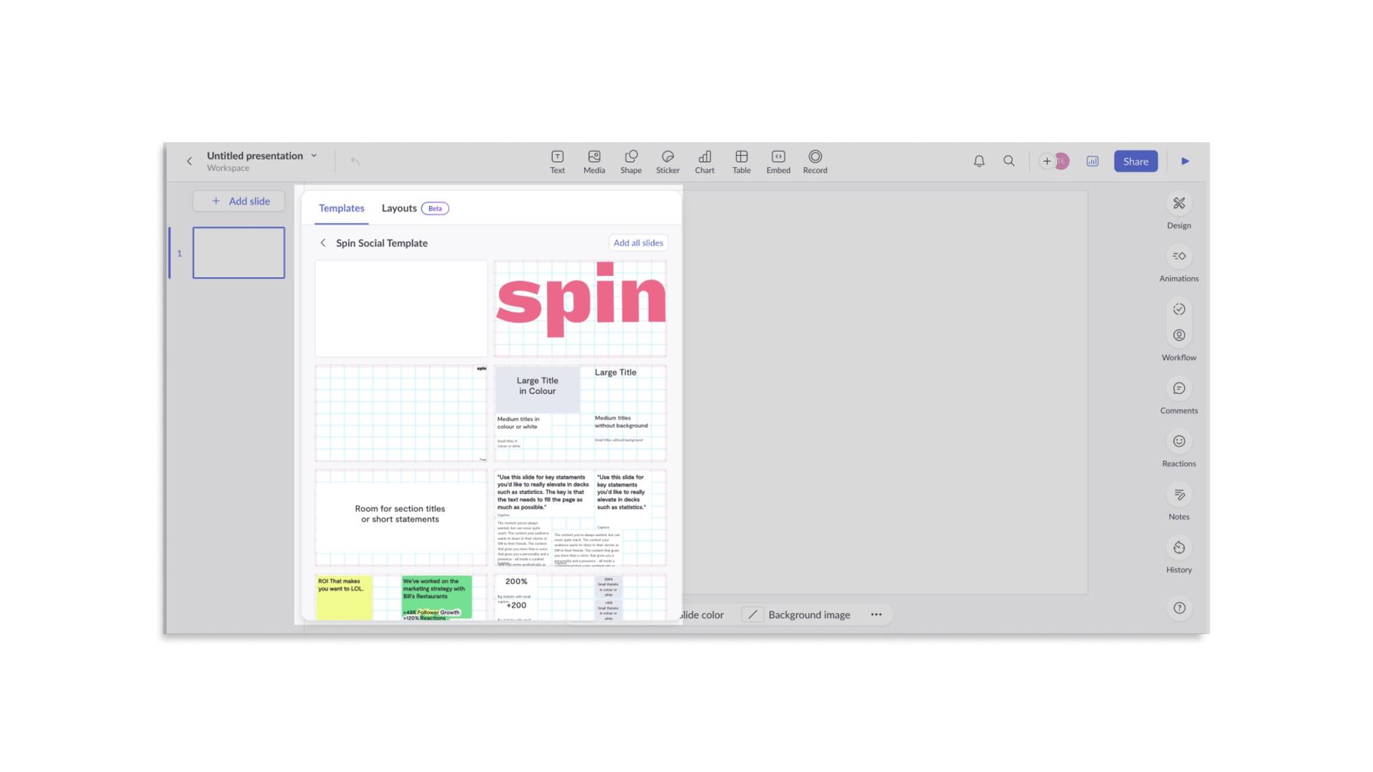
Once in a new presentation file, the page types are selectable through the template tab. Choose the most appropriate page type for your content.
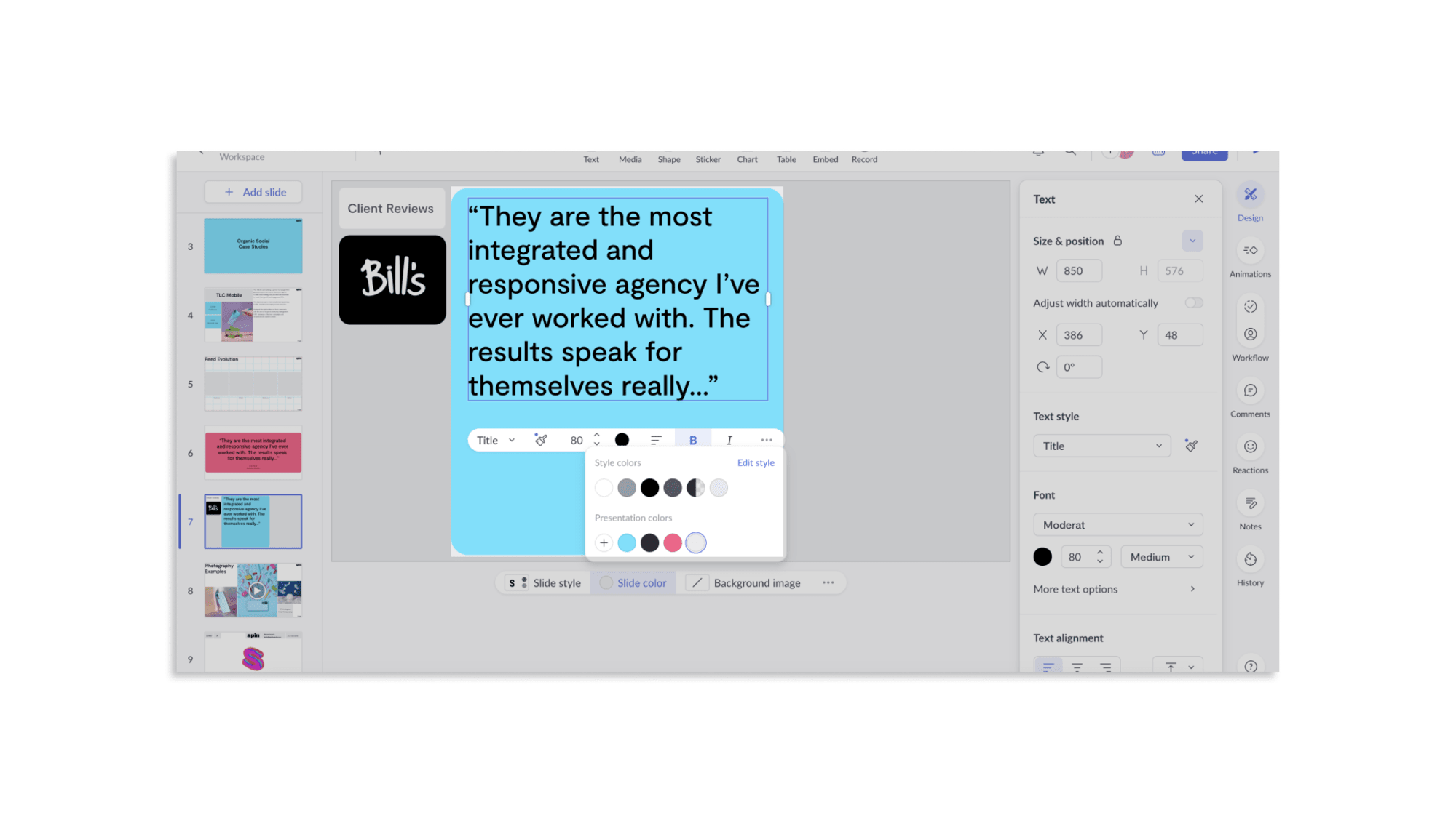
The Spin colour palette has been embedded into the templates. Click the item you would like to change colour and select from the drop-down menu.
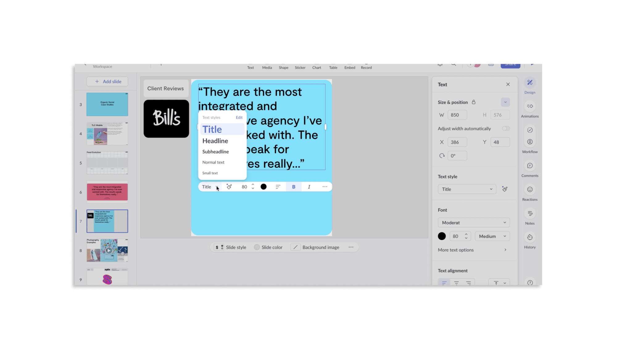
As your content will vary, a type system has been created within Pitch which allows you to easily change the style. Only use these type styles.
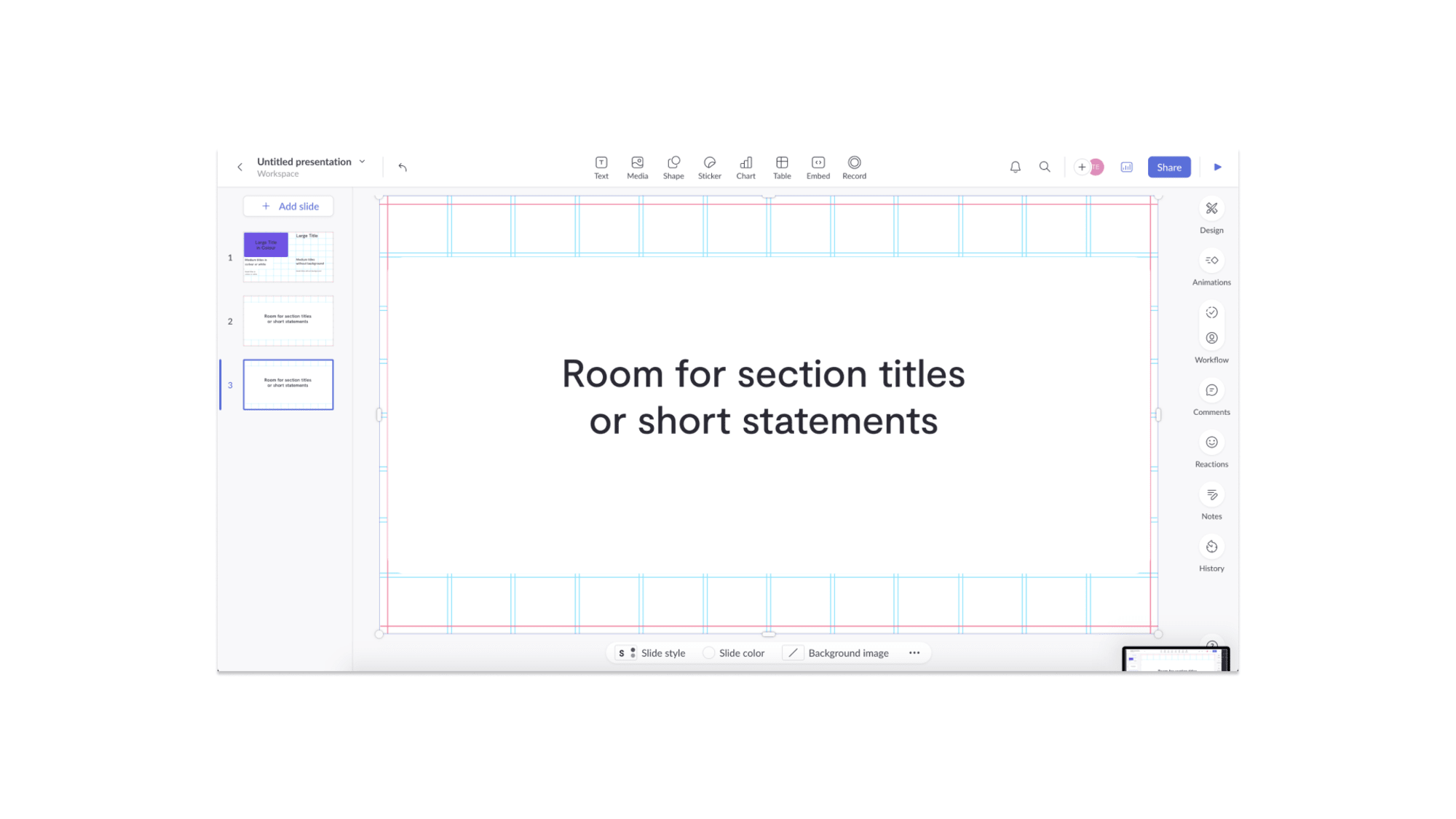
A base grid layer has been created to allow the design of each page to flex but also stay uniform. Once the page has been edited this layer will need to be deleted - double click on it and press delete on your keyboard.
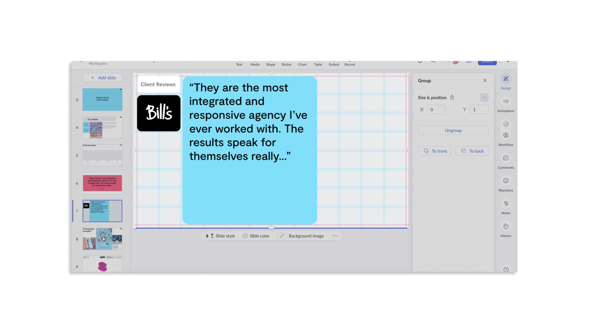
Deck Guidelines
The Spin deck template carries the brand into pitch and internal presentations. Copy the source file, work within the grid, and use only the embedded colour and type styles.
Spin Deck (Google Slides) Spin Deck Template (PDF) 1.2 MBColour
Pink, black and grey are the primary colours. They are supported by green, blue and yellow as secondary colours. Gradient versions of the core colours can be used on shapes and backgrounds.
Type
Header font - Special Gothic Expanded One (bold), always lower case.
Body font - Inter Tight: Bold for sub-headers, Medium for general body text. Always sentence case.
Copy and paste these buttons to use them throughout the deck. The styles can be applied to any shape using the gradient swatches in the colour palette.
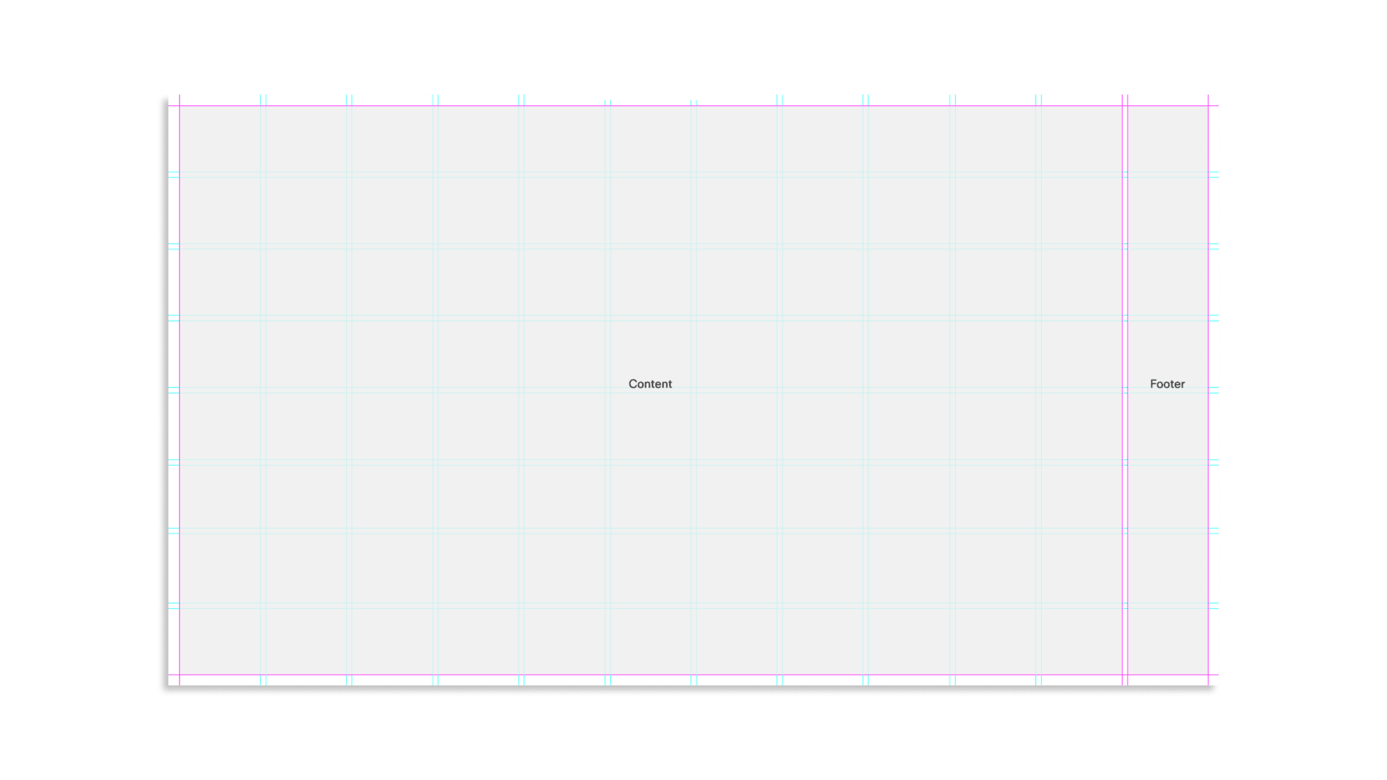
The Spin grid consists of 8 rows and 12 columns and should be adhered to for all layouts so that the visual identity of the Spin brand is communicated across all slides.
 hover to see visual
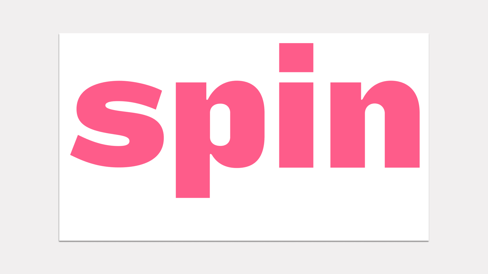
 These templates are specific to the title and end pages, creating space to indicate the beginning and end of the presentation.
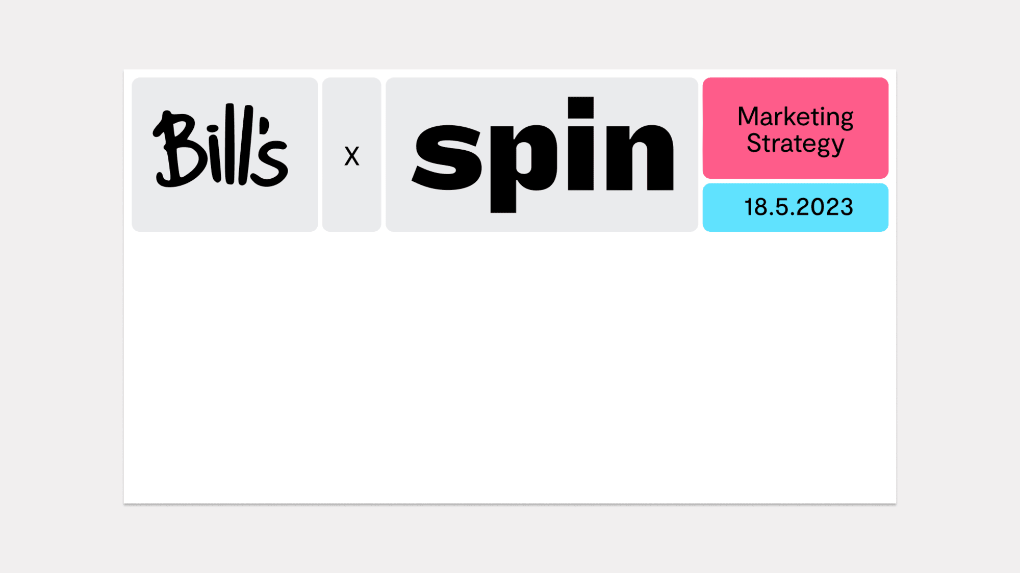
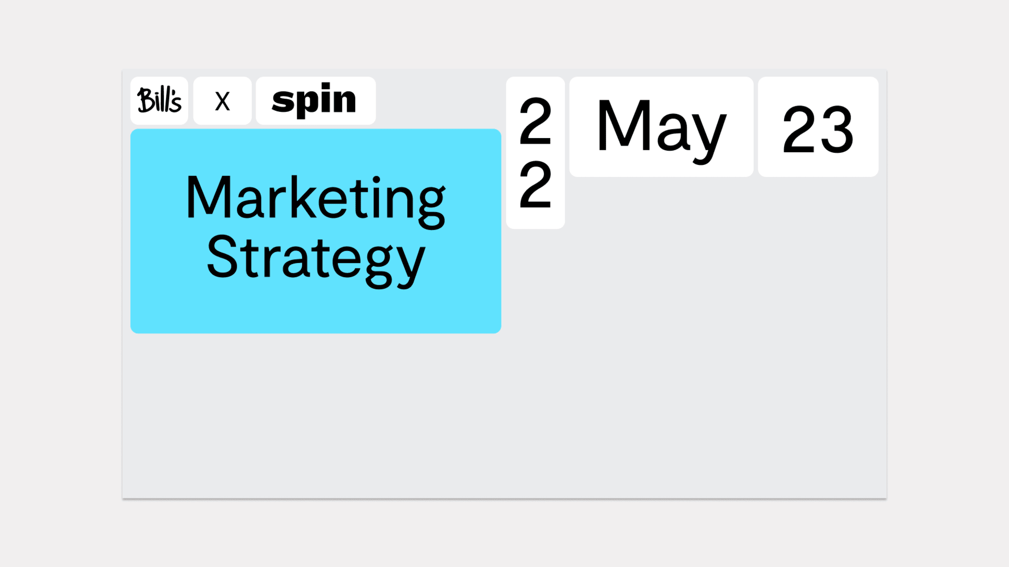
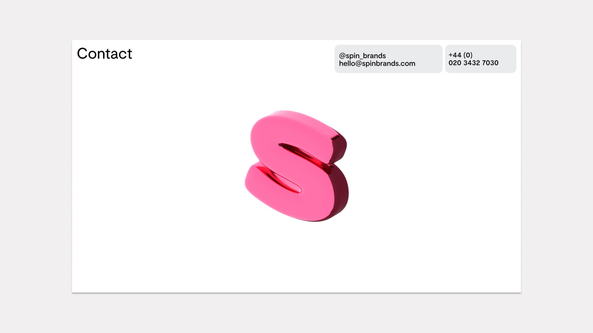
Two different heading templates are used to separate sections and create moments of pause between content-heavy slides.
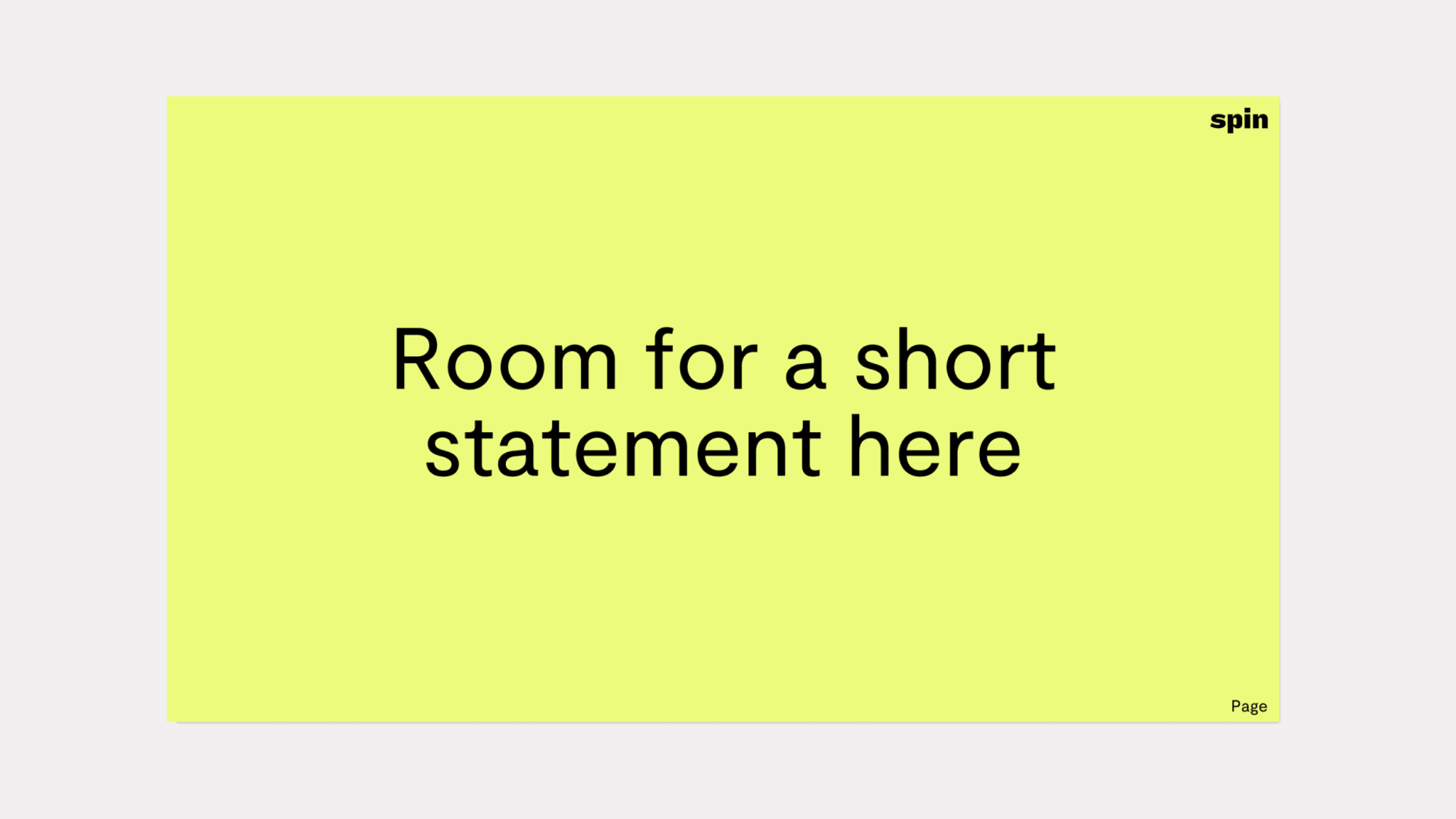
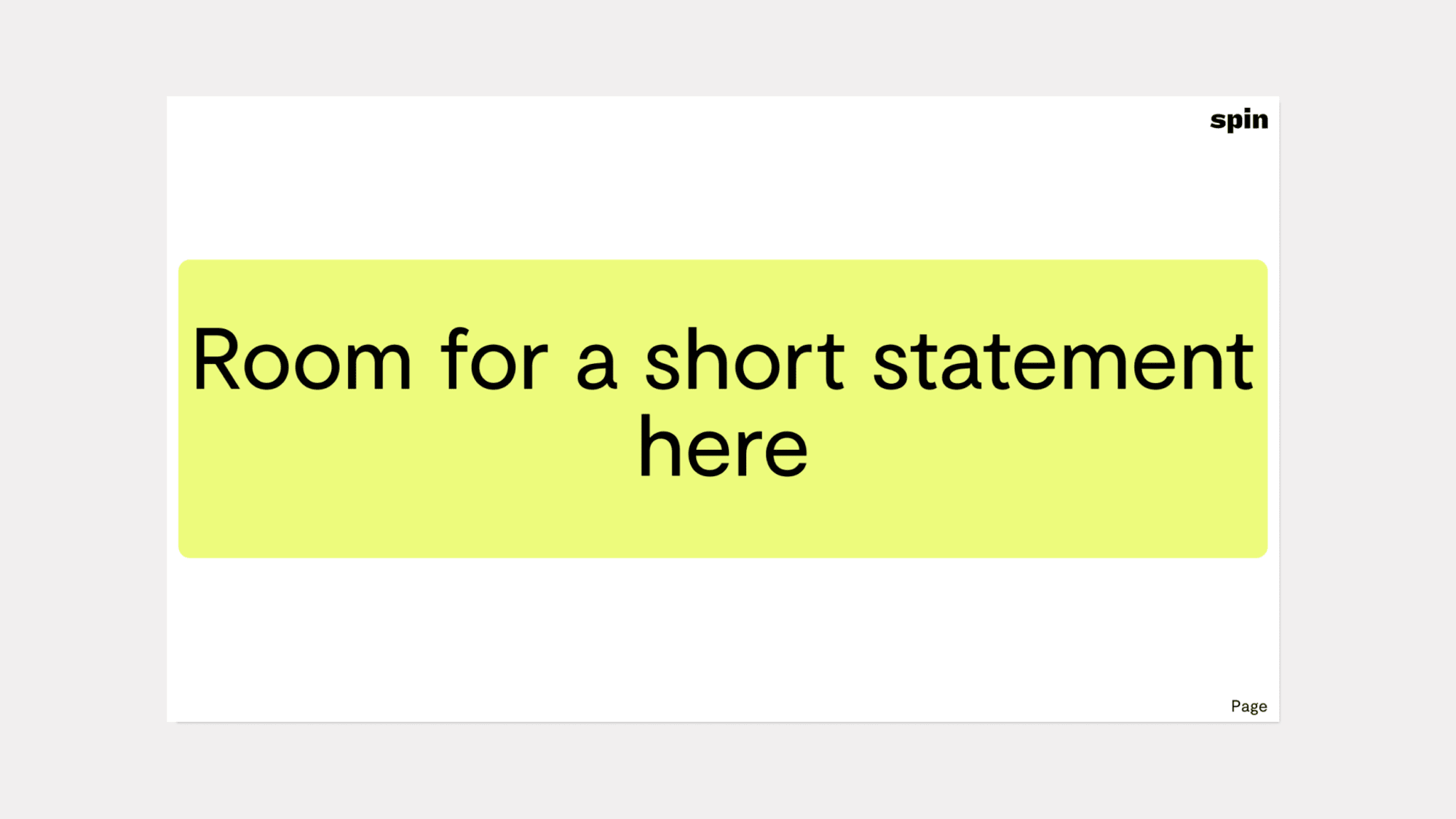
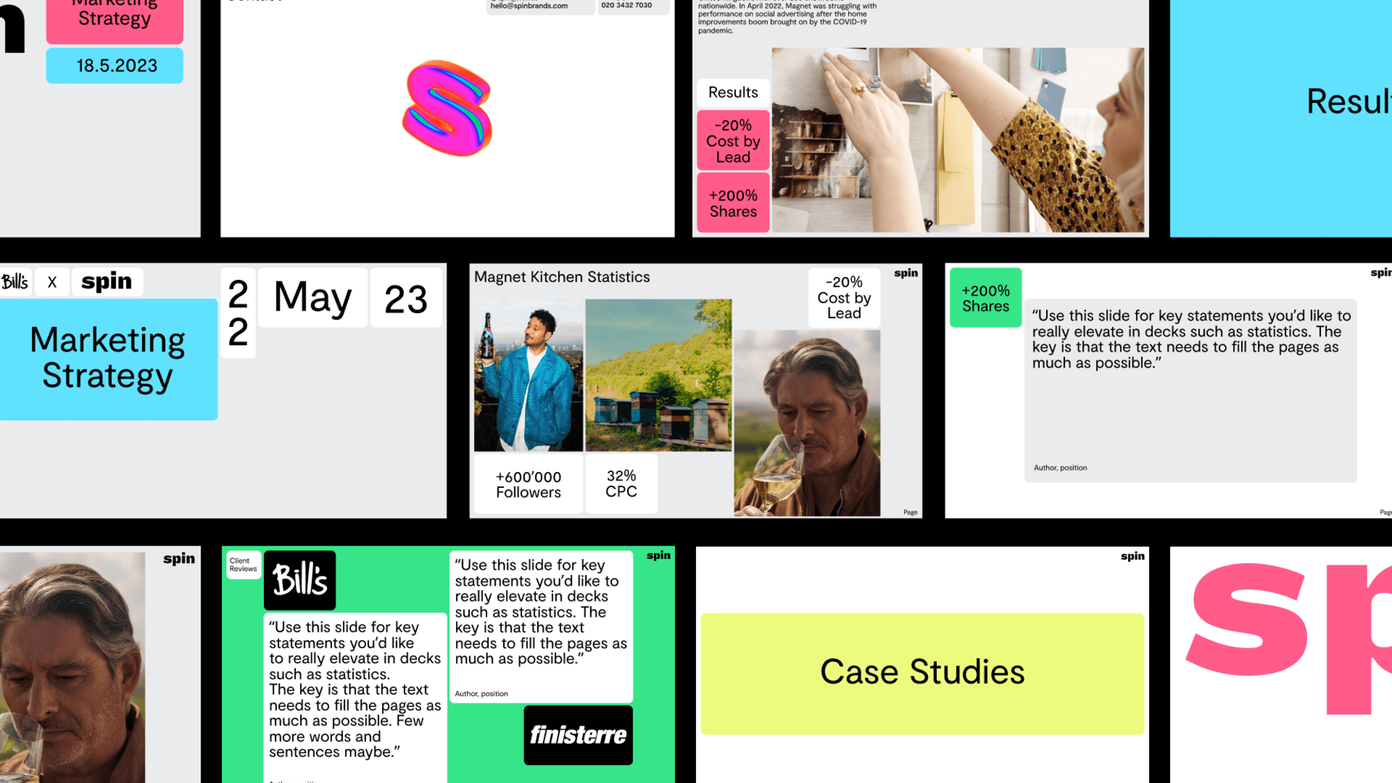
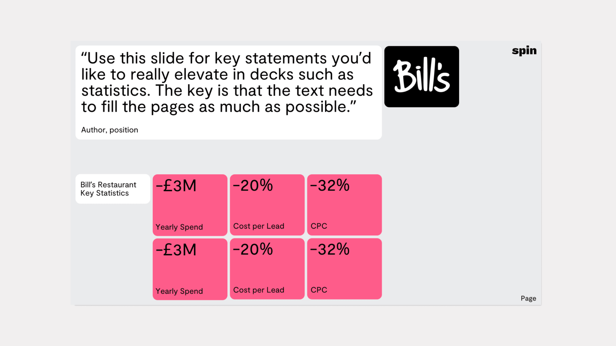
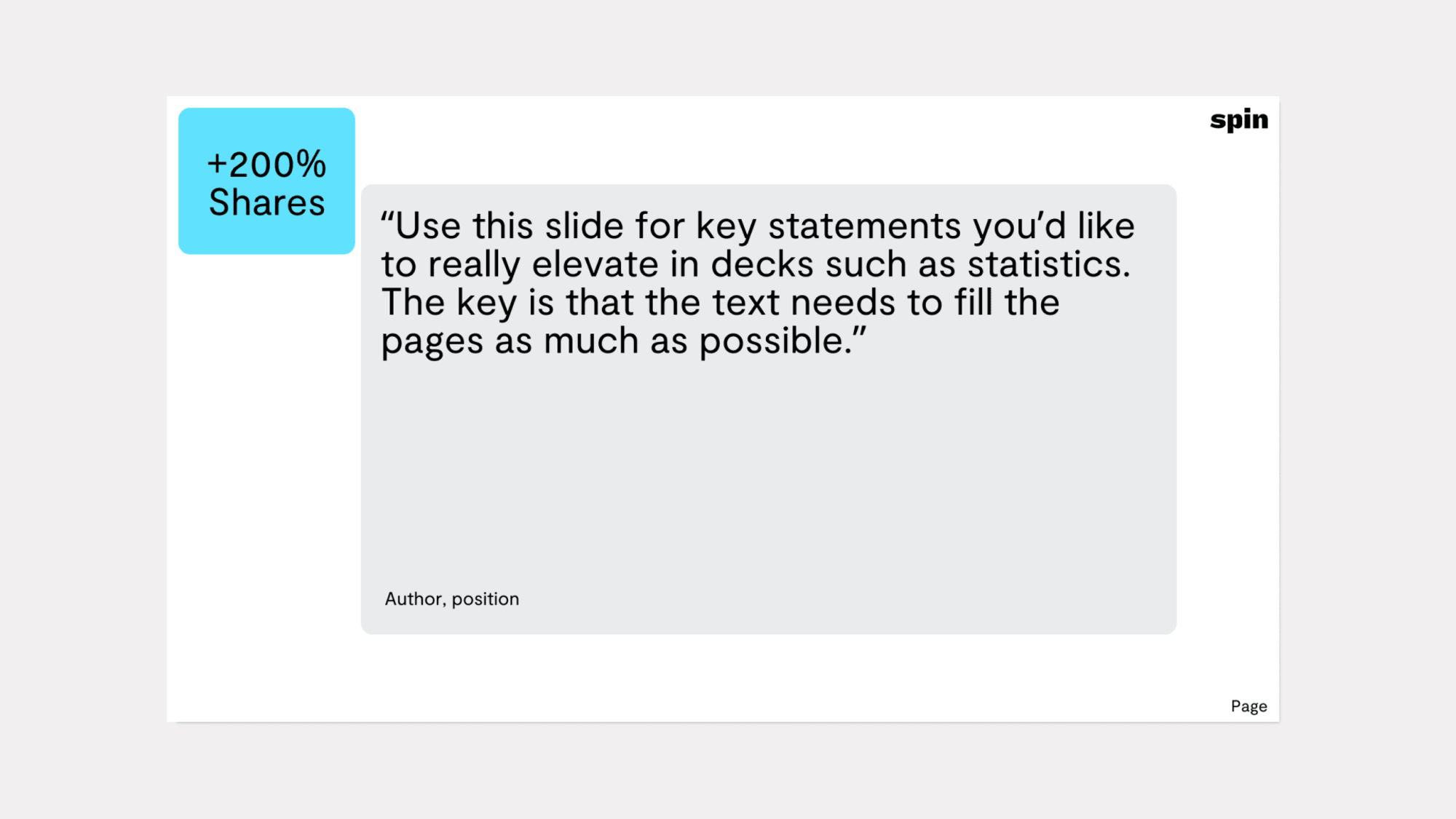
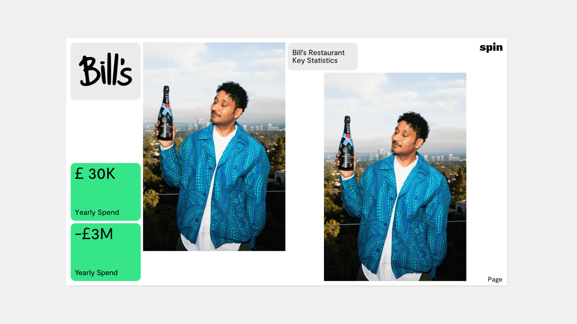
A series of templates show how varying content can be displayed. The ‘building blocks’ are styled to allow copy, stats and imagery to sit alongside each other. All content must sit and align to the baseline grid.
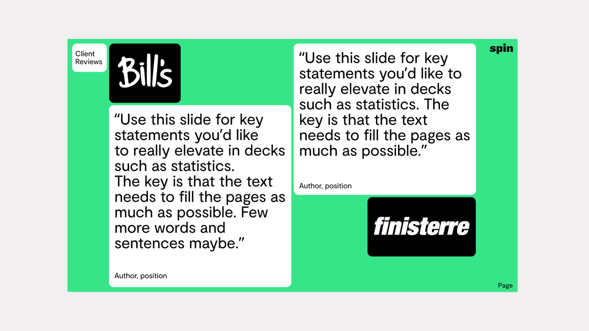
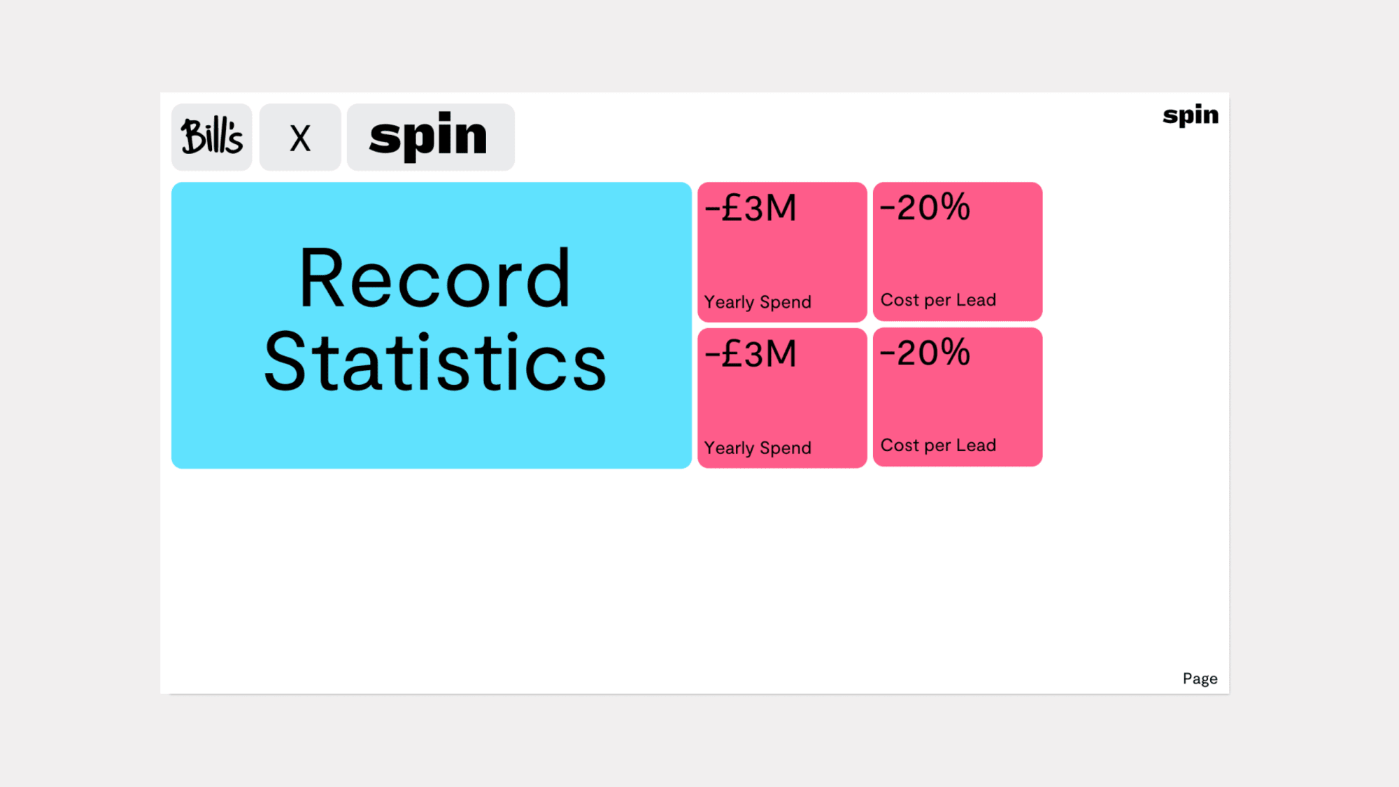
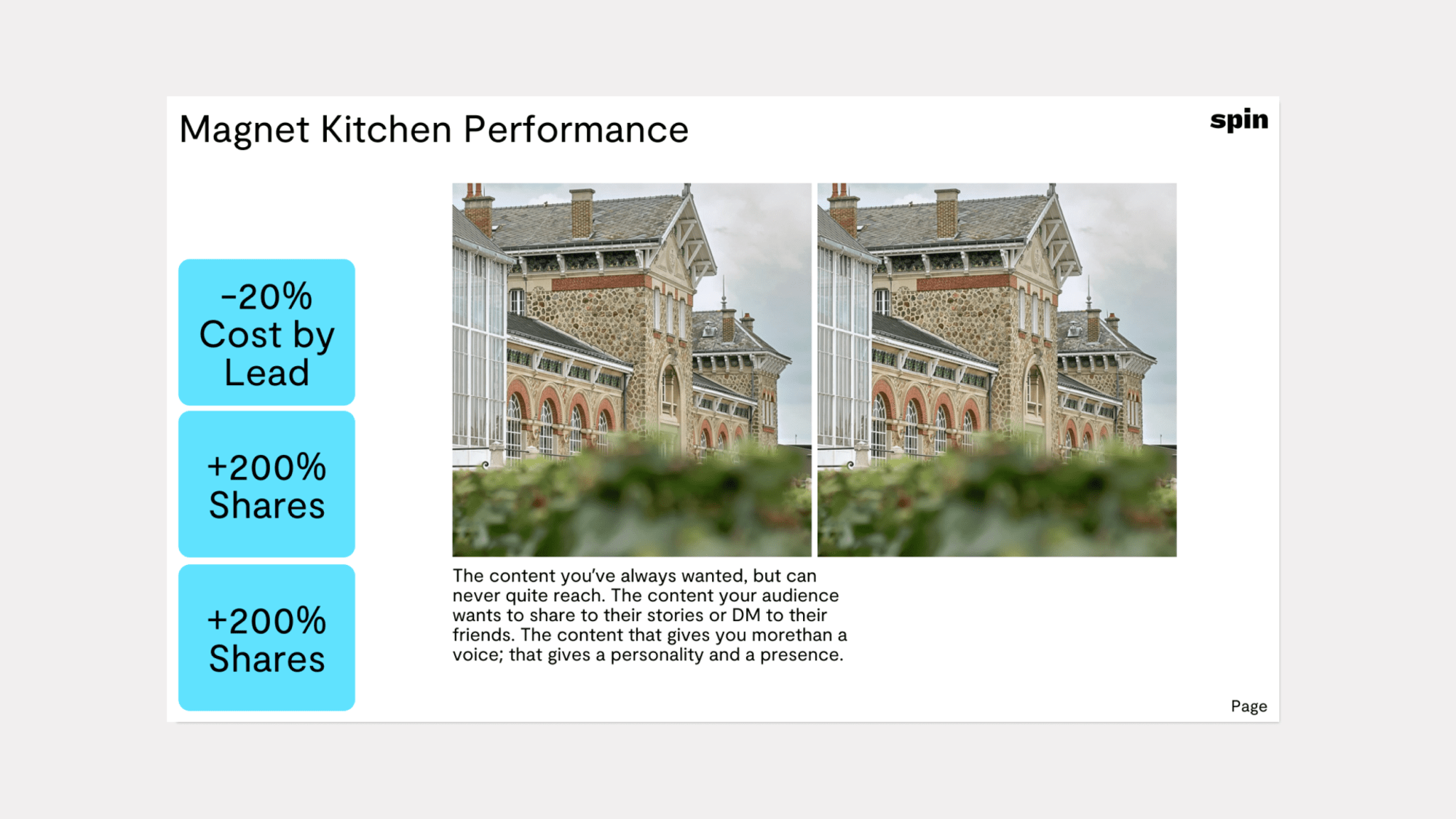
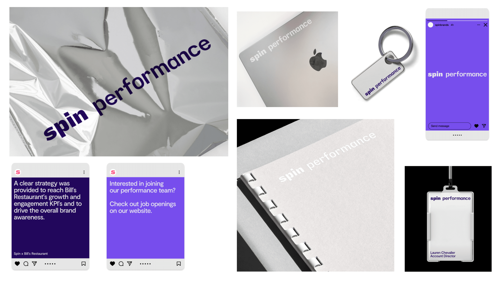
Specialist performance marketing built upon data-driven insight, social-first creative and continuous experimentation.
Introducing the Wordmark
This is the Core Spin Performance Wordmark. This should be used in all instances where we need to use a logo. In order to maintain the legibility and recognisability of the mark, there are a few guidelines to follow.
Spin Performance Wordmark 1.3 MB
The margin around the wordmark is derived from the width of the letter “i”.
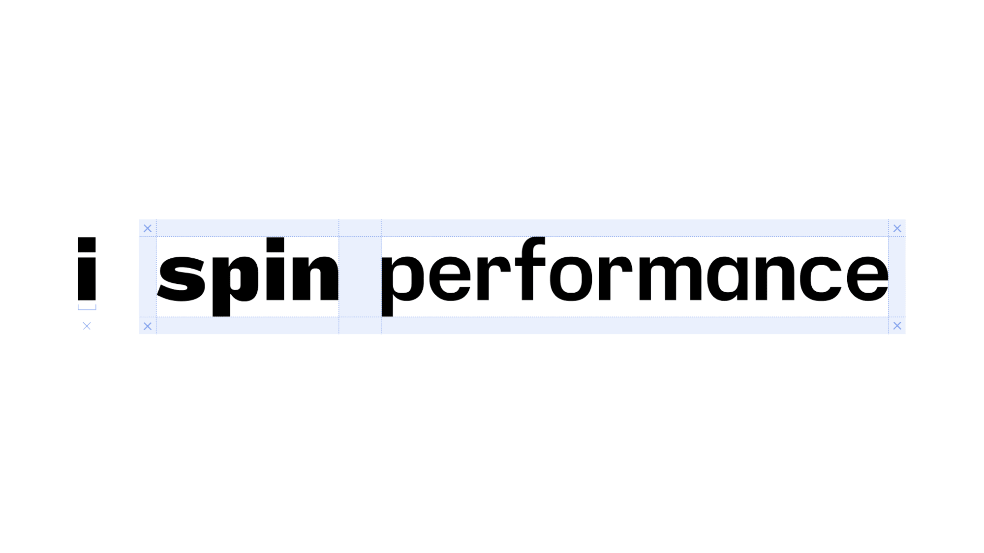
The wordmark and subsequent typeface was designed to work great when used at a friendly display scale and at smaller subheading sizes for body copy. There is no limit on how big you can make the mark (as long as it fits within the grid parameters), but establishing a minimum size helps ensure that the legibility of the mark isn’t compromised.
Minimum Size - the Spin Wordmark should never be reproduced smaller than 25px / 28pt tall in any communication.
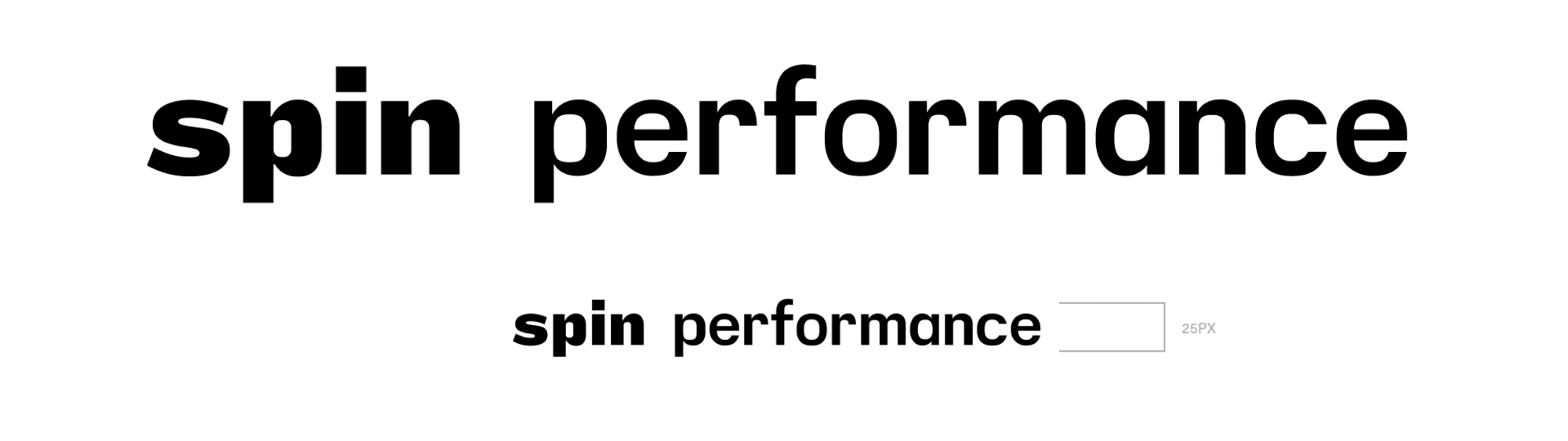
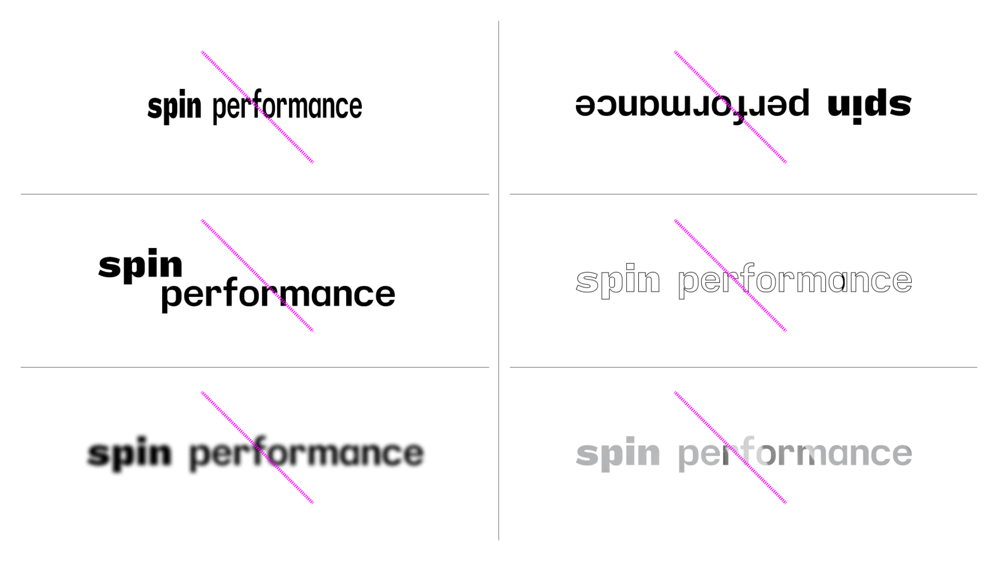
When setting the wordmark, it should always be positioned to the top of the format and expand to the width of the margins.
hover to see visual This applies to all iterations of the mark.
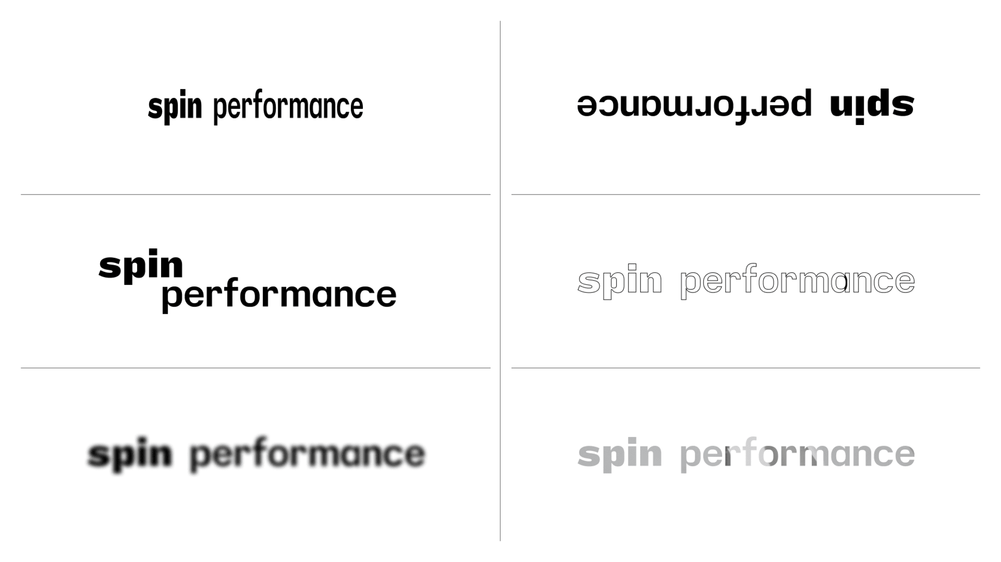 hover to see visual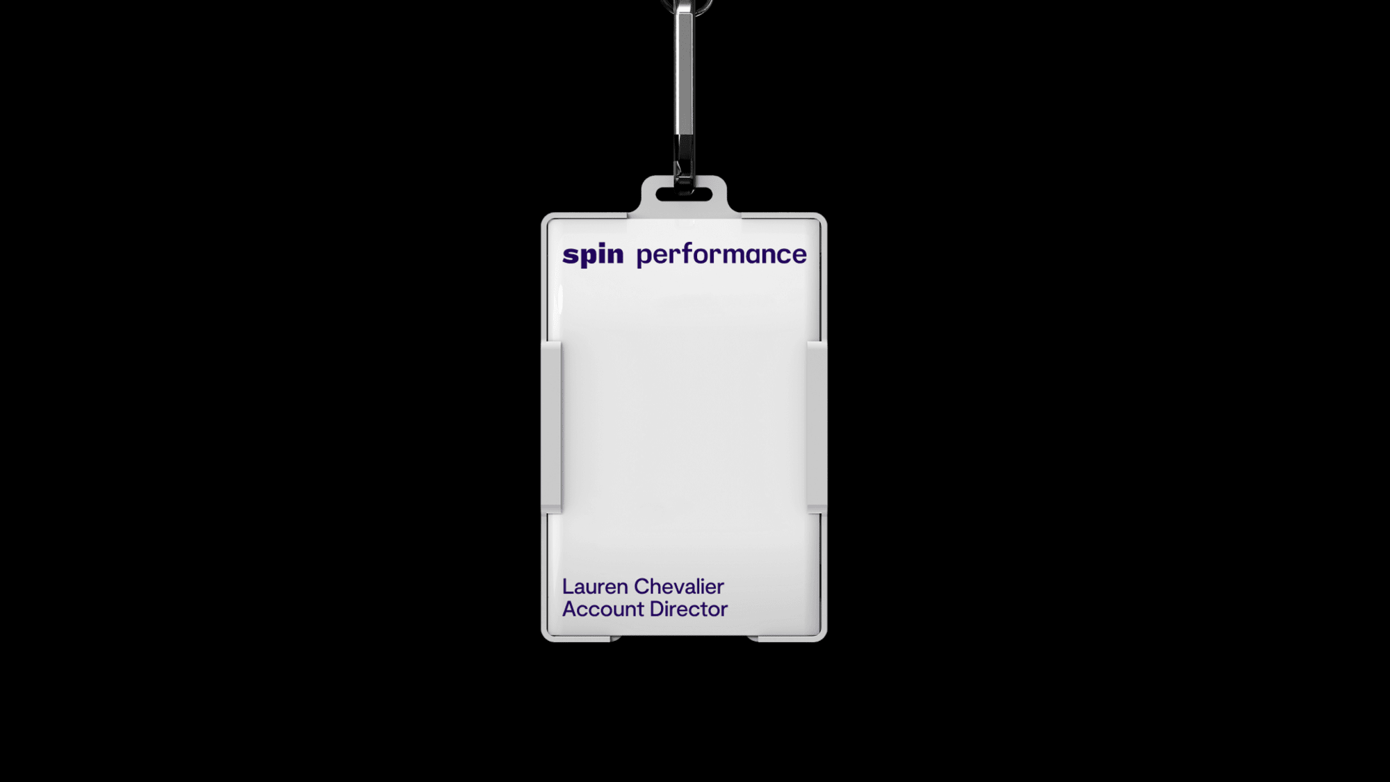
Introducing the Spin Performance Colour Palette
The most recognisable Spin Performance brand colour is a deep shade of navy blue. It should be used across all forms of communication from marketing, campaigns, and events to internal documents, press releases, and social media.
When designing for any digital application, the RGB values should be used. When designing for printed collateral, the PMS (Pantone) should be used where possible, or the CMYK values where PMS is not possible. RGB values should never be used in print environments.
Colour Palette 701 B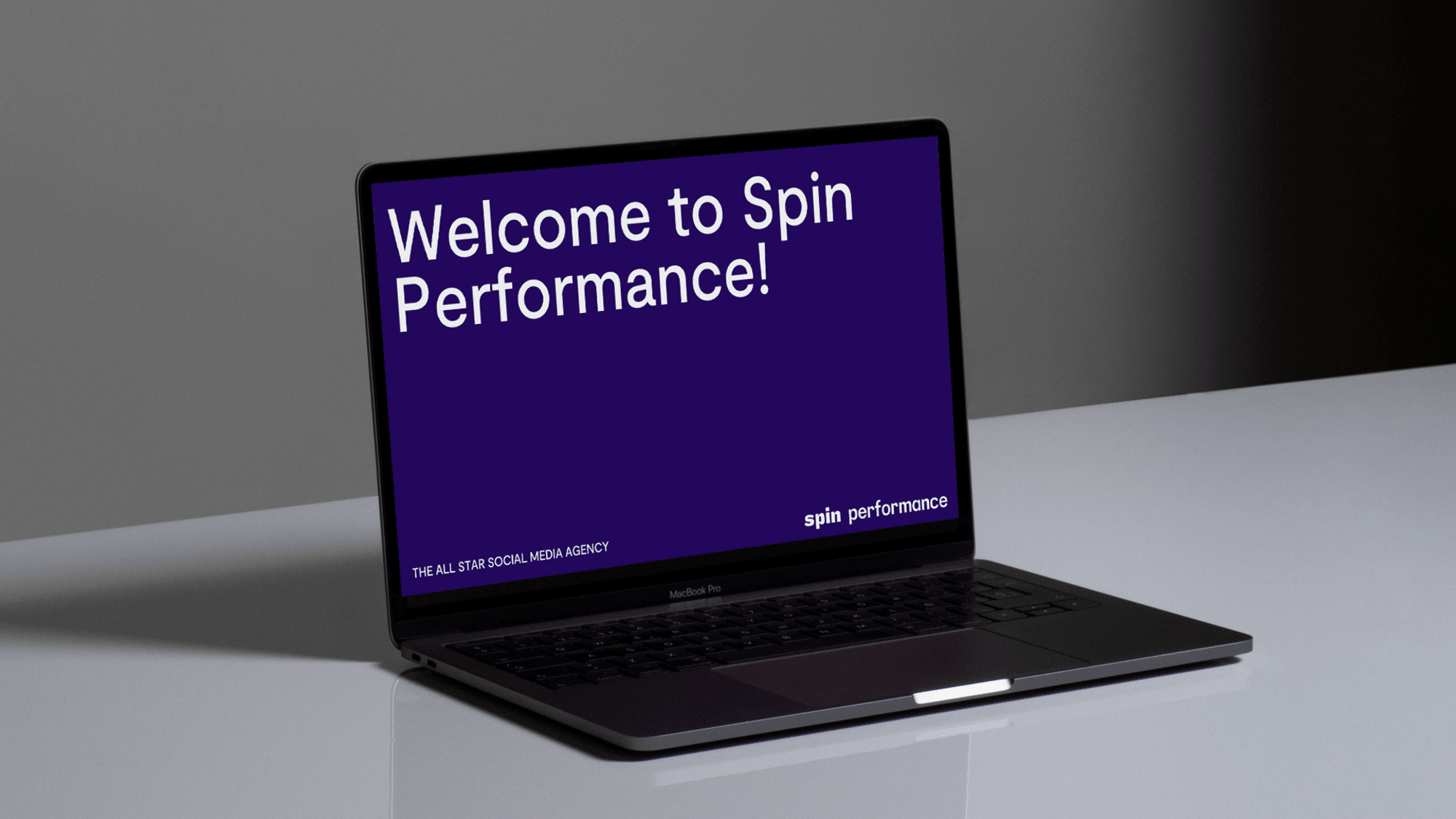
Introducing the Spin Iconography
A bespoke icon system has been created for Spin Performance. Icons can be used in both static and motion form. The motion helps connote the elevated experience of the performance sector. Follow the guidelines below when using the icon system.
Motion Iconography 6.5 MB Static Iconography 2.6 MB
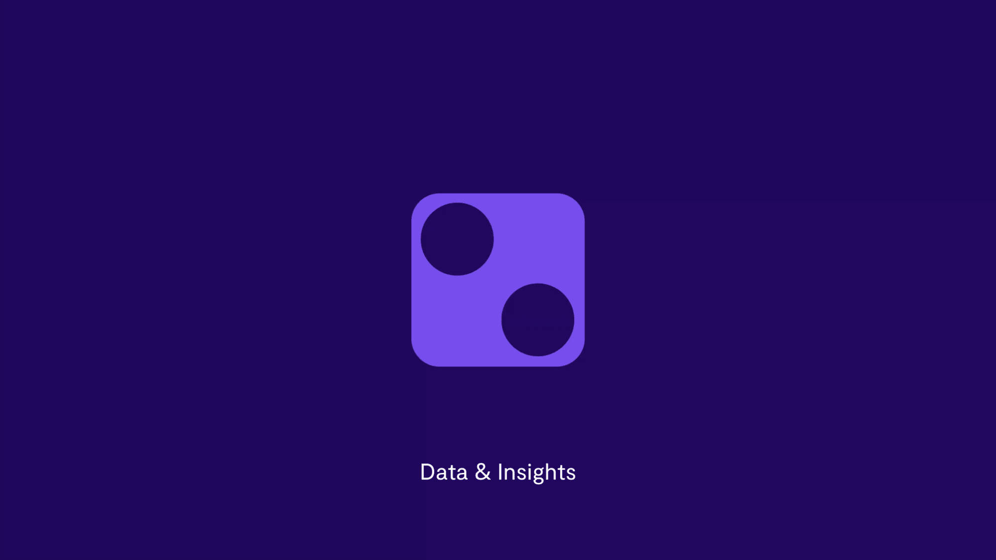
This applies to all iterations of the icons.
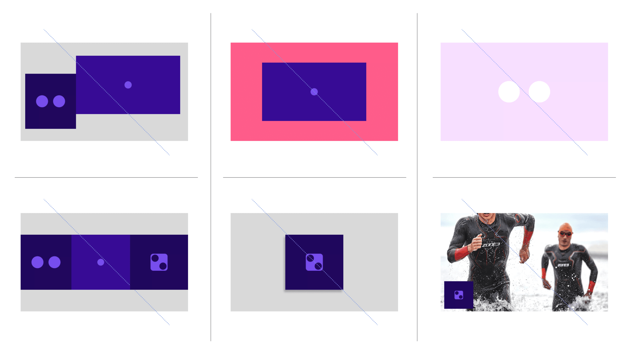
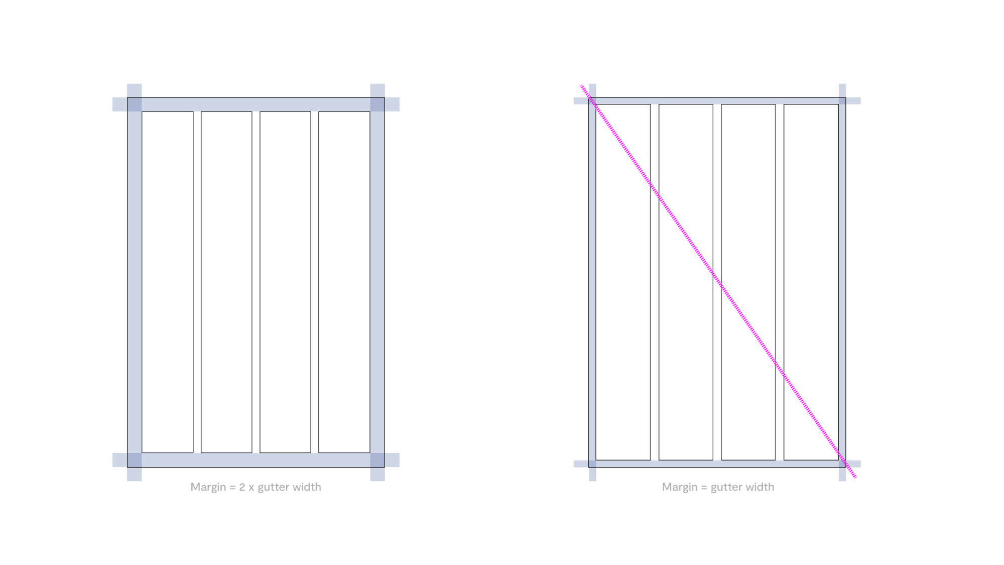
A grid system has been utilised across all printed and digital collateral. Please follow the guidelines below when working in different formats.
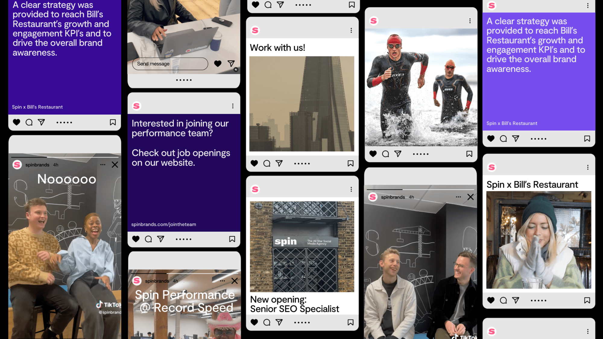
Within social media posts the two type scales can be used to create hierarchy. The larger type size within social posts should always be 80pt. The smaller size should be 40pt.
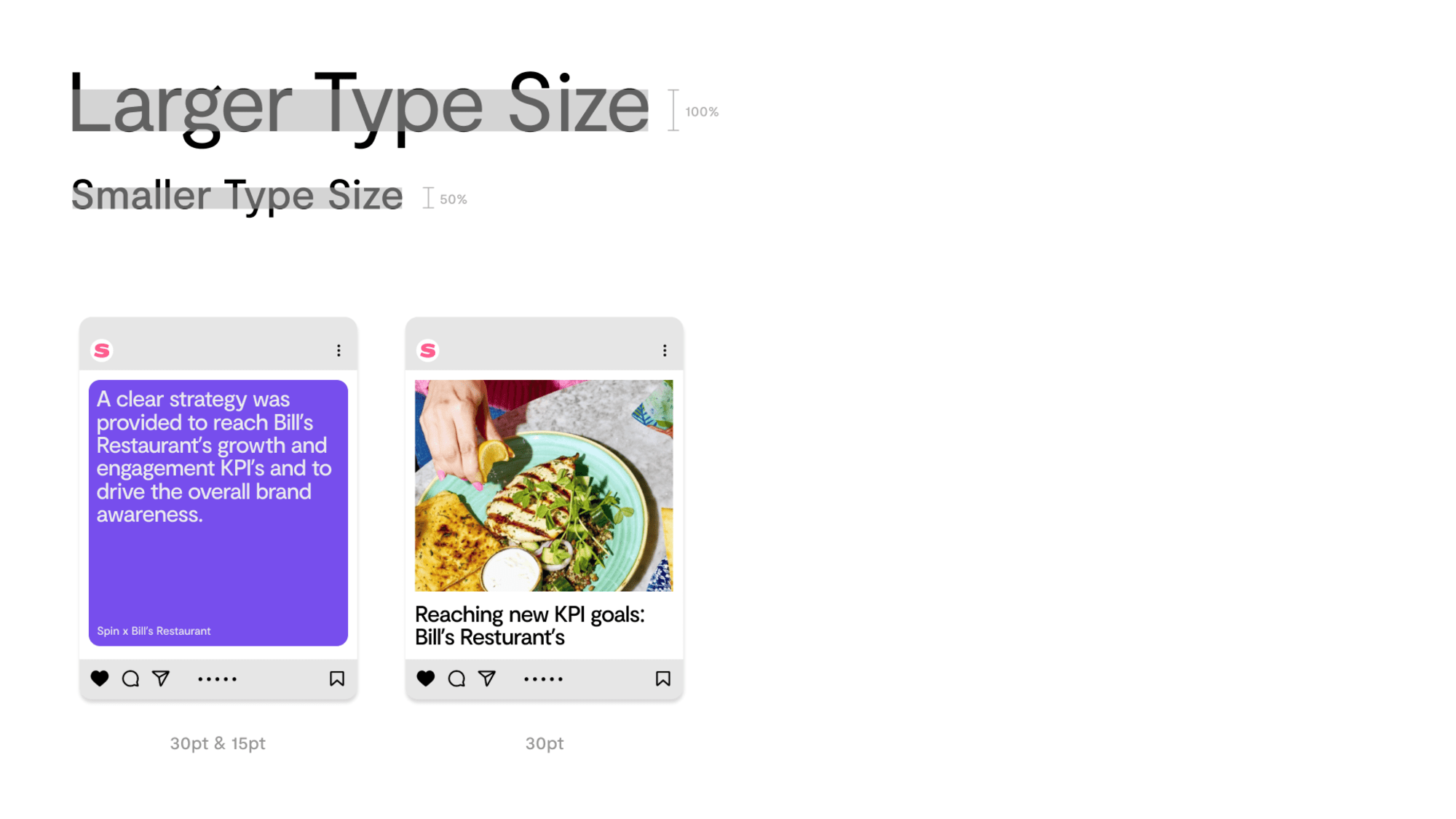
Instagram Post
This template can be used to house longer forms of copy.
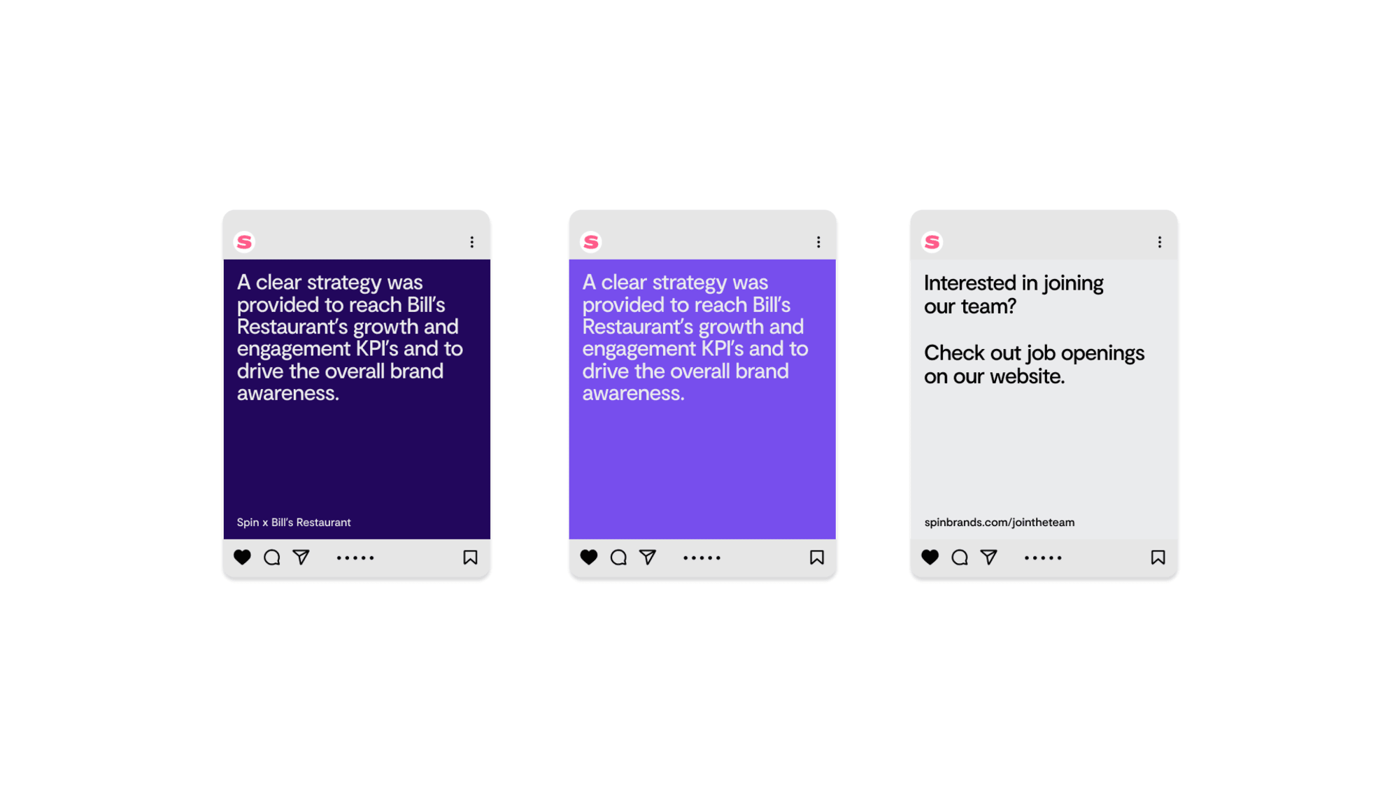
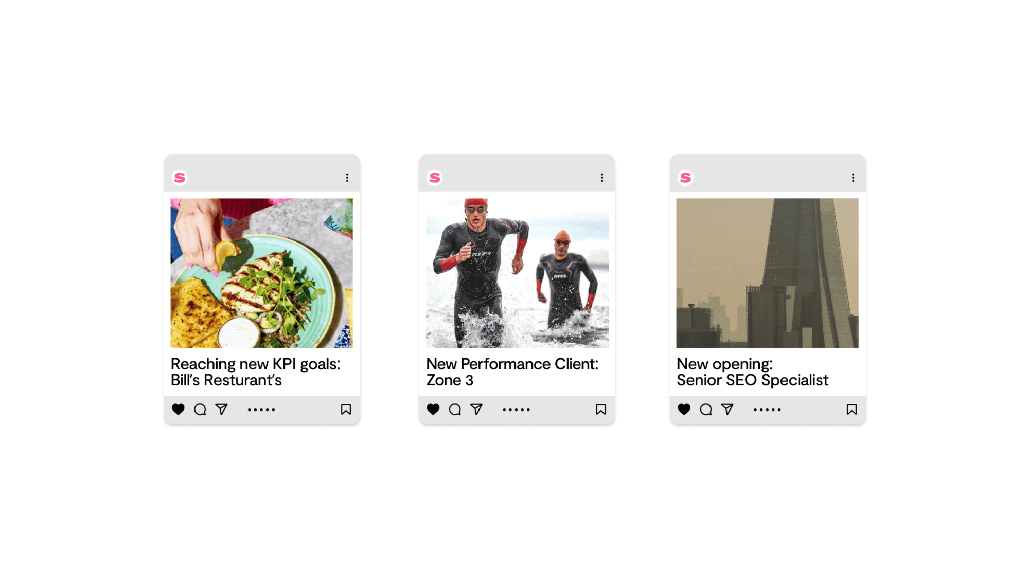
Instagram Post
This template can be used when the copy is only a few words long. We recommend only using two lines of copy max for this template.
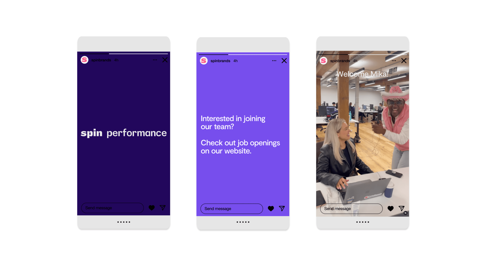
Template guide for InDesign
The InDesign templates provided include predefined style options for all typographic elements. It is important that the contents fit within the grid and style parameters of the template.
Spin Performance Template 4.2 MBYour InDesign template has the Spin Performance colour palette loaded in the colour swatches. Picking colours from here ensures consistency of colour use throughout.
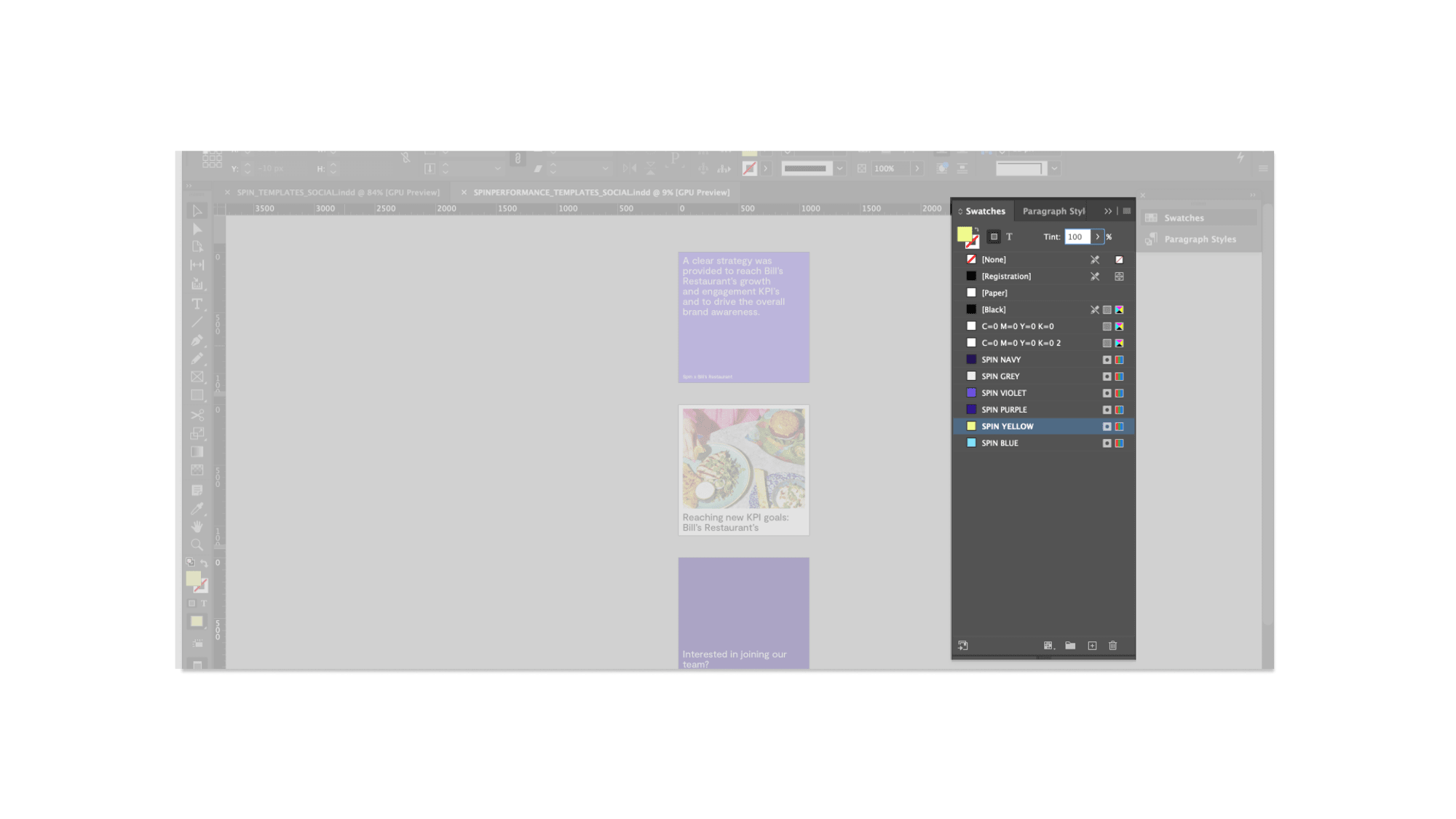
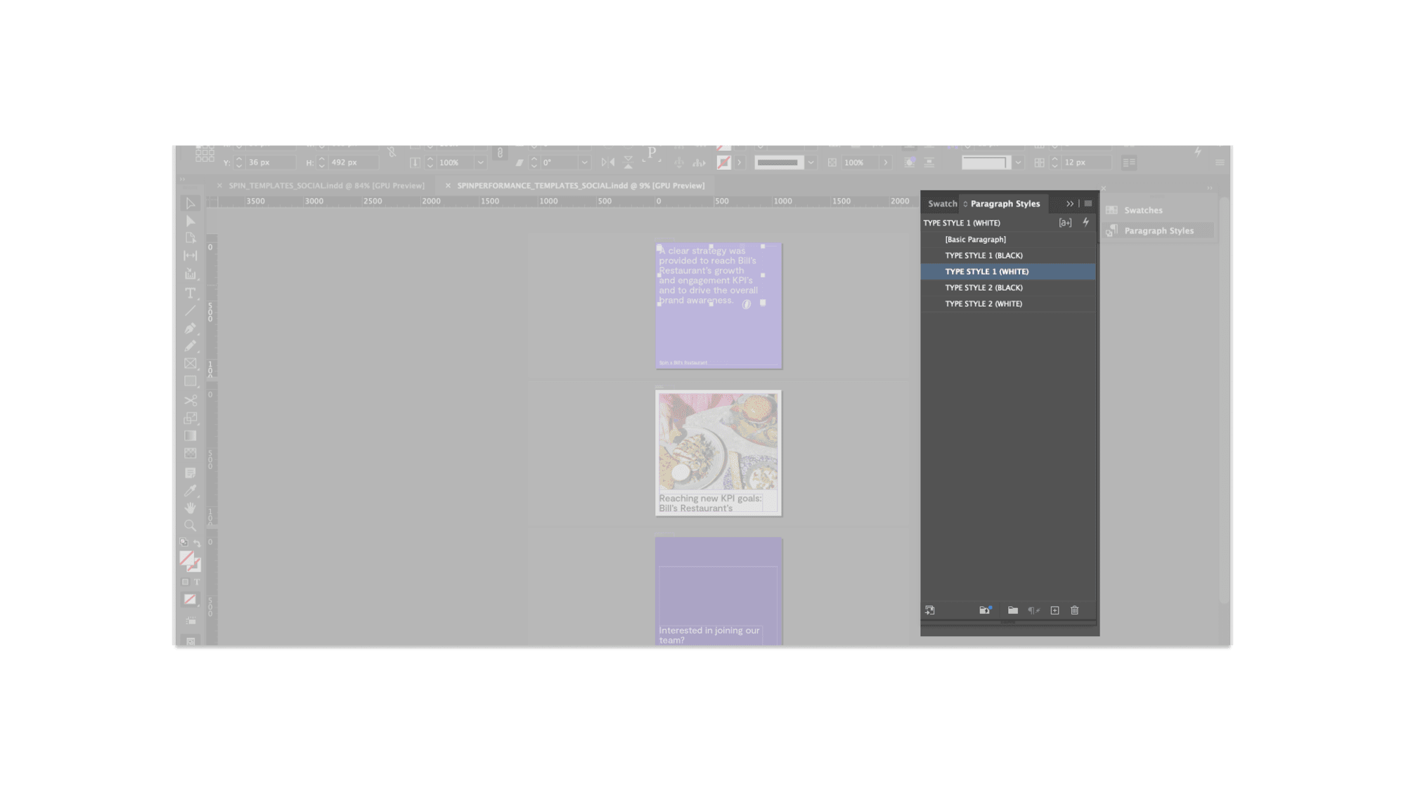
Text should always be styled using the type styles provided. There are 2 type styles to be applied where appropriate. All type should have a typestyle applied to ensure consistency and sophistication throughout the templates.
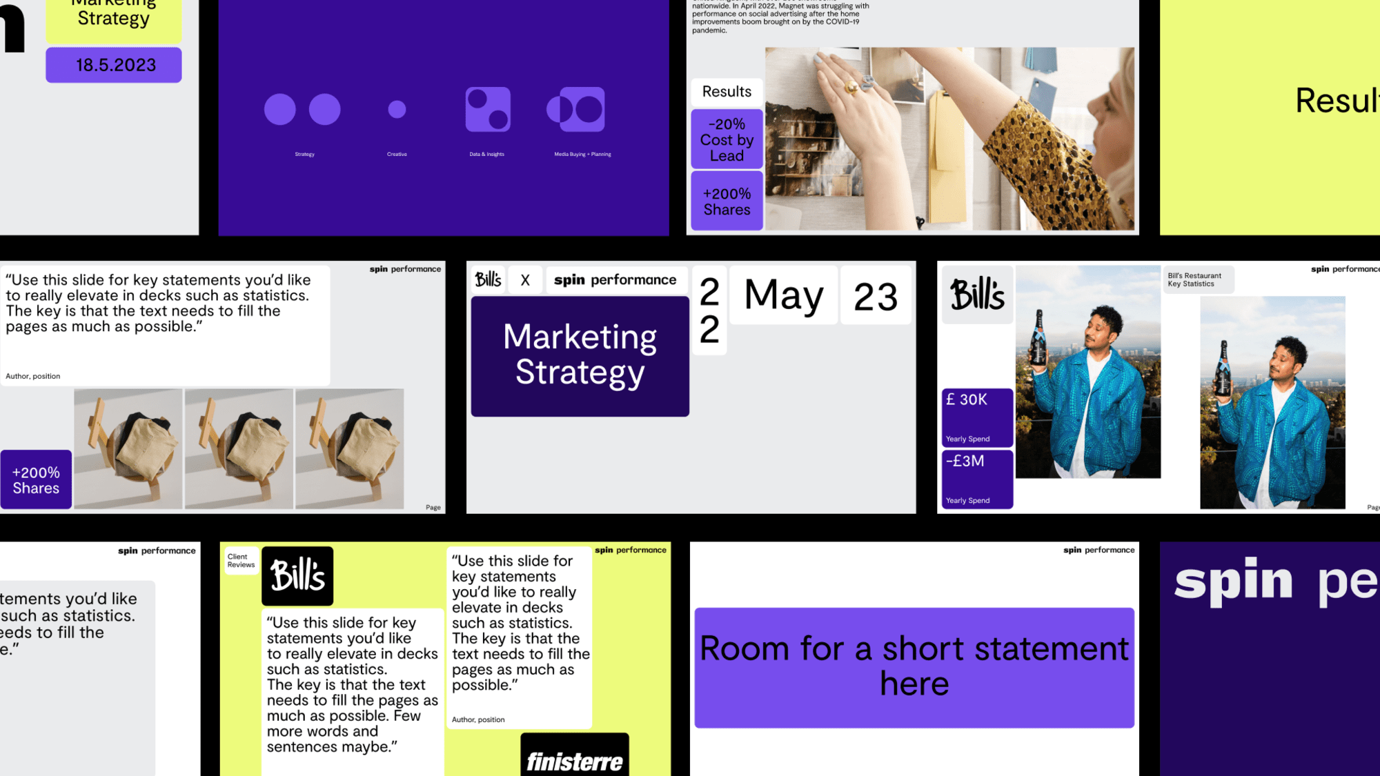
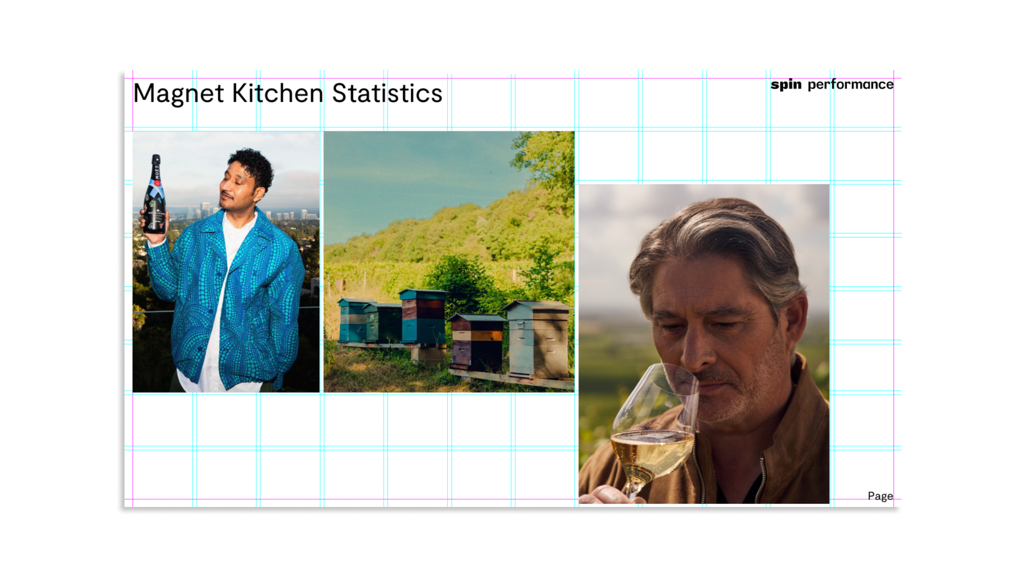
The Spin grid consists of 8 rows and 12 columns and should be adhered to for all layouts so that the visual identity of the Spin brand is communicated across all slides.
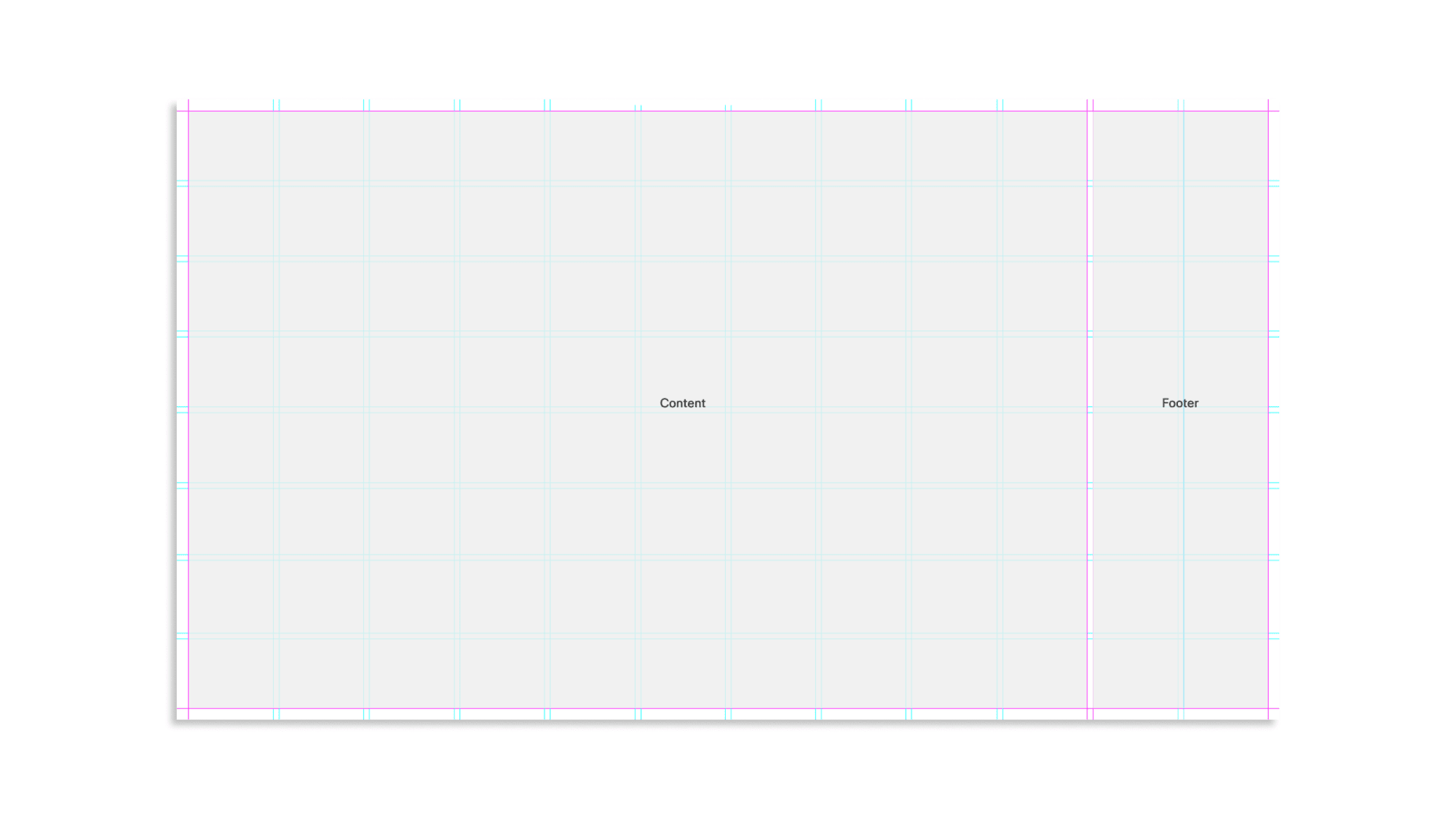 hover to see visual
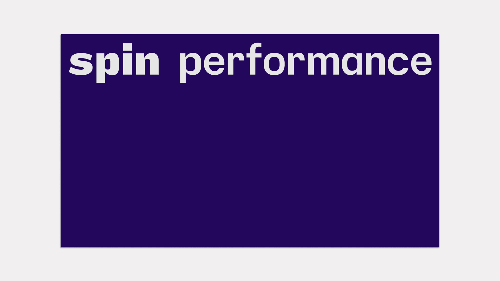
 These templates are specific to the title and end pages, creating space to indicate the beginning and end of the presentation.
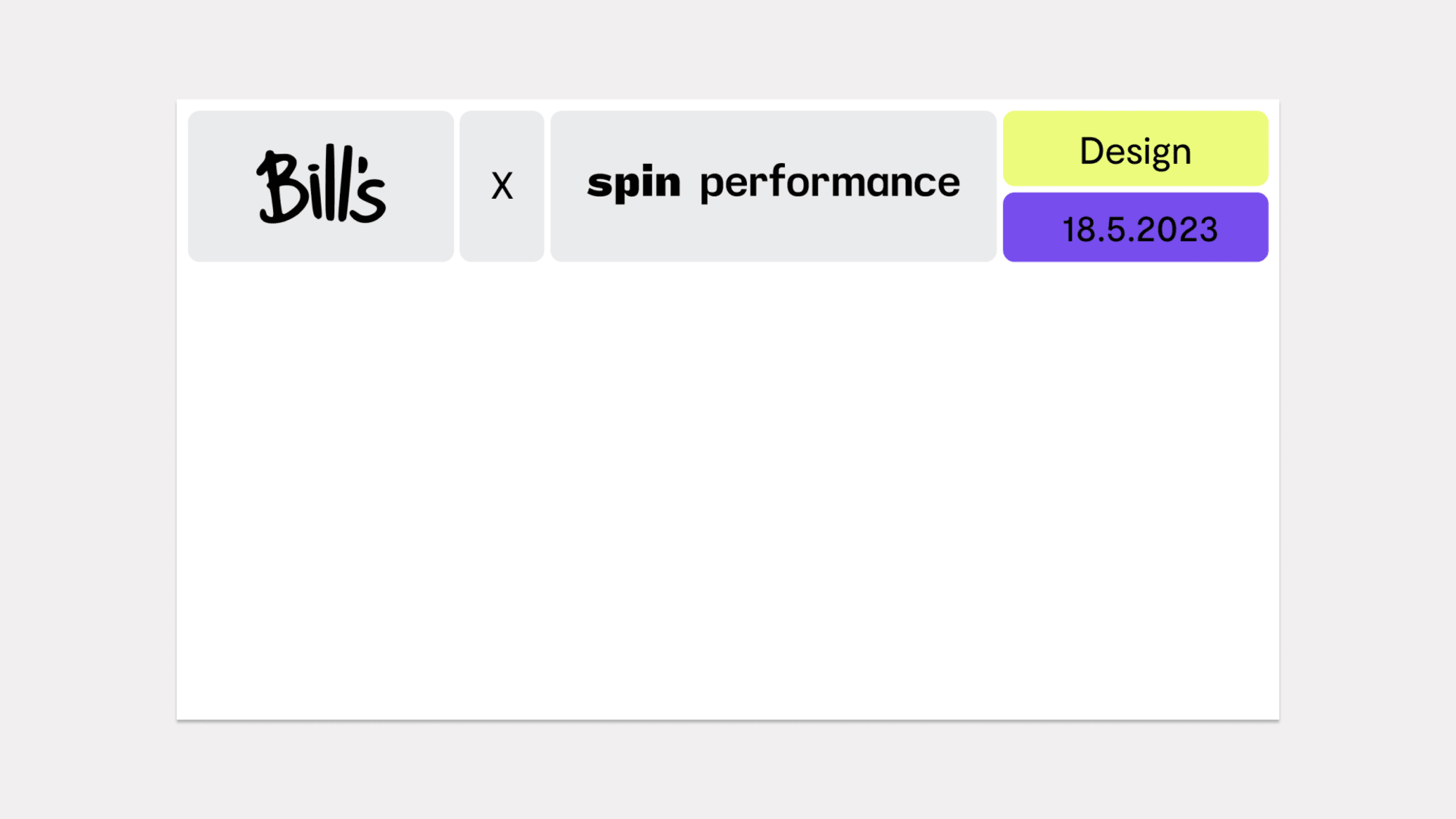
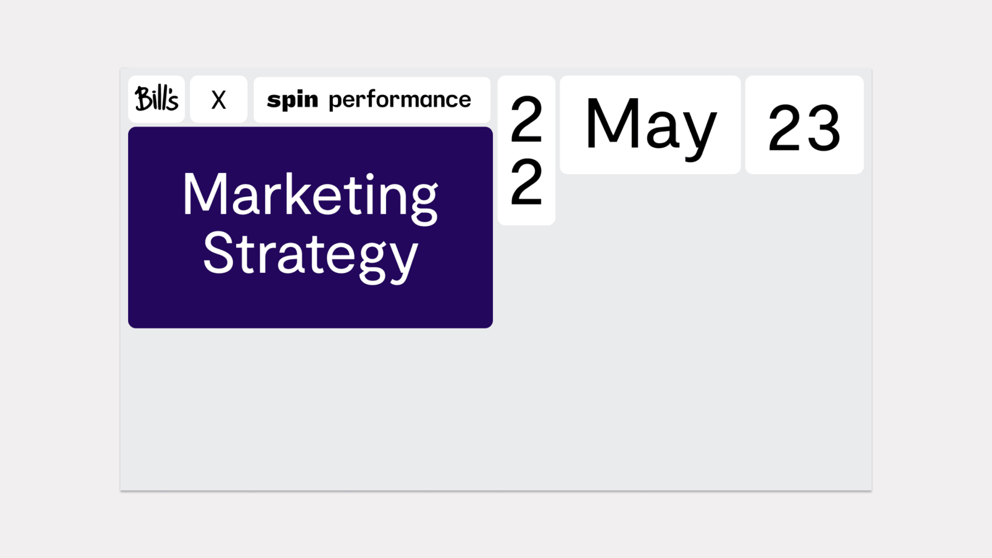
Two different heading templates are used to separate sections and create moments of pause between content-heavy slides.
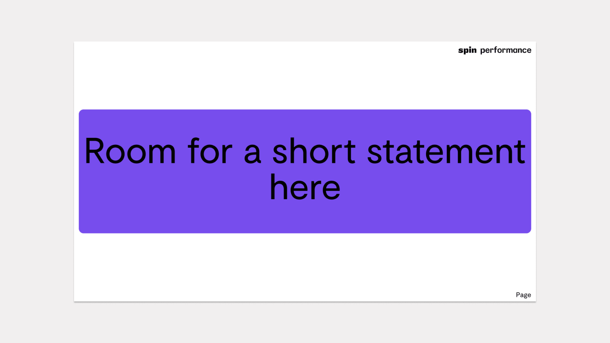
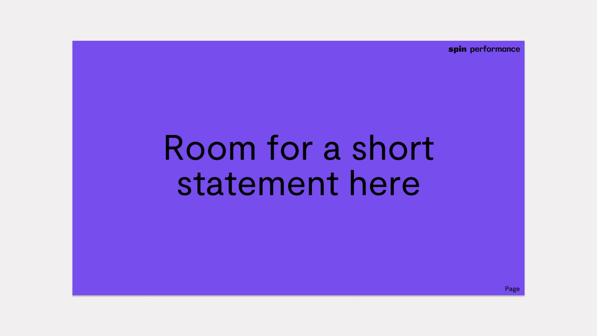
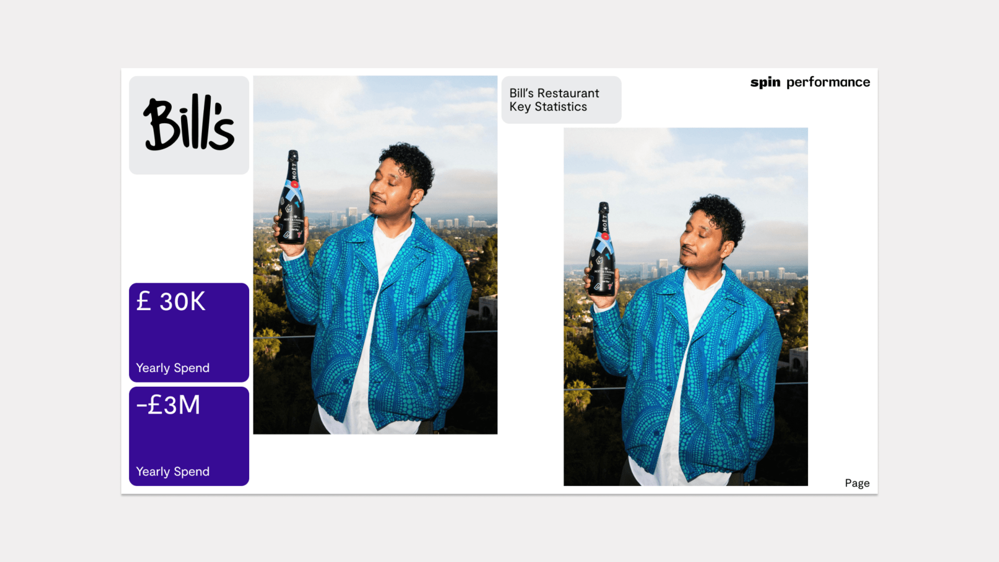
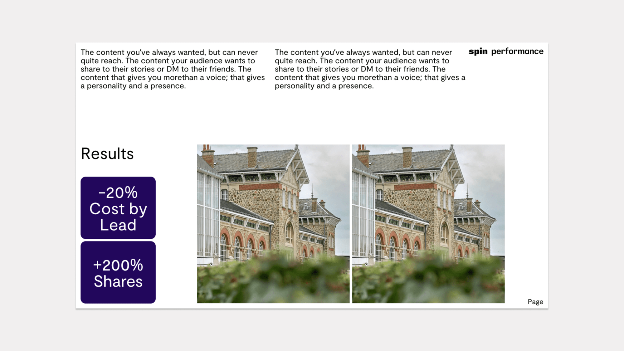
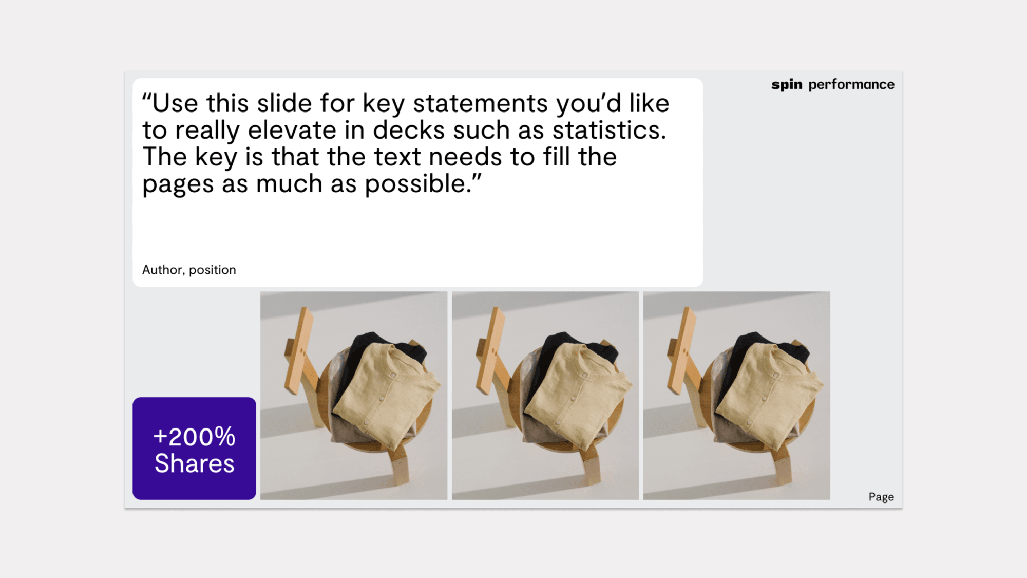
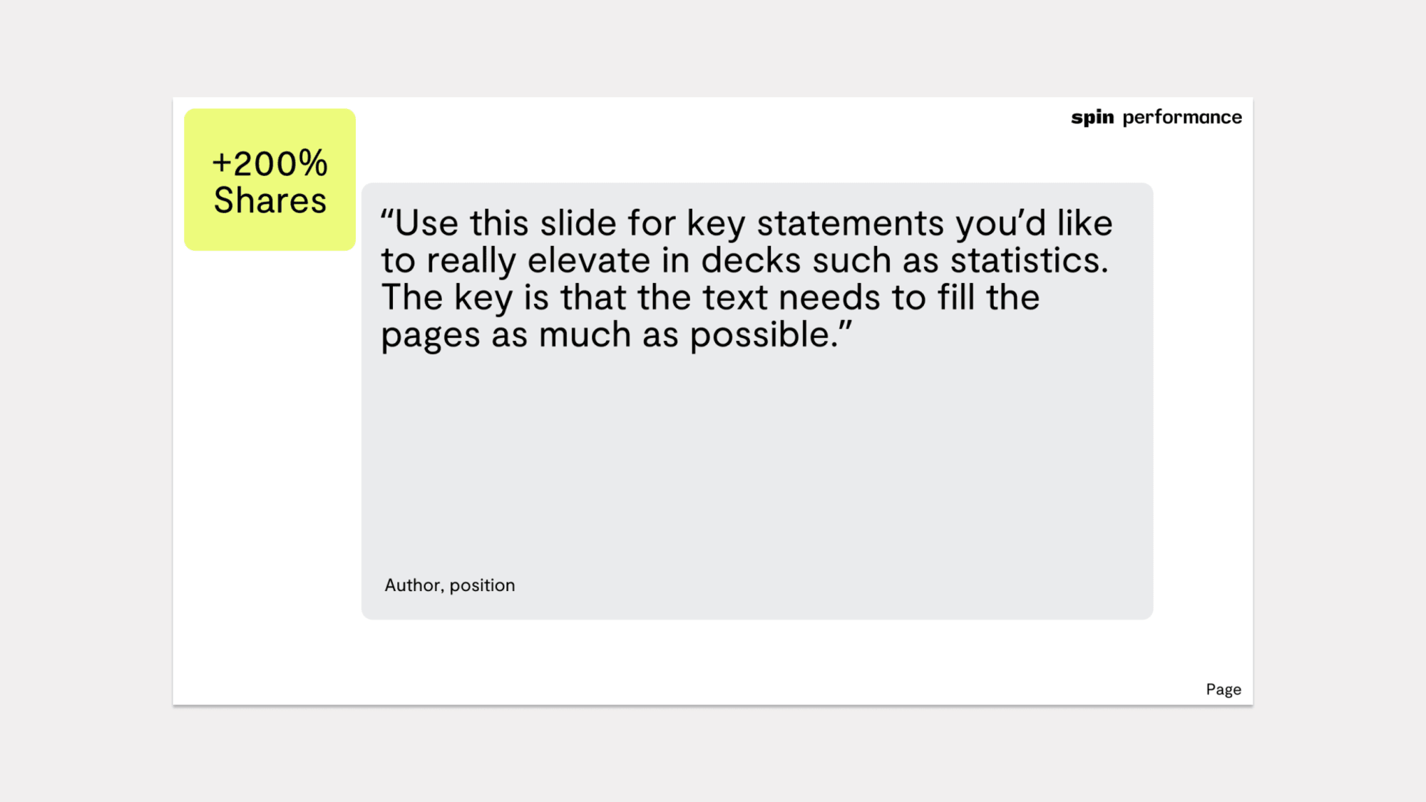
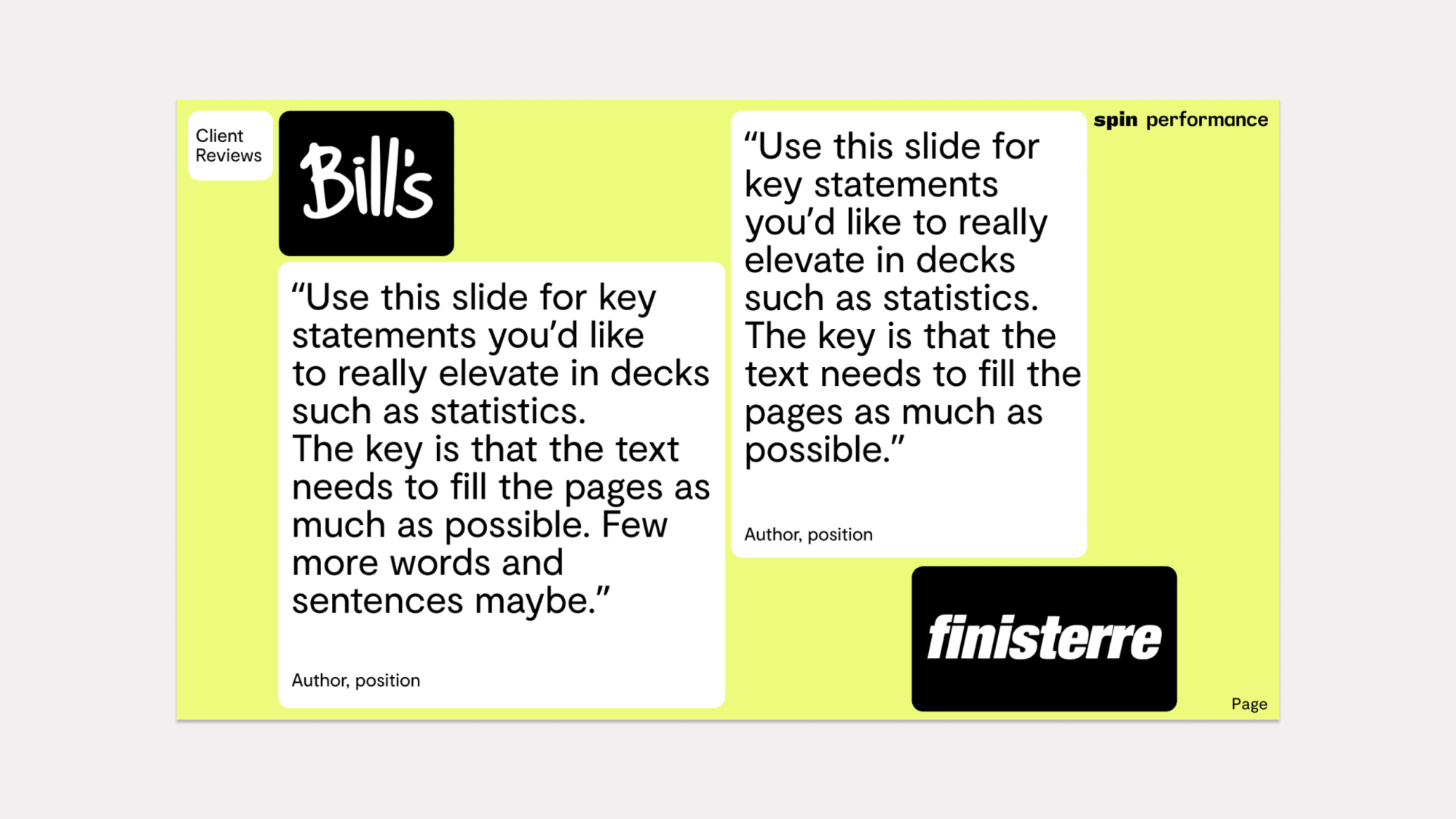
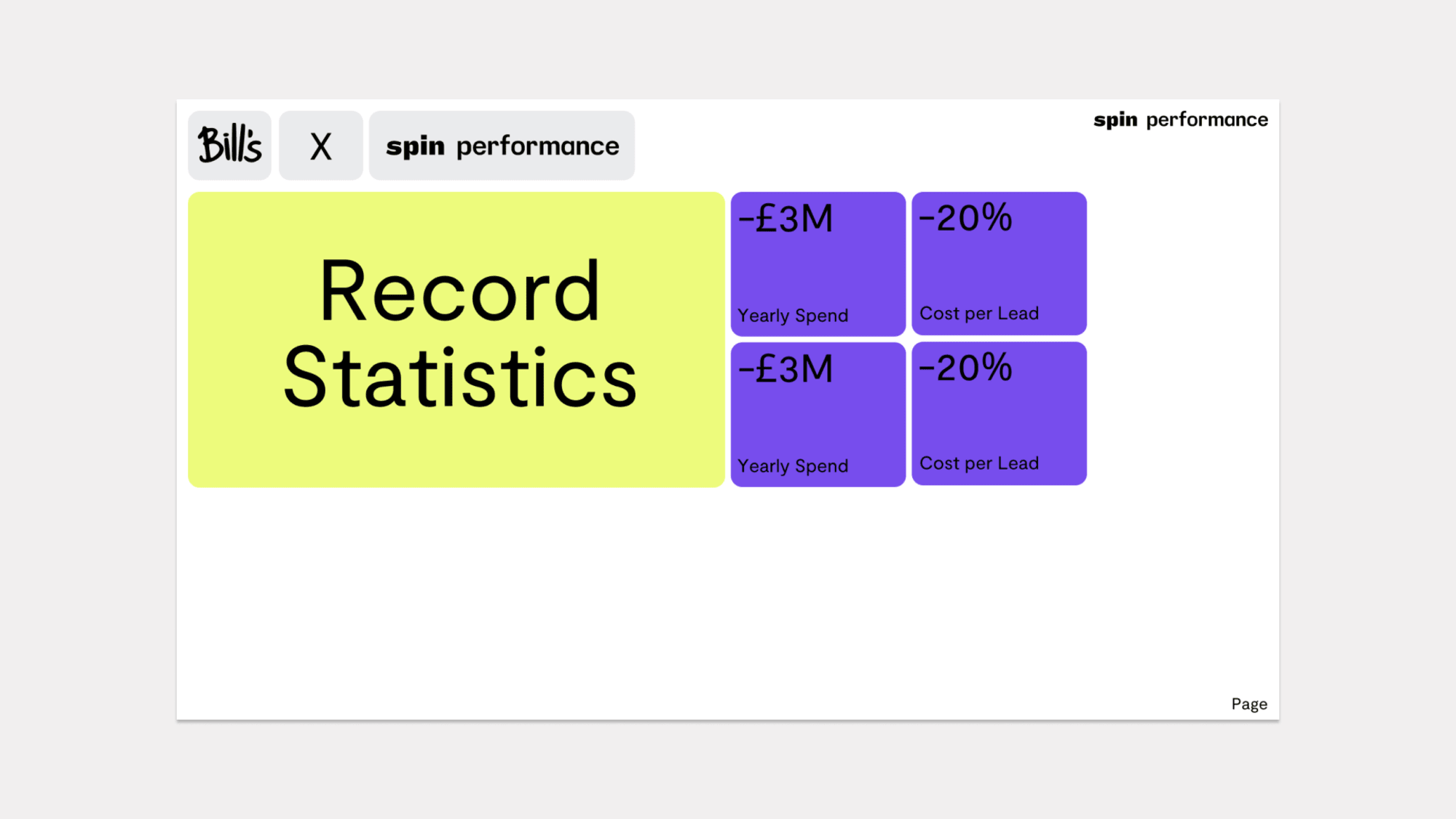
A series of templates show how varying content can be displayed. The ‘building blocks’ are styled to allow copy, stats and imagery to sit alongside each other. All content must sit and align to the baseline grid.
Template guide for Pitch
The Pitch templates provided include predefined style options for all typographic elements. It is important that the contents fit within the grid and style parameters of the template.
Spin Performance PitchThe Spin colour palette has been embedded into the templates. Click the item you would like to change colour and select from the drop-down menu.
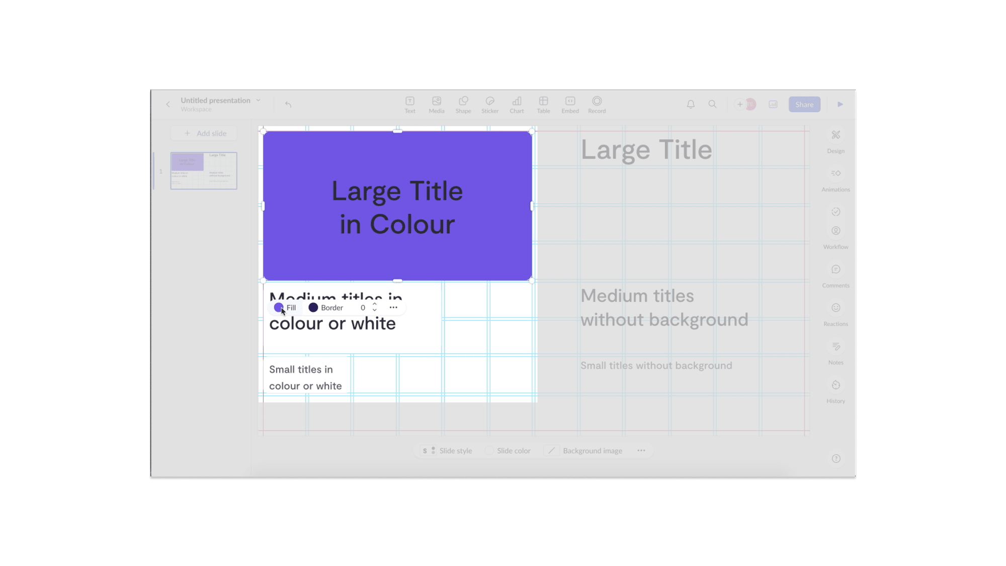
As your content will vary, a type system has been created within Pitch which allows you to easily change the style. Only use these type styles.
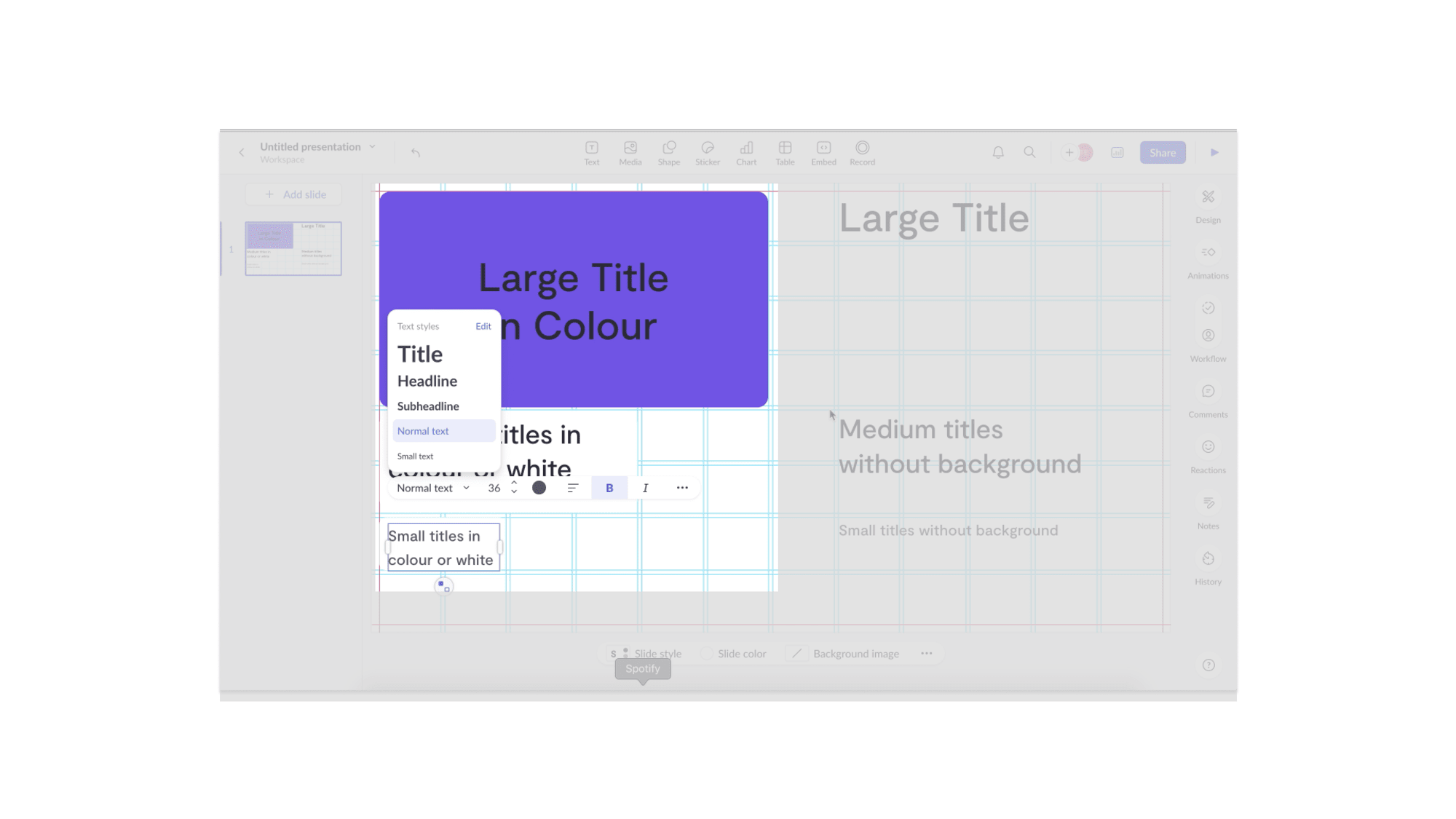
A base grid layer has been created to allow the design of each page to flex but also stay uniform. Once the page has been edited this layer will need to be deleted - double click on it and press delete on your keyboard.
Every brand asset referenced in these guidelines is available to download below. When in doubt, grab the full bundle.